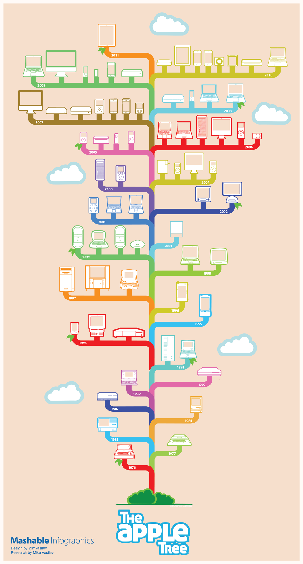
What It Shows
This infographic shows the release timeline for Apple products, from the Apple I in 1976 to today’s iPad.
Why It’s Good
The art of it works really well, capturing a hint of the bright cleanliness of the modern Apple brand.
Maybe it’s a bit cheesy, but I like the fact that a tree makes sense as a way of displaying timelines, and the result is an apple… tree.
What It’s Missing
I think this infographic could be improved in utility in two ways. First, I’m sorry, I know it would make it less pretty, but I want the names of the products. At least some indication. Unless you’re quite familiar with Apple’s product history, the product shapes aren’t easy to distinguish.
Second, to me, if you’re going to have it as a tree, use it as a tree. The only way these products are grouped is by year, with no breakdown beyond the chronological. Given that their products can be grouped (computers, portable computers, mp3 players, phones), I feel like the tree concept could be more logically and usefully applied, with each first branch being a category, and the sub branches representing evolutions within that category. Maybe this is easier said than done, but at the end of the day a straight linear timeline would have been just as effective, and the tree aspect seems forced for the sake of the apple tree joke.
This infographic was found on Mashable here