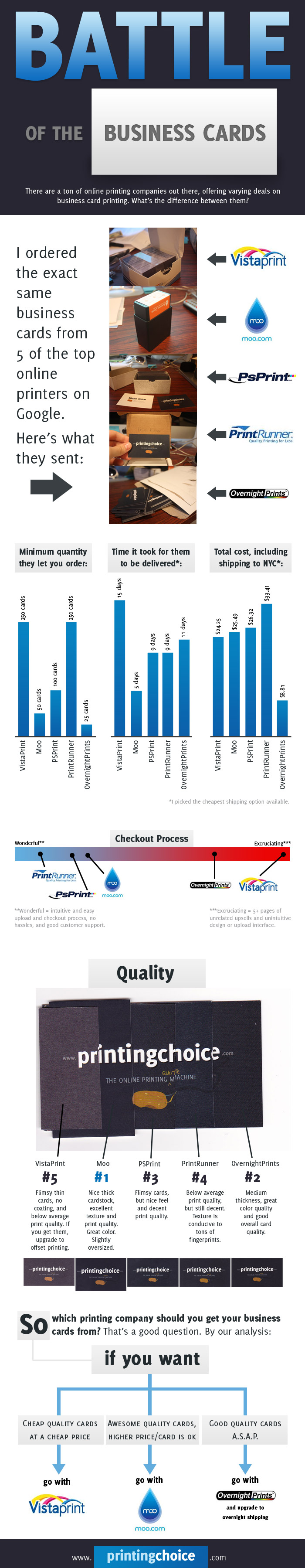
What It Shows
This infographic compares a seemingly equal business card purchasing process across 5 top online business card printing services, comparing cost, delivery time, quality, and other factors.
Why It’s Good
This is the kind of thing I want to see in infographics. I like comparative data that helps a person make a decision, so picking multiple aspects and then comparing them across a variety of options containing these elements is a good starting concept. The selection of elements to cover was also well chosen.
What It’s Missing
Unfortunately, this concept was poorly executed in a few ways, primarily in the fact that each of the elements studied (price, quality, etc.) were all considered completely independently from each other. Gah. Why?! The author makes some summary statements at the end, which is fine and useful in the absence of conclusions emerging from the presentation, but infographics are about showing, not telling.
Why not, for example, a graph plotting cost versus ship times? Maybe quality indicated by the colour of the plot point? Plotting cost versus quality? Ship time versus ship cost? This would show how much worse quality you get from the cheaper options, or how much you save. Merely stating the conclusions robs the infographic of its detail in data, detail that can be plotted in a combined visual presentation that gives a viewer a chance to take multiple elements in simultaneously, instead of in sequence.
It’s just a shame, and while I do regularly complain about infographics that present data in a boring sequence, this one is that much worse because it had the potential to do better.
And it’s a bit ugly.
This infographic was found here.