Archive for category Money
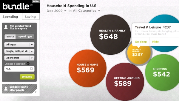
2010 Bundle Report: How America Spends (Stefanie Posavec)
What It Shows
This interactive multi-layered infographic breaks down last year’s spending in America by category (and sub-category), region (and sub-region), and demographic (and sub-demographic).
Read the rest of this entry »
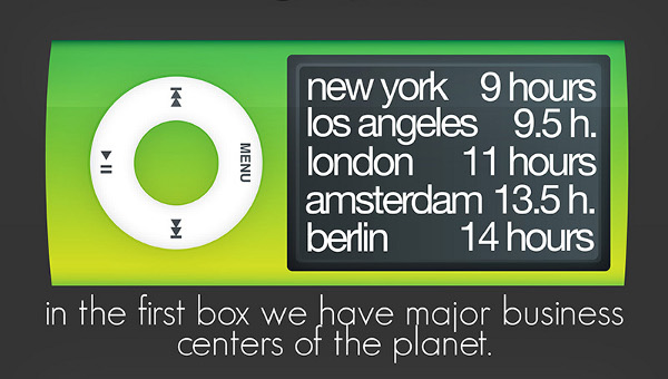
The iPod Index (Burak Nehbit)
Posted by Simon in Money, Science, Technology, & Internet on April 19, 2010
What It Shows
This infographic has taken data from a study on the amount of hours needed to work a typical wage job in different world cities in order to buy an 8 GB iPod Nano. The idea is that the iPod represents somewhat of a standardized global commodity, so it can be used as a constant to compare the richness of various cities in the world by measuring how many hours of average wage work are required to purchase it.
Read the rest of this entry »
Stimulus Home Buying Tax Credits (Fixr)
Posted by Simon in House & Home, Money on March 23, 2010
What It Shows
A flowchart to ascertain eligibility for government tax credits in purchasing a home, as well as remodeling opportunities, all tied to the economic stimulus plan.
Read the rest of this entry »
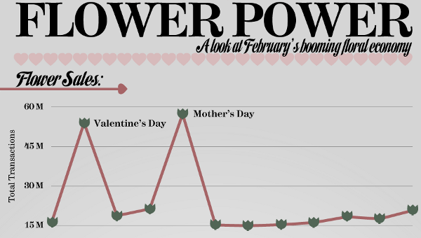
Flower Power: February’s Booming Floral Economy (Mint)
Posted by Simon in Money, Society & Culture on March 18, 2010
What It Shows
This infographic shows flower-related holiday activity, essentially showing the size of the Valentine’s Day and Mother’s day spikes, and how flowers and flower delivery compare to other purchases.
Read the rest of this entry »


