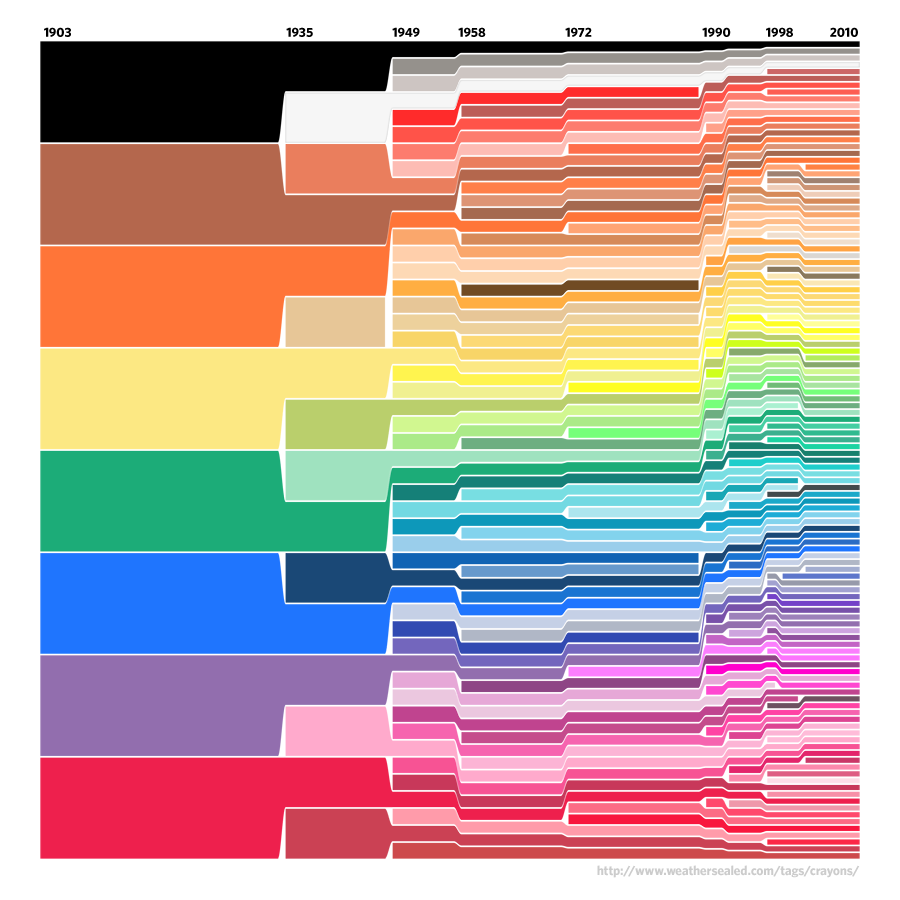
What It Shows
The chronology of Crayola crayon colours, basically showing which colours were available at which points in Crayola’s… evolutionary history.
Why It’s Good
It’s bright and colourful (as you would expect!) and generally aesthetically cool. The article that surrounds it does a clever job of tying the author’s personal sense of history (as a dinosaur) with the infographic that is very much reminiscent of evolutionary species mapping across time. Nicely done, in that respect.
You also do get a sense of the rate of colour multiplication, and see the choices that were made at different points in time and make guesses as to why those colours were selected, and just how similar the colours are becoming as time moves on.
What It’s Missing
The infographic makes sense with the accompanying text on the article page, but whether it was intended to be presented stand-alone or not, I like all the relevant information to be present in the image. All you get are dates and colours, and I could have done with at least a title.
It would be very cool if this infographic had some interactivity to fit in more information, in the form of mousing over a particular colour giving the text bubble with the official colour name. Not really necessary, and certainly much more technically involved and a lot more work, but I think it would take it from good to great.
Found at Weather Sealed here.