What It Shows
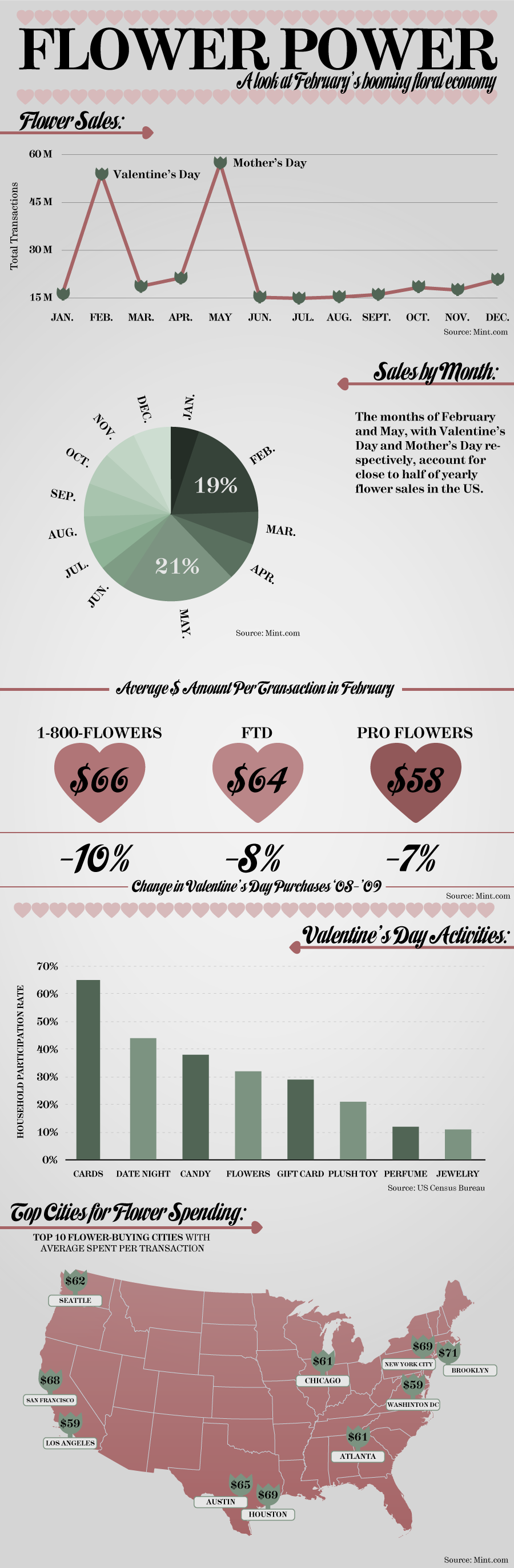
This infographic shows flower-related holiday activity, essentially showing the size of the Valentine’s Day and Mother’s day spikes, and how flowers and flower delivery compare to other purchases.
Why It’s Good
If you were curious about the size of the holiday flower market, you will have a good idea after seeing this infographic. The data it does show is clear and easy to understand.
What It’s Missing
Overall, this infographic doesn’t really say much. The first two graphs show pretty much the same information in two different ways. While I do actually see the value of having both types of graphs there, they seem a bit redundant in an infographic without much extra information. The average transaction prices don’t differ significantly with the average transaction prices in the top flower-buying cities, so I’m not sure what the point of that last graphic is.
None of the information is particularly mind-blowing. The costs are expected, and that there are significant spikes for those holidays is hardly a surprise. The data was probably gathered with good intentions, and sometimes, the results just aren’t meaty.
The visuals have some character and are somewhat well themed, but for a flower infographic, the presentation comes off as a bit drab.
This infographic is found at Mint.com here.