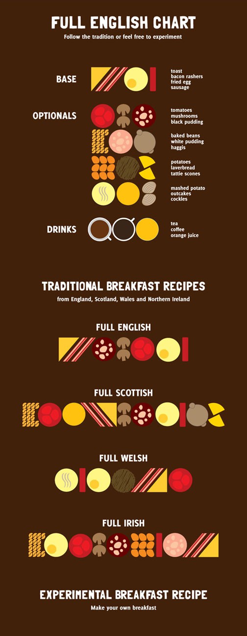
What It Shows
This chart shows the various components of classic breakfasts across the regions of the British Isles. Irish for me, please.
Why It’s Good
The infographic is cute and to the point, and I can see myself referring to it. The breakdown of base foods, those which are present in all regions, as distinct from the optionals, makes sense. Although tomatoes are part of all variations, they do still seem somewhat more optional than the bacon and eggs. Behold, my protein bias!
What It’s Missing
I’m not quite sure what the point of the drinks part is, since they don’t figure officially into any of the breakfasts.
The drawings are adequate, but I did find myself looking back and forth between the meals and the labels for each item. They are stylized, perhaps to the point of laziness (outcakes sure look a lot like orange juice…), but I respect the commitment to the top-down viewpoint.
The location where I found this indicated a source that is no longer active, so I can’t know where to point a link or whether or not the indicated source is who actually created the infographic, or just where it can be found. Any sourcing information would be appreciated.
Also, if anyone has access to a bigger size of the full version, I would gladly substitute.