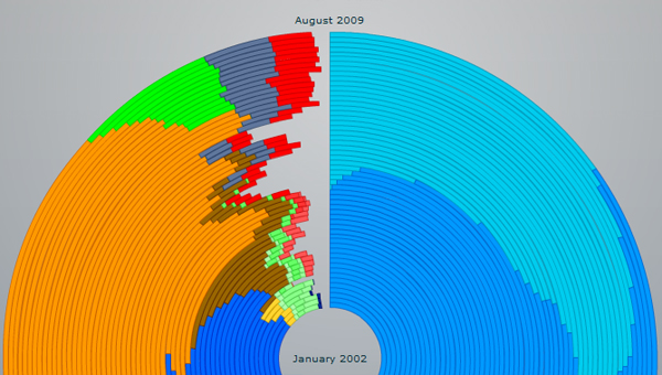
What It Shows
This infographic tracks use of the various web browsers, visually representing market share across time.
Why It’s Good
Infographics are particularly useful when there are multiple axes of data to track and you need a way to get them all in one place in a coherent way. As you might expect, time is often one of these axes.
In many cases, the infographics can themselves display their information across time to capture this variable, for example with a video depicting information, the data across time as the video plays as with the nuclear bomb video infographic.
In most cases with infographics, the visuals are relatively static and time is graphed out, in this case past to future being represented as going from inner rings of a circle to outer rings, like a tree (an actual tree, not a tree graph).
I find the use of that method particularly effective here. The time rings are equally spaced for broad clarity, and blend perfectly with the browser use percentages for that time period shown in brand-matching colour.
The infographic achieves the big picture trend view that is necessary for it to have a point. Without any actual figures or data beyond just the colours, anyone with a basic browser historical knowledge can understand it.
My favourite thing about this, and the most noteworthy aspect relative to criticisms I’ve made of past infographics, is the subtle interactivity. When you mouse over any arc segment, you get the basic data for that segment: the browser, the percentage it represents, and the time period.
This is not printed media, so why not take advantage of a mouseover effect when there is a space constraint? The infographic could have survived without this extra element, but putting it in gave a very worthwhile extra level of control, saving the viewer from having to scan back and forth to the legend and eyeball quantitative estimates.
Most often, infographics are either completely static (which is fine) or heavily interactive (which is also fine), but it’s nice to see one that can stand on its own without the interactivity, but then still uses it in a classy way to unobtrusively add more functionality.
What It’s Missing
While I know that older versions of Internet Explorer tend to persist and function somewhat independently of the new ones, I’m a bit bothered by the lack of mention of Firefox 2 and 3, which came out in 2006 and 2008 respectively. With Firefox, you are far more “forced” to upgrade than with IE, so there isn’t as much of a pressure to separate the versions graphically. Still, I think I would have preferred this infographic track Firefox’s release versions as well.
Also, I wonder if it’s pure coincidence that the final picture does not look unlike the Firefox logo, perhaps a hidden statement about the direction in which things are heading and a reflection of the creator’s preference.
This infographic was found on Axiis.org here via Smashing Apps.