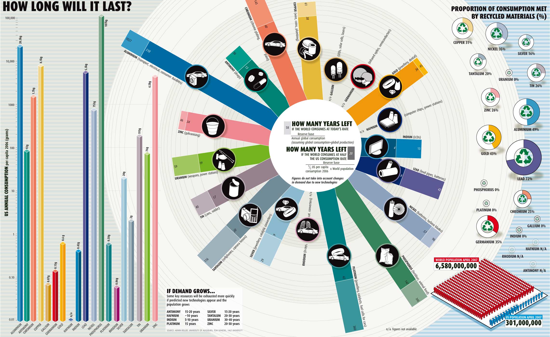
What It Shows
This environmental infographic shows consumption levels of various materials and relative timelines until we run out of them. It also shows the impact of American consumption, in particular, and makes the point by showing the even worse spot we’d be in if the world’s per capita consumption rate was just half that of the United States.
Why It’s Good
Environmental infographics that highlight US consumption do exist, but this one does a particularly good job of focusing a wide range of specific materials, and how they fit into our industries and technologies.
What It’s Missing
Nothing I can think of right now!
Found here, but created by Armin Reller of the University of Augsburg and Tom Graedel of Yale University.
Edit: Thanks for the correcting comment. The graphics department at NewScientist actually put it together with the help of data from Armin Reller and Tom Graedel.