What It Shows
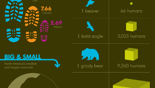
This infographic offers somewhat of an environmental breakdown of Canadian, American, and Mexican wilderness with specific focus on the degree of actual wild in these countries. This includes percentage of water use, human to animal relative populations, and straight up untouched by humanity territory calculations.
Why It’s Good
I’ve been on a bit of an environmental infographic kick here, and I like that this one has a bit of a different take. Yes, emissions and consumption are important metrics, but looking at how much of a country’s lands is totally untouched gives an interesting perspective. I think the facts presented were mostly good in light of this viewpoint. Human effect on land, water, animals, and an assessment of ecological footprint generally are all interesting and worthwhile.
What It’s Missing
I’m not thrilled about the color use… bit hard on the eyes. While the color-attribution for each country was consistent (Blue = USA, Orange = Canada, Pink = Mexico), once the same colors started being used in stats that weren’t a country-by-country breakdown, the consistency was damaged.
What I found lacking was a focused message to deliver a clear point (and supporting points). Largest and smallest mammals are fun to know, but irrelevant. If human activity reduced/made extinct the amount of even larger mammals, that would be more interesting and pertinent to the infographic.
Relative populations don’t completely demonstrate the impact of humans, since you don’t really know what the animal populations would be without human effects. Some species are naturally more populated than others, and I think you need that variable to properly assess impact. The relative amount of species showing a causally and morally neutral ratio of human to animal populations would make sense as a point about how wild the countries are, but I’m not sure if this section was meant to be about humans affecting animal numbers, too, which is a bit separate.
As far as percentage of land untouched by human activity, the first impression I get and what my brain expects, especially once I see a map (!), is which areas are untouched. Instead, presenting the countries as “filled” up in the way it’s done just comes across as a bit lazy to me. Is that information really not available? Also, with so much of Canada being relatively uninhabitable, stats about what was touched get tricky. They are technically wildlife areas, and yes, they’re untouched, but I feel like how habitable for humans a lot of this land is could be worth knowing and relevant. Untouched, as opposed to couldn’t really be touched anyway.
And of course, I am not a fan of visualized stats only infographics that didn’t need to be infographics to convey the same information. Again, yes, the visuals are more fun and that aspect has value, but once you’re going to not just list stats, the medium should be rather necessary for the message, and it’s not here.
If the goal is to both represent how wild Canada, the US, and Mexico are now while making a point about human interference, I would like to see how much was untouched at different points in North American history. I’d like to know what relative animal to human populations are, but what they were (tough as that might be depending on how far back you go). I think time is the variable that could add a lot to the point of this infographic, and could also be the kind of variable that could affect how the information is presented, to the point where an infographic might truly be necessary as opposed to a stats list!
The Big Wild emailed me this infographic, but its source is here.
