Welcome to Infographics Blog! On this site you will see a wide variety of forms of data visualization. Some are funny, some are cool, some are interactive, and some are animated. All are reviewed along with explanations of the strong and weak points of the given infographic: how they handle aesthetics, data selection and presentation, how clever they are, and more.
Enjoy the best and worst of the infographic world, and feel free to leave a comment!
Japan Earthquakes 2011 Visualization Map
Posted by Simon in Health & Safety on February 4, 2012
What It Shows
This video infographic shows the map of Japan and marks the locations of 2011’s earthquakes. The magnitude of each earthquake is expressed in the size of the circle marking its location. It’s impossible to not react when the big one hits.
Read the review of this infographic »
TOMS: Giving Back, One for One (Autism United)
Posted by Simon in Society & Culture on January 30, 2012
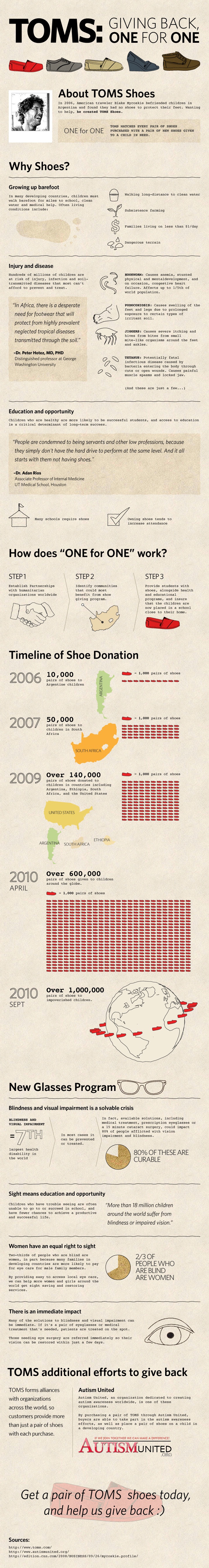
What It Shows
This infographic gives some background about the lack of footwear and visual impairment problems that exist in developing nations, and the TOMS program that, through numerous partnerships, is working towards solving these problems.
Read the review of this infographic »
The Designer’s Toolkit (BestVendor)
Posted by Simon in Infographics & Design, Science, Technology, & Internet on January 18, 2012
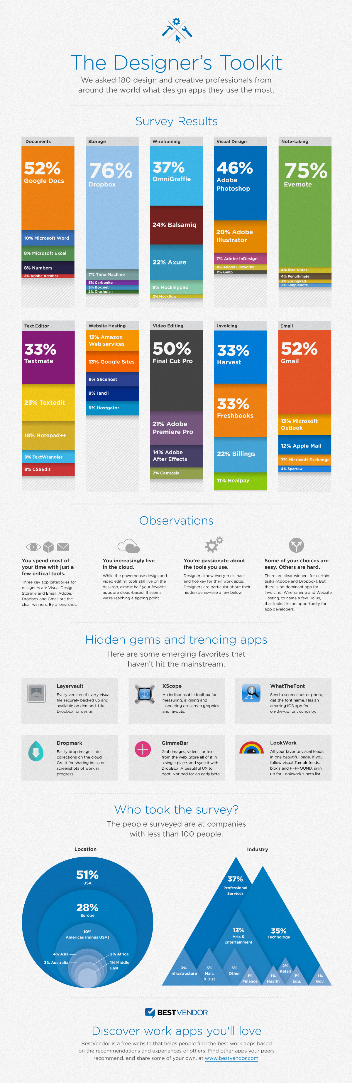
What It Shows
This infographic visually breaks down web tool use based on a polling of 180 designers, for documents, file storage, wireframing, visual design, note taking, text editing, web hosting, video editing, invoicing, and email.
Read the review of this infographic »
History’s Hottest Holiday Toys 1903-2010 (Black Friday)
Posted by Simon in Entertainment on January 7, 2012
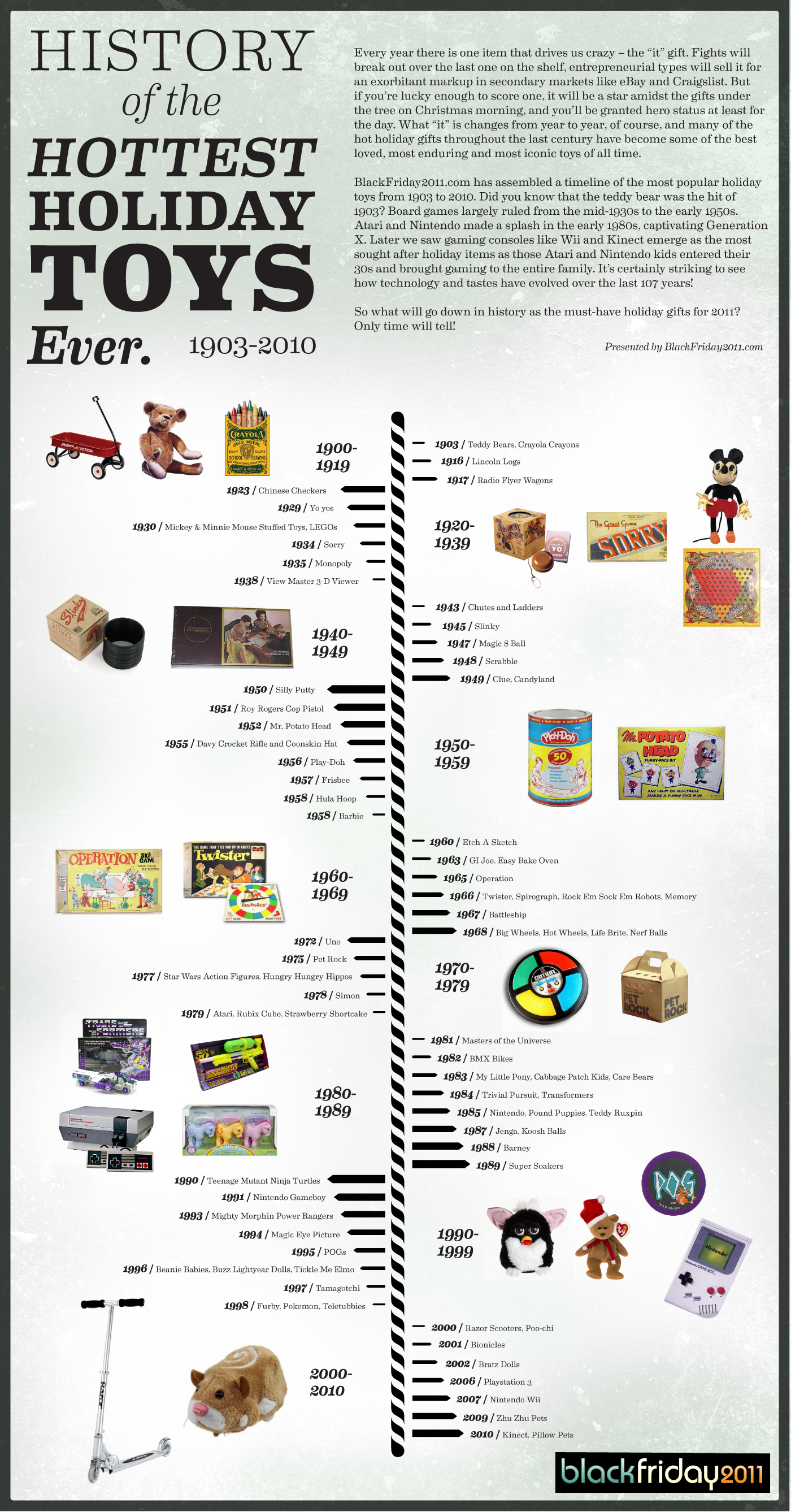
What It Shows
This timeline infographic indicates which toys created Christmas crazes over the last century, from yo-yos to the Microsoft Kinect.
Read the review of this infographic »
The Game of Life (Lifebroker)

What It Shows
This infographic presents numerous facts and figures about life insurance, with an Australian focus.
Read the review of this infographic »
Mapping America (Matthew Block, Shan Carter, Alan McLean)
Posted by Simon in Society & Culture on December 4, 2011
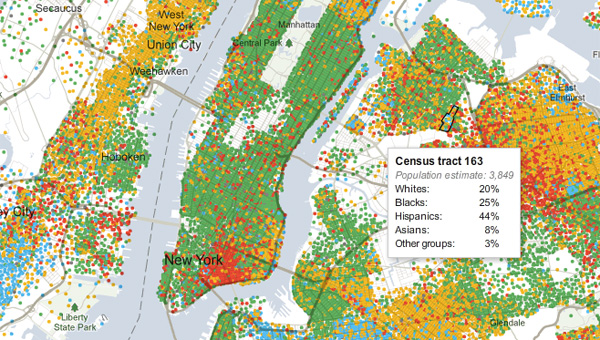
What It Shows
This interactive infographic lets you visually explore race, ethnicity, income, home value, and education level – census data, basically – across block of every city in the US. Seriously. Color-coded for easy big picture, mouse over a given block for its data.
Read the review of this infographic »
Horoscoped: Most Common Words in Star Sign Predictions (David McCandless, Matt Hancock & Thomas Winningham)
Posted by Simon in Psychology on November 27, 2011
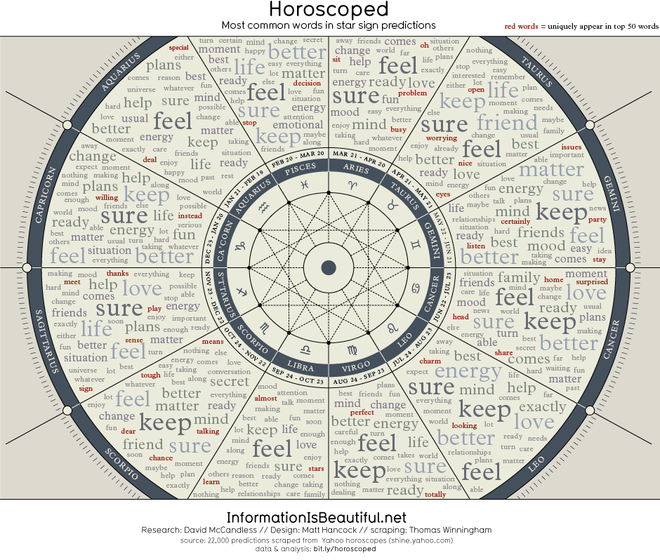
What It Shows
This infographic maps out frequently used words across horoscopes for all astrological signs, highlighting their apparent similarity.
Read the review of this infographic »
A Cupful of Tea Facts (Holland & Barrett)
Posted by Simon in Food & Drink on November 24, 2011
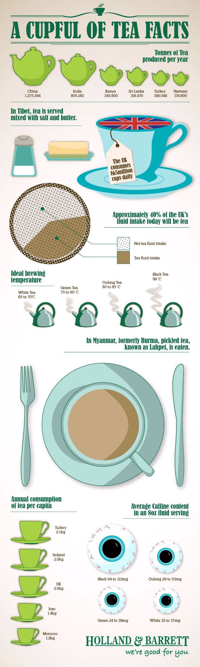
What It Shows
This infographic outlines a variety of tea facts, but with bit of a UK focus.
Read the review of this infographic »
Chart Suggestions: A Thought Starter (Andrew Abela)
Posted by Simon in Infographics & Design on November 21, 2011
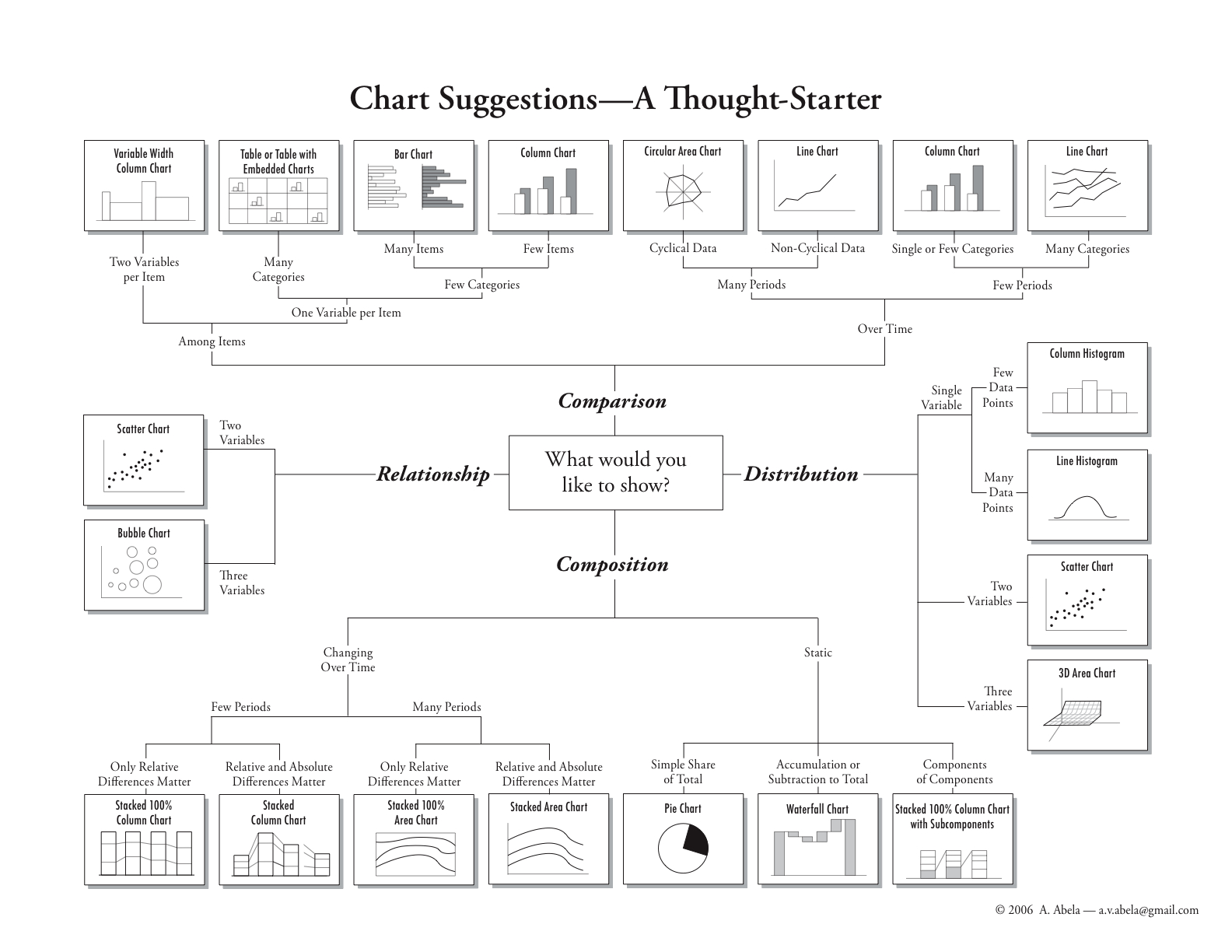
What It Shows
This infographic helps people who want to graphically represent data. Starting at the middle, it offers paths to the ideal graph to express whatever type of data they have, for relationship, comparison, distribution, and composition mapping.
Read the review of this infographic »
Visualizing How a Population Grows to 7 Billion (Adam Cole & Maggie Starbard)
Posted by Simon in Society & Culture on November 1, 2011
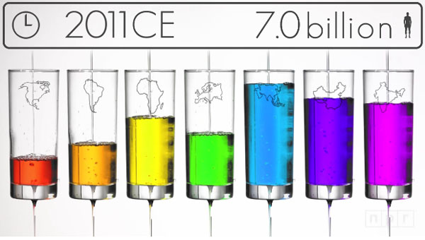
What It Shows
This video infographic gives a broad overview of how the world’s population skyrocketed from 0.3 billion a thousand years ago to 1 billion 200 years ago, and then in that 200 years from 1 billion to 7 billion today.
Read the review of this infographic »