Welcome to Infographics Blog! On this site you will see a wide variety of forms of data visualization. Some are funny, some are cool, some are interactive, and some are animated. All are reviewed along with explanations of the strong and weak points of the given infographic: how they handle aesthetics, data selection and presentation, how clever they are, and more.
Enjoy the best and worst of the infographic world, and feel free to leave a comment!
Historical Browser Statistics (Axiis)
Posted by Simon in Science, Technology, & Internet on June 22, 2011
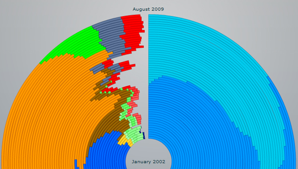
What It Shows
This infographic tracks use of the various web browsers, visually representing market share across time.
Read the review of this infographic »
“1945-1998″: Nuclear Bomb Detonations (Isao Hashimoto)
What It Shows
This infographic, with sound and visuals, presents the detonation of nuclear bombs around the world from 1945 to 1998. The first blip is the Manhattan Project‘s test, and the next two are Hiroshima and Nagasaki. Every video second represents a month in the historical timeline. The sounds indicate which country is responsible for the test.
Read the review of this infographic »
Chilean Miners Rescue (Andrew Blenkinsop & Michael Agar)
Posted by Simon in Health & Safety on June 2, 2011
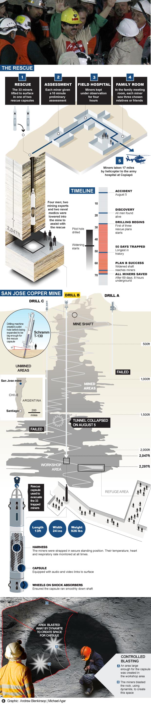
What It Shows
This infographic explains the steps, successes, and failures of the rescue of the miners in Chile in the late summer of 2010. I realize I’m somewhat late with this infographic, but I still like it, and just because a story isn’t fresh news doesn’t mean it’s not worth learning about or remembering.
Read the review of this infographic »
The Simpsons Voices
Posted by Simon in Entertainment on May 17, 2011
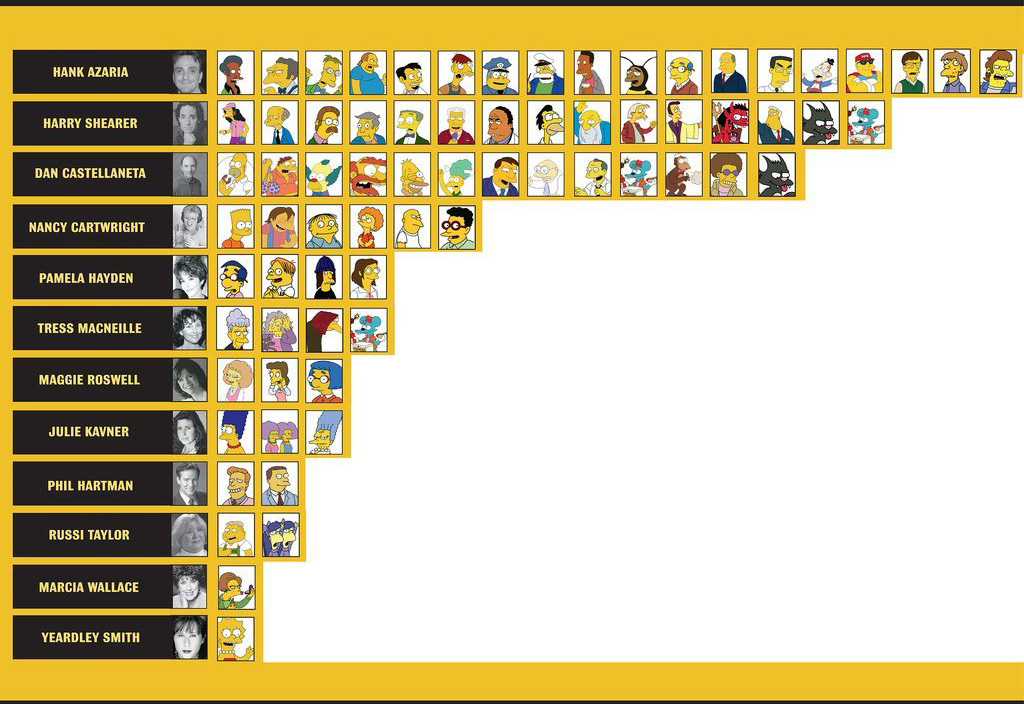
What It Shows
This infographic shows which voice actors play are responsible for which characters on The Simpsons, the most popular cartoon show in history.
Read the review of this infographic »
Full English Chart
Posted by Simon in Food & Drink on May 10, 2011
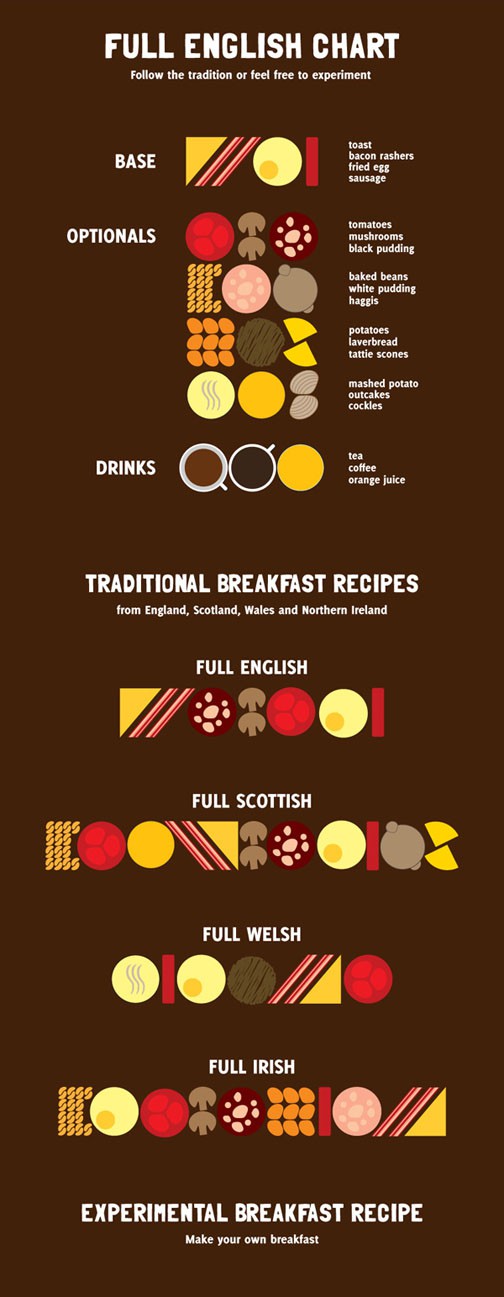
What It Shows
This chart shows the various components of classic breakfasts across the regions of the British Isles. Irish for me, please.
Read the review of this infographic »
Inception Infographics: Which is the Best Inception Infographic?
Posted by Simon in Entertainment on May 3, 2011
The post contains a collection of every infographic I could find based around Chris Nolan’s film Inception. The movie is structurally complex, so the opportunity for clarifying infographics emerged, seized upon by many an inspiring infographic designer. Indeed, Chris Nolan himself drew a sketch diagram himself, from which many of the infographics were inspired.

A few of these are the result of a Fast Company Inception infographic contest, and I’ll point out which as I give a quick comparative review of each. Of course, knowledge of the film is essential, and, on the flip side, this post could be said to provide a dozen forms of spoiler alert.
Read the review of this infographic »
Tea Facts (Steven Trotter)
Posted by Simon in Food & Drink on April 26, 2011
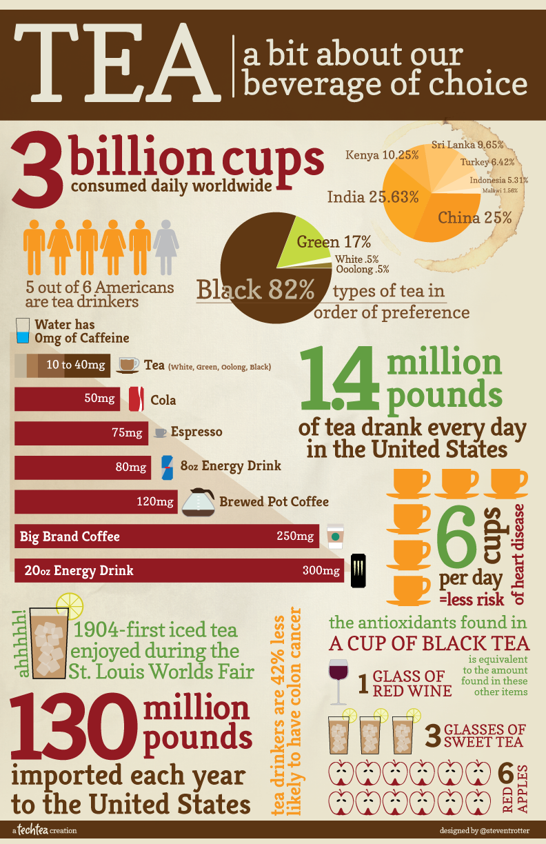
What It Shows
This infographic is a collage of tea facts, from caffeine content to drinking habits around the world.
Read the review of this infographic »
David McCandless: The Beauty of Data Visualization (TED)
Posted by Simon in Infographics & Design on April 22, 2011
I am a fan of infographics, of David McCandless’ work, and of TED.com videos, and so what more could I ask for than their combination? The video below is a solid, inspiring presentation discussing a variety of infographics with a great deal of surrounding context for not only why we love them, but why we need them.
What Are the Hardest Languages to Learn? (VOXY)
Posted by Simon in Society & Culture on April 19, 2011
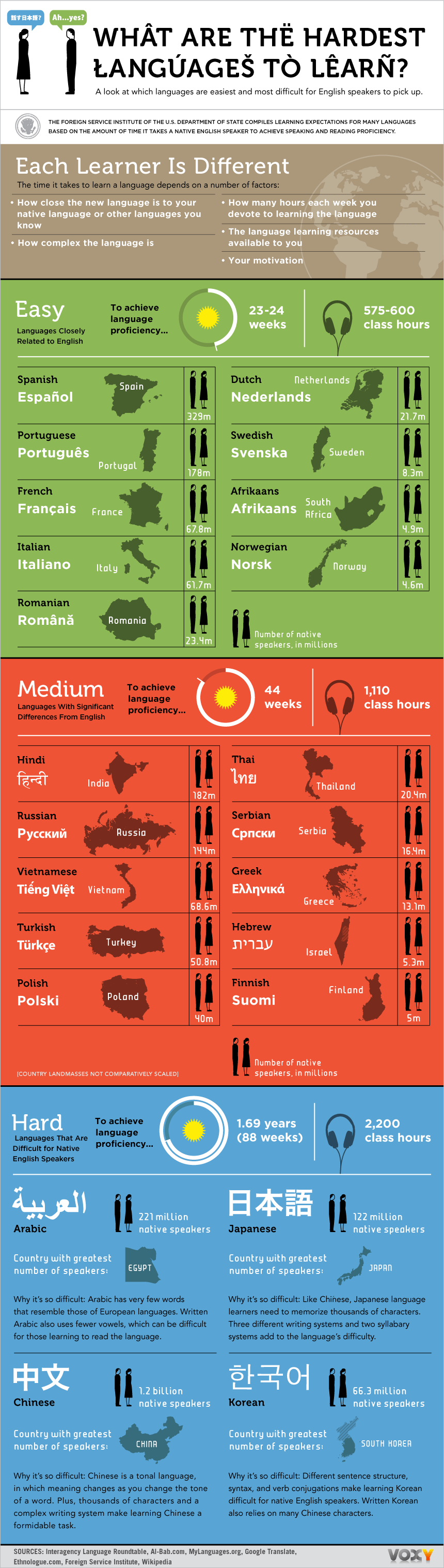
What It Shows
This infographic shows the time taken (and thus approximate difficulty) and amount of speakers (and thus approximate value) to learn foreign languages, for an English-speaker.
Read the review of this infographic »
The True Cost of Homeownership (Moolanomy)
Posted by Simon in House & Home, Money on July 12, 2010
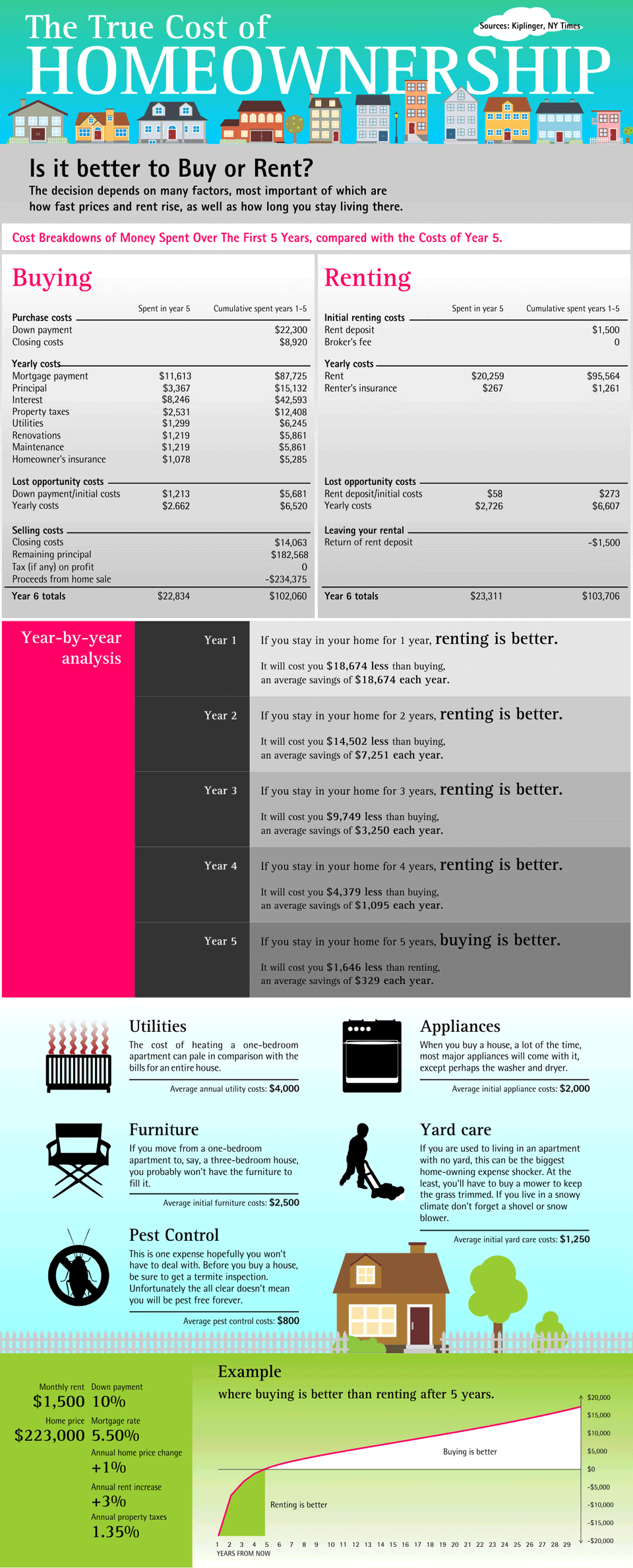
What It Shows
This infographic breaks down the factors associated with one of the perennial home questions: to buy, or to rent?
Read the review of this infographic »