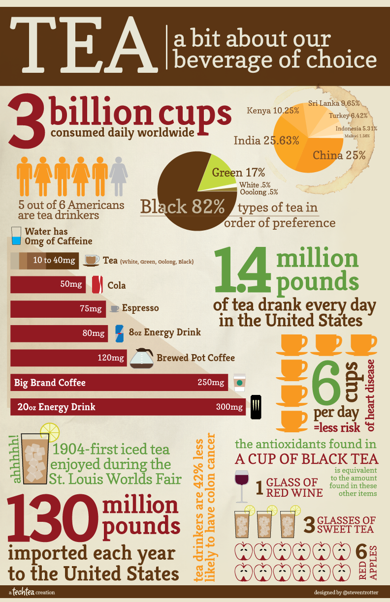
What It Shows
This infographic is a collage of tea facts, from caffeine content to drinking habits around the world.
Why It’s Good
I like the tea-soaked background colour, and the palette generally. Ok, I’ll be honest – I’m reviewing this infographic because I’m angry at it, so let’s just move on to the problems so I can vent.
What It’s Missing
Last I checked, part of the point of infographics is to make informations easier to absorb. This has got to be one of the most chaotically presented infographics I have yet seen. I’ve made it clear I’m not the biggest fan of facts dump infographics, and part of the reason is that the nuggets of information don’t really connect to each other other than the fact that they’re on the same general subject.
The caffeine content of coffee versus tea has little to do with tea’s reduced risk for heart disease, other than that they’re both related to tea. As a result, the information can’t be combined in any space-saving, creative way, and the fact infographics end up extremely long (in dimension) as a result. Here, the infographic was able to be shorter in length because it was all jammed together, including the irritating vertical text shoved in just in case there might have been some breathing room. Worst is the “6 cups per day = less risk of heart disease”, which starts vertical, continues horizontal, continues again horizontal in a different font, then ends vertical. 1 infographic per day = greater risk of rage.
More shoddy data presentation includes the “6” apples at the bottom right, which the guy decided to present as… 12 apple halves? Really?
Once you’re mooshing facts together, why not have the two United States import and consumption facts (1.4 million pounds drank (sic) every day, 120 million pounds imported) next to each other?
The bar graph for caffeine. It’s an infographic about tea, so why have 6 bars for non-tea, and 4 tea caffeine amounts jammed into one bar, with a range of quantities instead of actual amounts for each? Also, how much brewed pot coffee? How much big brand coffee?
Probably the worst data depiction is the pie chart at the upper right, which displays percentages of the world’s tea consumed by a selection of countries, on a pie chart that is divided into sections of relative proportion amongst only those countries. So, the figure for China is 25%, meaning China accounts for 25% of the world’s consumption, but China’s pie slice is about 33% of the chart, based on how it compares with the other countries in the chart. Why those countries? Who knows. Why Malawi, over, say, Japan?
The pie chart for preferences by tea type says they’re in “order” of preference. Pie charts don’t really have an order. They’re a distribution.
Even the “Ahhhhh!” next to the iced tea fact at the bottom left – potentially the only mistake-free fact of the whole infographic, comes off less as delicious refreshing relief, and more as a shriek of terror, or of my infographic-reviewing rage cries.
This infographic was found on TechTea.tv here.