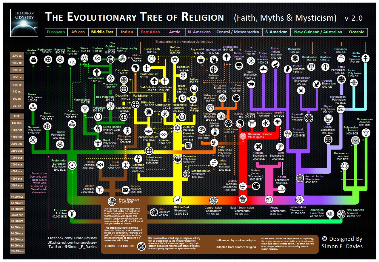
What It Shows
This is a timeline infographic mapping the evolution of various religious lines, organized geographically.
Why It’s Good
The colour use is great for not losing track of the regions as you read up and down the tree. I also appreciate the effort in putting associated religious symbols next to the names, as a nice and more granular visual element to spruce up the tree nodes (pun intended).
I also like global timeline infographics generally, giving me a nice overall picture. My experience with history has always quickly drilled down and rarely given me a sense of the world at once and across time for a given topic.
I wonder if someone could pull off a fuller sense of religious evolution (to capture, for example, the extent of the spread of Christianity outside the Middle East) in a heavier infographic, but I think it’s fine to not have it here. I’m happy to have a mapping of religious origins.
The dotted lines to indicate the influence of one religion on another are cool, too, and I think it adds a lot to the amount of education here. The infographic could have been decent without the influence lines, but made all the better for having them.
What It’s Missing
While the visuals are simple, they ended up looking nice. The fonts used are also simple, but they’re ugly. After all the effort that went into this, seeing default fonts like that is disappointing.
As far as what it’s missing, well, there are a lot more religions than this, depending on how specific you’re looking to get. To see how things can get really crazy, check out this guy (warning: huge)

I’m not sure who created it (let me know if you know and I’ll source it!) but the simple one can be found here