What It Shows
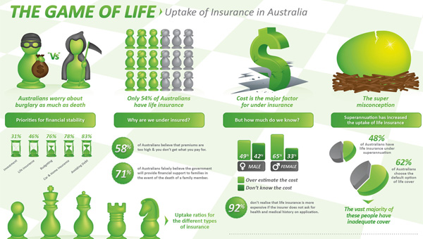
This infographic presents numerous facts and figures about life insurance, with an Australian focus.
Why It’s Good
I know I complain about stats-driven infographics, but it’s nice to see one with some decent and original artwork. Usually it’s lame vector cutouts and crappy pie charts. Ok, so there are some pie charts here, but at least they tried to make them nice here. I also have a thing for chess pieces – some childhood nostalgia joy. Not that chess is a kid’s thing, but it’s when I played. Irrelevant digressions aside, I also like the way it was more organized than the usual statistics infographics, with the theme running across the middle, supporting graphics above and below.
What It’s Missing
What I want out of a life insurance infographic is a crunching of the numbers of what people can expect to pay at which ages and which states of health, monthly costs versus payoffs, to know the sweet spots, if there are any. I know that wasn’t the point of this infographic, but it’s what I’m after (partly because I’ve recently looked into life insurance. Or rather, my wife has on my behalf, presumably to profit from my death).
This infographic is available at Lifebroker here. If anyone knows the artist/author, please let me know, and I’ll give credit there too.
