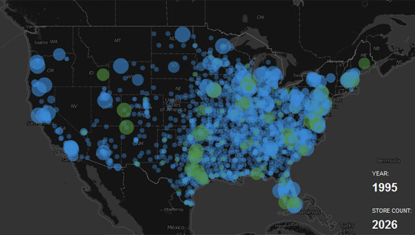
What It Shows
This video infographic tracks the expansion of Walmart by mapping the opening of stores over time.
Why It’s Good
This infographic is ambitious and clearly took some work, but is simple. There is no editorial point, just an impressive visualization of how Walmart has grown tremendously since its one-store beginnings. The choice of medium, to show the rate of growth over time but also the geographic spread, wasn’t rocket science to choose, but is ideal nonetheless. It is very much like the nuclear bomb infographic, tracking destruction of a different kind, you could say.
What It’s Missing
It doesn’t necessarily do much, with no real statistical analysis, but I don’t think it matters. I wish I could have come away with some kind of growth rate per year, and to be able to see how it has grown, but I don’t feel short changed.
This infographic was found here.