What It Shows
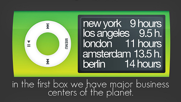
This infographic has taken data from a study on the amount of hours needed to work a typical wage job in different world cities in order to buy an 8 GB iPod Nano. The idea is that the iPod represents somewhat of a standardized global commodity, so it can be used as a constant to compare the richness of various cities in the world by measuring how many hours of average wage work are required to purchase it.
Why It’s Good
I generally like the concept, and the iPod Index data that the designer drew from is interesting.
The aesthetics are crispy and clean, and I love the use of the sideways iPod Nanos to display the data. I think the use of color to indicate different economic strength was clever, playing off the quite colorful nature of the product to subtly qualify the information. The dividing up of what was originally just a big list into manageable chunks was useful, and fitting them into the Nano screens was another good use of the product to visually present what the infographic is about.
I like the willingness to discuss the information, and while I’d say there’s a bit too much text that’s purely emotional without being informative, overall I like the willingness to add some personality.
What It’s Missing
If the cost of an iPod Nano is meant to be considered as constant as possible for the purposes of a fair comparison, I find it a bit strange that the designer didn’t include this constant cost. I understand that it’s the comparison of working hours that is meant to be the variable and interesting portion, but why not just tell me what it costs?
The source page for the infographic touches on cost of living data, but I think it’s important to think about cost of living in order to know what conclusions to really draw. The designer himself summarizes to say “A New Yorker’s one day work equals to one month work of a man in Buenos Aires.” I understand the point being made about how much work is necessary to buy a luxury item like an iPod Nano to compare wealth, but I think it’s a leap to make that kind of summary. Yes, costs for things like bread and milk vary quite a lot to be used as an international standard, but doesn’t that factor into what a day’s work is worth? Doesn’t this data just show that the iPod Nano is relatively cheap compared to other commodities in “richer”, more expensive cities? Put it this way. With the cost of an iPod Nano, how long can you live in New York city, versus Mumbai? You could say that makes NYC rich. I say that simply makes NYC expensive.
To me, to really get at the kind of data that I think would make more sense, I would want to take let’s say a month’s accumulated wages, subtract a month’s average living costs, and work with leftover figures. Basically, disposable income for luxuries like iPod Nanos come after the basics have been paid for, and these basics that form a standard cost of living are, for the most part, relative to the expected wages of the given city. The cost of living in London is huge, salaries are roughly proportional, just as the cost of living is much lower in Mexico, with roughly proportional wages.
Now this alone isn’t an entirely fair way to look at it, either, since poorer countries tend to have more people below the poverty line, who are actually unable to sufficiently earn enough to get by well and healthily according to their cost of living. But my point is that something like an iPod Nano is bought with a percentage that is left over after expenses, and if that percentage was constant (meaning the average earnings and costs of living had the same proportions), yes, the excess hours could buy more iPod Nanos in a richer city than in a poorer city. But I think quality of life and happiness (and survival) don’t rely on luxury commodities like iPod Nanos, and a salary that wouldn’t stretch far in NYC could be quite enough in a cheaper/poorer country. That’s why I think that the “A New Yorker’s one day work equals to one month work of a man in Buenos Aires” statement is a bit unfair, since that New Yorker’s one day of work has to go into funding a rather expensive basic living cost.
So, the data is intriguing, and I appreciate the designer’s zeal, but I think the conclusion is a bit oversimplified. It’s all well and good that only a day of work for me could buy an iPod Nano, but that doesn’t really matter if I don’t have a day’s wages to spare and am going into debt just trying to get by in a “rich” country.
Aesthetically, I would have liked it to have been about 2/3 of its original size. Maybe I should save up for a bigger monitor, but I found the amount of scrolling I had to do a bit distracting, especially the large blue iPod with the vertical text.
This infographic is found on the Deviant Art site here.
