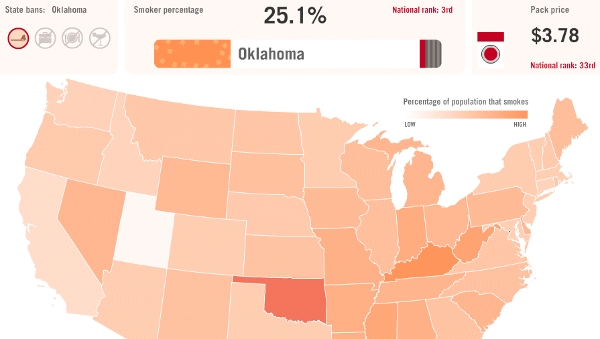
What It Shows
This interactive infographic gives an American state-by-state look at cigarette smoking popularity, prices, and bans.
Why It’s Good
As an interactive infographic, the interactivity is intuitive and useful, and visually appealing.
There are size change animations in the icons for smoking popularity and pack costs depending on which state is selected, which are relatively pointless, but make the infographic a bit more fun. Even if the amount of growth is proportional to the quantities, they aren’t really helpful since there’s no comparative potential (one state at a time). Still, a nice touch.
The choice for which types of information to display (bans, cost, use) was good, as they seem the most pertinent and interesting axes.
What It’s Missing
While the variance in initial shading offers a comparative start, I would have liked more conclusion-like comparisons between states. It’s hard to know, off hand, which state has the cheapest cigarettes. Also, given the connection between pack costs and cigarette use, I would have liked some information and correlation (or lack of correlation) between those figures.
The infographic, in all its interactive glory, can be found here.