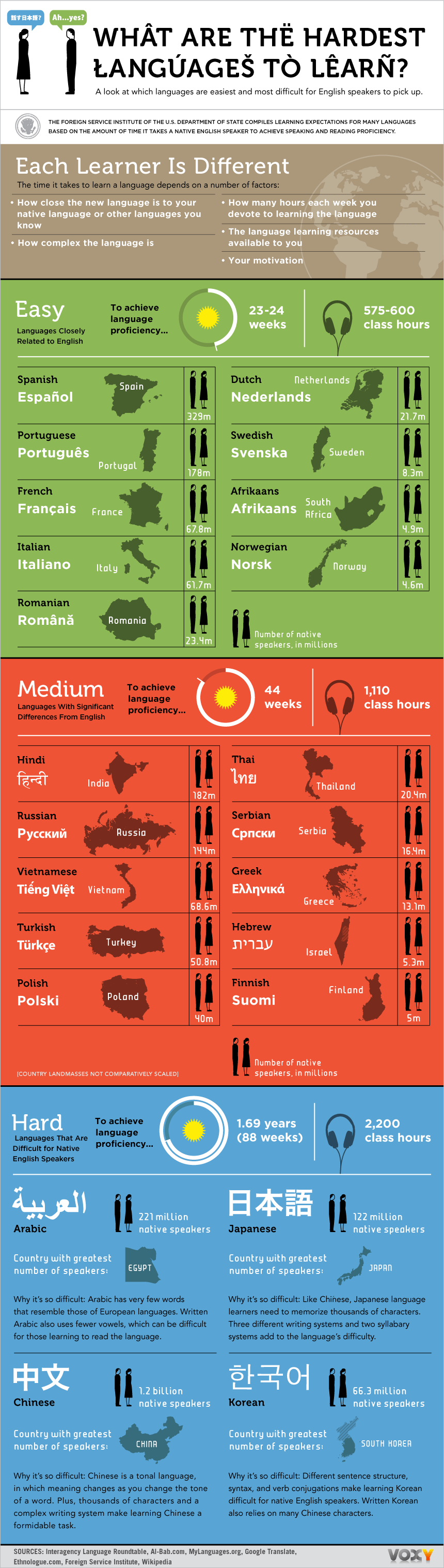
What It Shows
This infographic shows the time taken (and thus approximate difficulty) and amount of speakers (and thus approximate value) to learn foreign languages, for an English-speaker.
Why It’s Good
For a given language to learn, I really want to know how long it will take, and how many people speak it. Those are my two top concerns, and seem to be the two top concerns of this infographic as well. Describing time taken using both hours and weeks at a normal hourly rate was a nice touch.
I generally like the grouping strategy, and find the colours pleasing to view. I’m also a sucker for the subject matter in general, so I give it extra unfair credit. The infographic gives a nice overview, and even though it has some significant problems, I feel like I got something out of it.
What It’s Missing
There are some unfortunately confusions, errors, and omissions…
First, where’s German? It’s one of the most taught second languages, and in the top 10 most spoken language on Earth. A few comments under the blog post picked up on this as well, and the site’s response, besides the rather sassy “we weren’t ready to win the award for the world’s largest infographic” is that it problematically falls between Easy and Medium in difficulty. While I sympathize with the desire to keep the categories neat, it’s just too popular a language, especially for English-speakers, to not even be mentioned. It’s nice to avoid asterisked explanations and statistical bandaids that ruin pretty groupings, but there’s a line you cross where it just has to be done. This is one of those cases.
Chinese: Mandarin? Cantonese?
It’s unclear whether the figures for the amount of native speakers are associated with the country presented next to them, unless you have a decent sense of country populations. The last block of hardest languages indicates that the country shown is the one with the most speakers of that language, but that needs to be made clear sooner. Presenting populations so close to countries establishes a largely false connection.
A few of the comments under their post were angry that it is an infographic geared towards English-speakers only. I’m not sure what they really expect – a difficulty graph depending on your native tongue? While that would be cool and is far from impossible, it would be difficult and either need to be extremely massive, have remarkable organizational cleverness, or employ some useful interactivity. Given that the infographic is in English, it is likely to suit most viewers/readers, so I forgive this problem.
More blatant is the problem of the figures for the number of speakers actually being incorrect. They are approximately correct for the most part, but the numbers are inaccurate enough to have irritated many responders. Their commented annoyance and the infographic itself appear at the blog post here.