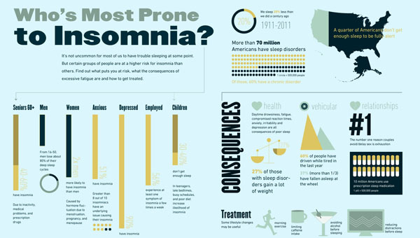
What It Shows
This infographic presents a collection of statistics to do with sleeping disorders, insomnia in particular, and how it tends to be treated.
Why It’s Good
As someone with sleep issues my whole life, I was keen to talk about this topic. I attribute my inability to fall asleep to an over-thinking mind and a broken body clock, and was interested to see the most statistically common causes. Now I’m anxious about whether or not I’m anxious. Thanks, infographic.
I like the colour palette a lot. I think the skinny yellow type is a bit of a strain to read, but I think the thickness is really the problem, and overall, it’s nice.
Despite having seen many bar graphs in my time, I don’t remember ranges being handled very often (eg. depicting ’30-40%’) I guess they handled it in the most obvious logical way, but it was still nifty to see.
What It’s Missing
I find the lack of explanation about the Canada source for with the US-driven infographic a bit of an elephant in the room. Like, what’s the deal? I can make guesses, but if they are going to be overt about saying Canada, it’s on them to explain what’s going on.
Also, “27% of those with sleeping disorders gain a lot of weight.” If you’re going to say it at all, say how much, or it sounds made up.
This infographic was found at the Canada Drug Center