Archive for April, 2012
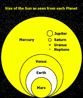
The Size of the Sun As Seen From Each Planet
Posted by Simon in Science, Technology, & Internet on April 5, 2012
What It Shows
Super simple, not much as far as style, but a fun concept done cleanly and clearly. This infographic shows relative sizes of the sun in the sky depending on which planet you would be looking at it from.
Read the rest of this entry »