Archive for May, 2011
The Simpsons Voices
Posted by Simon in Entertainment on May 17, 2011
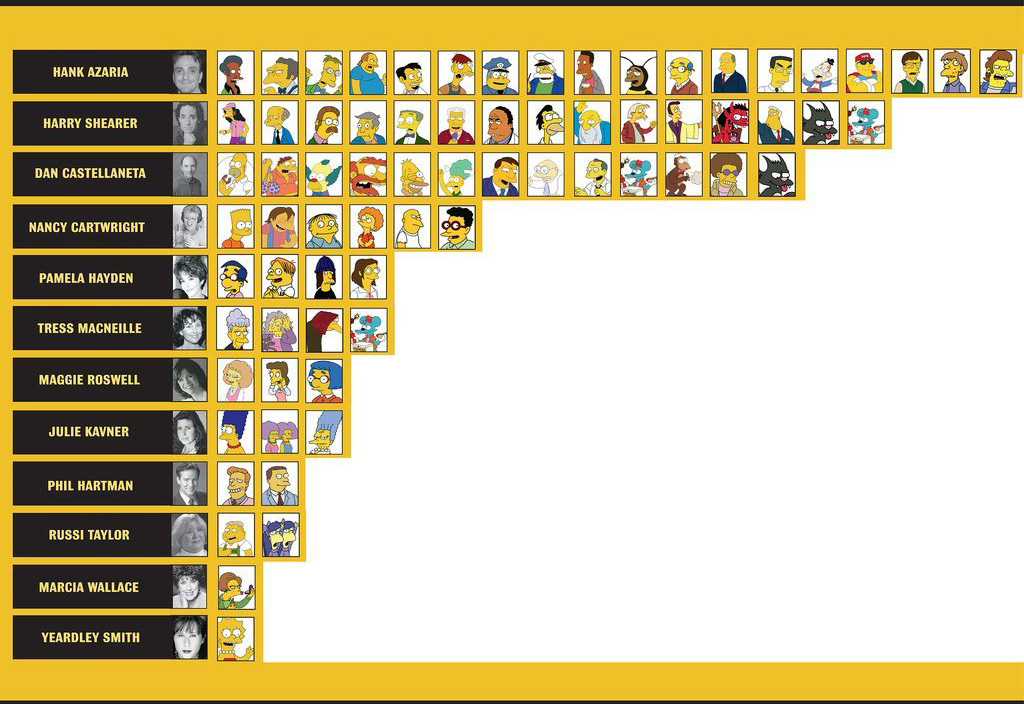
What It Shows
This infographic shows which voice actors play are responsible for which characters on The Simpsons, the most popular cartoon show in history.
Read the rest of this entry »
Full English Chart
Posted by Simon in Food & Drink on May 10, 2011
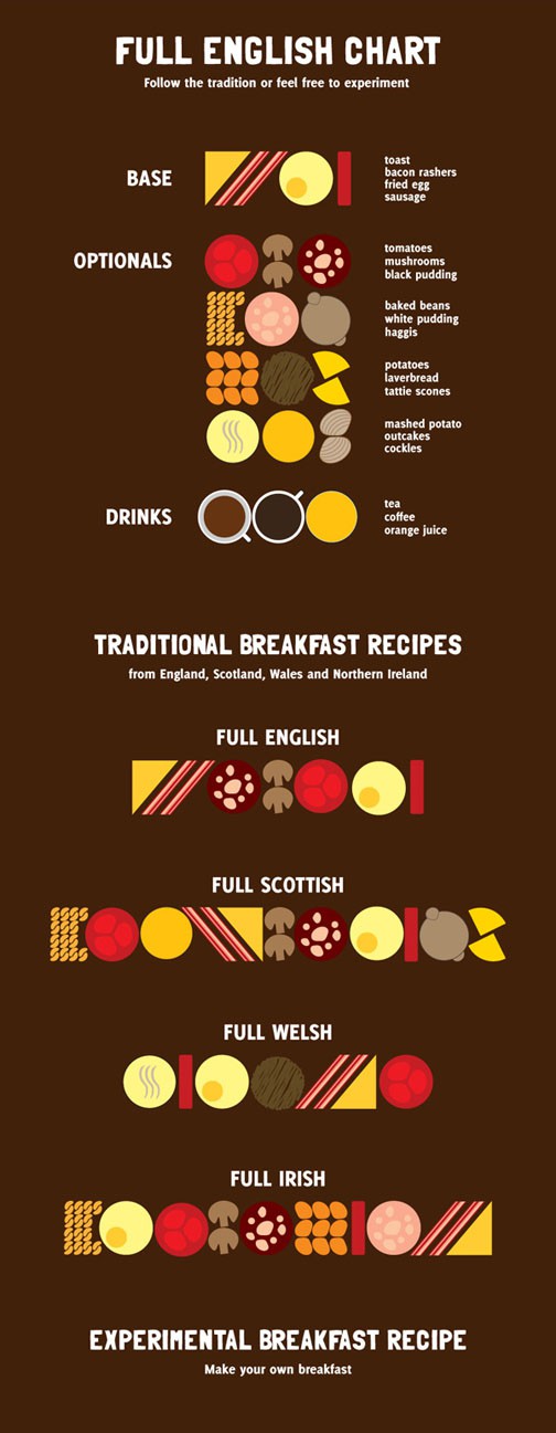
What It Shows
This chart shows the various components of classic breakfasts across the regions of the British Isles. Irish for me, please.
Read the rest of this entry »
Inception Infographics: Which is the Best Inception Infographic?
Posted by Simon in Entertainment on May 3, 2011
The post contains a collection of every infographic I could find based around Chris Nolan’s film Inception. The movie is structurally complex, so the opportunity for clarifying infographics emerged, seized upon by many an inspiring infographic designer. Indeed, Chris Nolan himself drew a sketch diagram himself, from which many of the infographics were inspired.

A few of these are the result of a Fast Company Inception infographic contest, and I’ll point out which as I give a quick comparative review of each. Of course, knowledge of the film is essential, and, on the flip side, this post could be said to provide a dozen forms of spoiler alert.
Read the rest of this entry »