Archive for November, 2011
Horoscoped: Most Common Words in Star Sign Predictions (David McCandless, Matt Hancock & Thomas Winningham)
Posted by Simon in Psychology on November 27, 2011
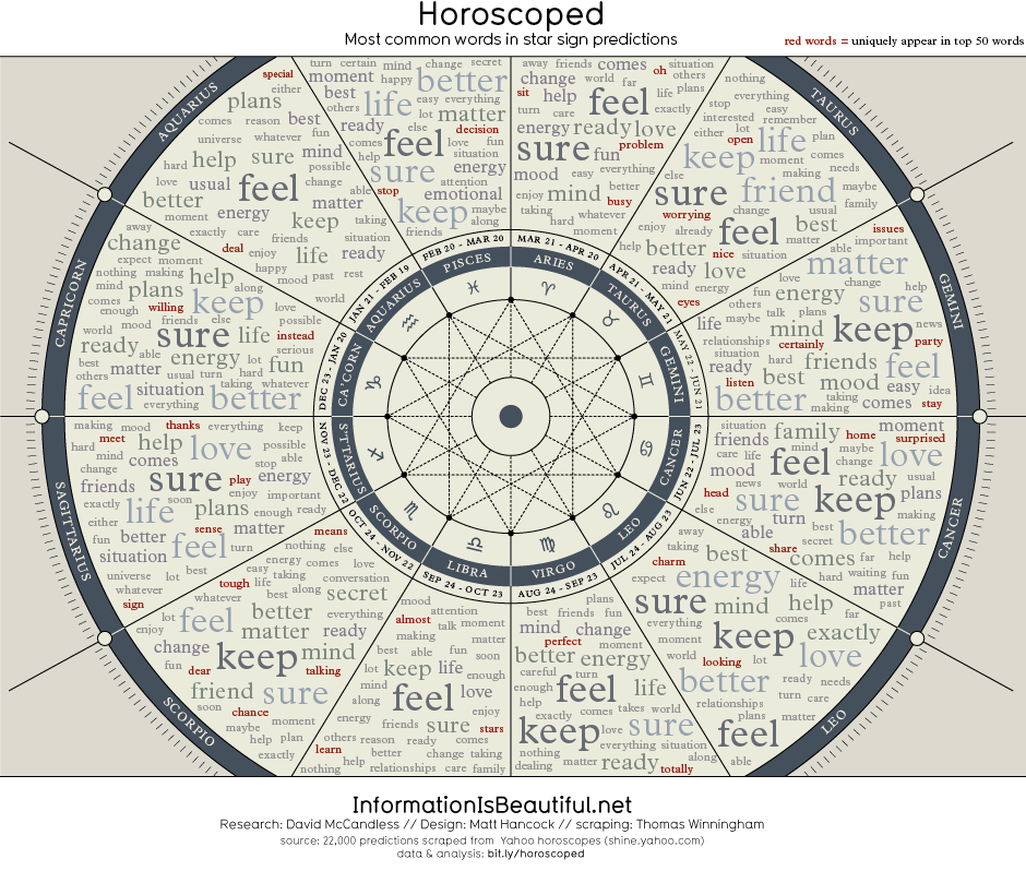
What It Shows
This infographic maps out frequently used words across horoscopes for all astrological signs, highlighting their apparent similarity.
Read the rest of this entry »
A Cupful of Tea Facts (Holland & Barrett)
Posted by Simon in Food & Drink on November 24, 2011
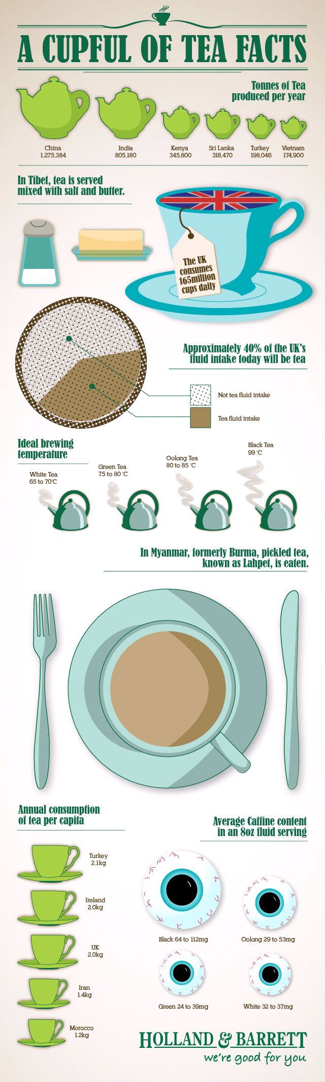
What It Shows
This infographic outlines a variety of tea facts, but with bit of a UK focus.
Read the rest of this entry »
Chart Suggestions: A Thought Starter (Andrew Abela)
Posted by Simon in Infographics & Design on November 21, 2011
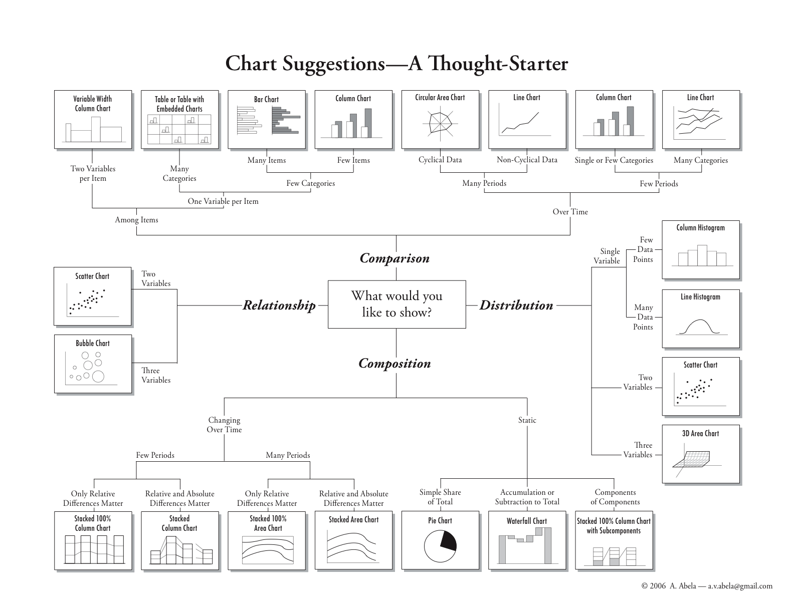
What It Shows
This infographic helps people who want to graphically represent data. Starting at the middle, it offers paths to the ideal graph to express whatever type of data they have, for relationship, comparison, distribution, and composition mapping.
Read the rest of this entry »
Visualizing How a Population Grows to 7 Billion (Adam Cole & Maggie Starbard)
Posted by Simon in Society & Culture on November 1, 2011
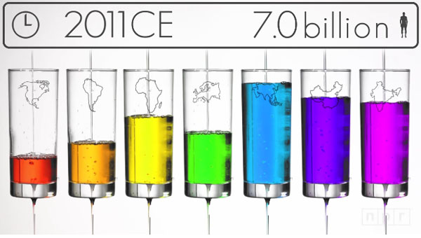
What It Shows
This video infographic gives a broad overview of how the world’s population skyrocketed from 0.3 billion a thousand years ago to 1 billion 200 years ago, and then in that 200 years from 1 billion to 7 billion today.
Read the rest of this entry »