Archive for category Environment & Nature
Cheetah (Jacob O’Neal)
Posted by Simon in Environment & Nature on January 3, 2015
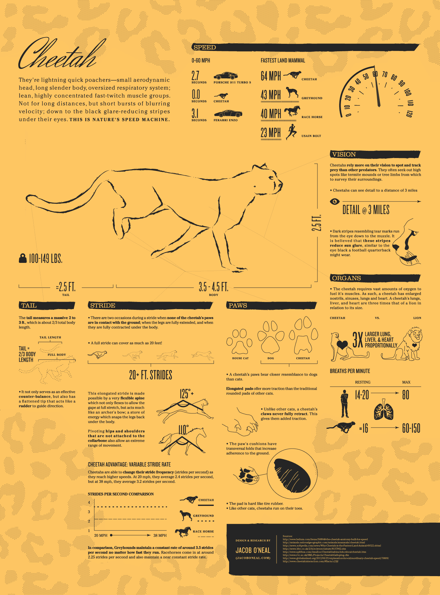
What It Shows
This infographic is an animated fact sheet all about the cheetah, with a specific focus on its speed (obviously).
Read the rest of this entry »
Worst Oil Spills (Tiffany Farrant)
Posted by Simon in Environment & Nature, Money on June 28, 2010
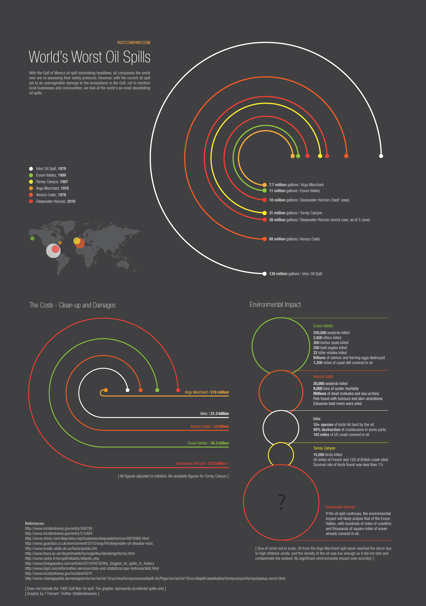
What It Shows
This infographic compares the worst oil spills in history, taking into account not only size, but economic and environmental damage. Figures for the current spill in the Gulf of Mexico are estimates, and this infographic uses these estimates to put the current spill into historical perspective.
Read the rest of this entry »
How Wild is North America? (The Big Wild)
Posted by Simon in Environment & Nature on June 15, 2010

What It Shows
This infographic offers somewhat of an environmental breakdown of Canadian, American, and Mexican wilderness with specific focus on the degree of actual wild in these countries. This includes percentage of water use, human to animal relative populations, and straight up untouched by humanity territory calculations.
Read the rest of this entry »
The Energy Used in Google Search (Wellhome)
Posted by Simon in Environment & Nature, Science, Technology, & Internet on June 10, 2010
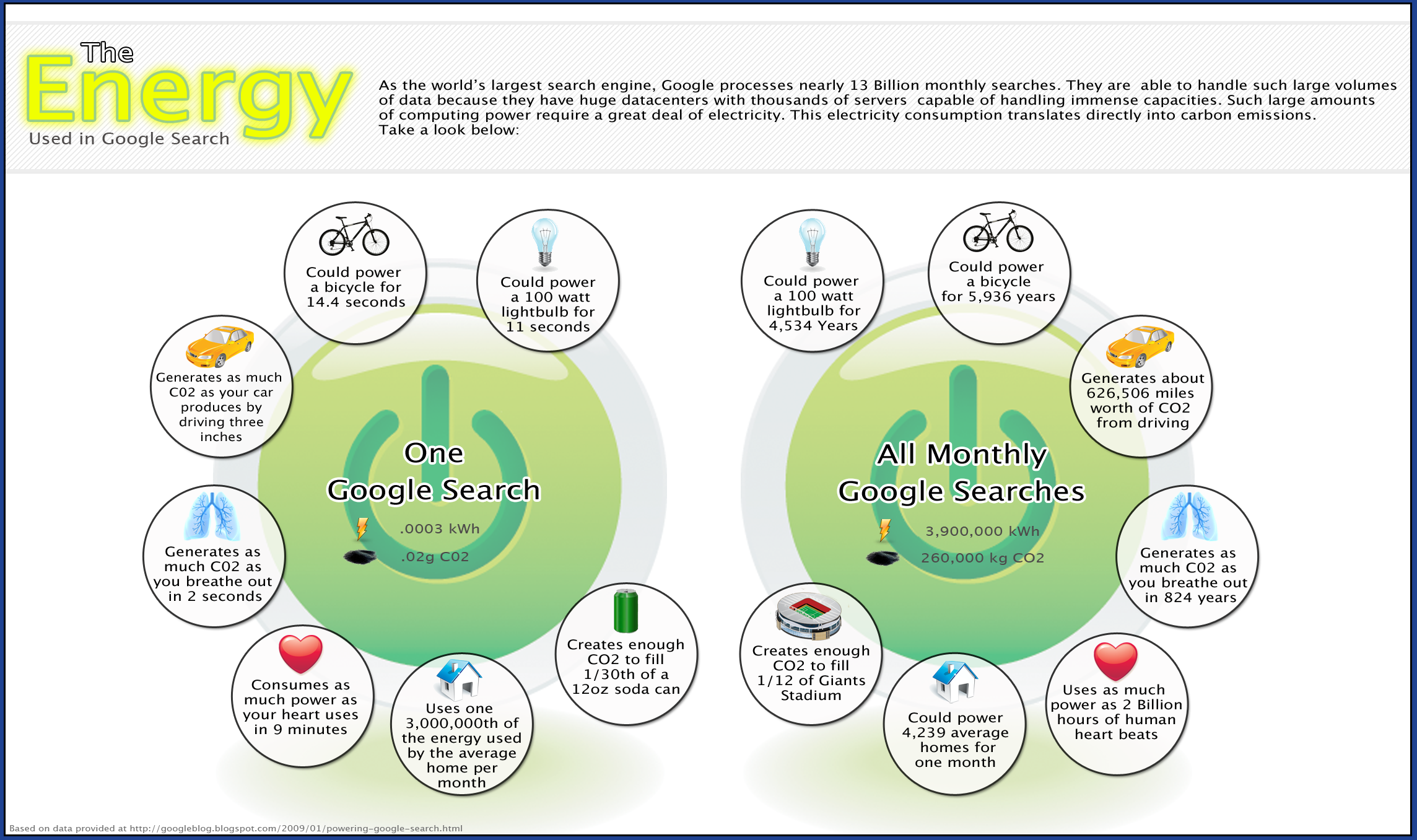
What It Shows
This infographic maps out the various energy opportunity costs of having Google run as it does, on per search and monthly search levels. Environmental effects are presented in kWh and CO2 emissions.
Read the rest of this entry »
Surface Area Required to Power the World (Land Art Generator Initiative)
Posted by Simon in Environment & Nature on June 7, 2010

What It Shows
This pair of infographics shows the amount of surface area required to power the world with solar and wind power at a projected estimate of consumption in the year 2030.
Read the rest of this entry »
The Facts About Bottled Water (Online Education)
Posted by Simon in Environment & Nature on January 24, 2010
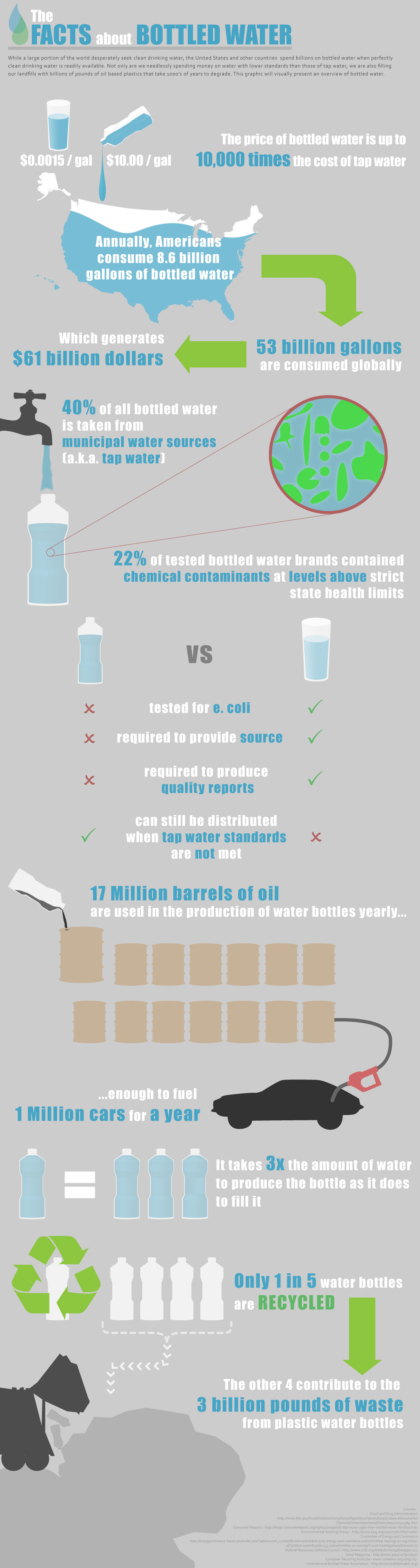
What It Shows
A breakdown of the ills caused by the bottled water industry, from economic, environmental, and health perspectives.
Read the rest of this entry »
How Long Will It Last? (Armin Reller & Tom Graedel)
Posted by Simon in Environment & Nature on October 15, 2009
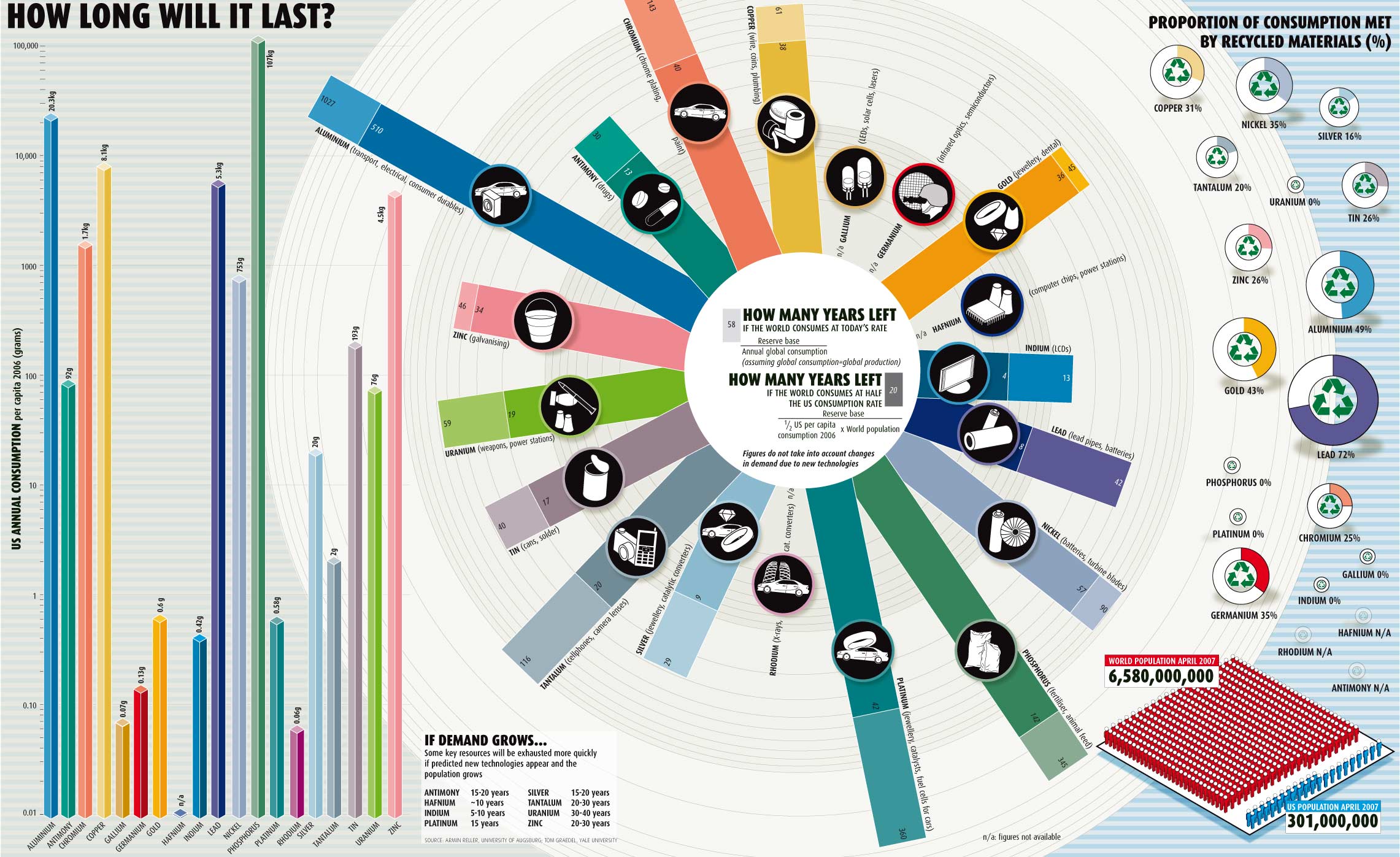
What It Shows
This environmental infographic shows consumption levels of various materials and relative timelines until we run out of them. It also shows the impact of American consumption, in particular, and makes the point by showing the even worse spot we’d be in if the world’s per capita consumption rate was just half that of the United States.
Read the rest of this entry »