Archive for April, 2011
Tea Facts (Steven Trotter)
Posted by Simon in Food & Drink on April 26, 2011
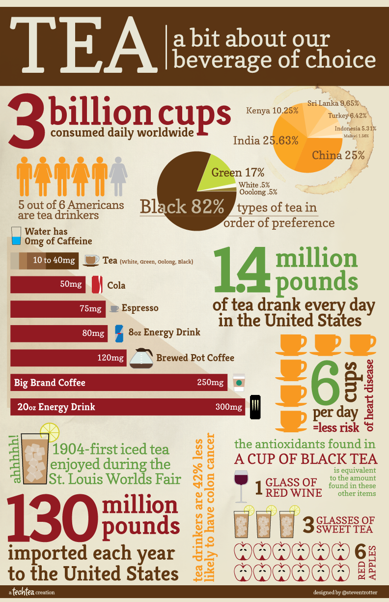
What It Shows
This infographic is a collage of tea facts, from caffeine content to drinking habits around the world.
Read the rest of this entry »
David McCandless: The Beauty of Data Visualization (TED)
Posted by Simon in Infographics & Design on April 22, 2011
I am a fan of infographics, of David McCandless’ work, and of TED.com videos, and so what more could I ask for than their combination? The video below is a solid, inspiring presentation discussing a variety of infographics with a great deal of surrounding context for not only why we love them, but why we need them.
What Are the Hardest Languages to Learn? (VOXY)
Posted by Simon in Society & Culture on April 19, 2011
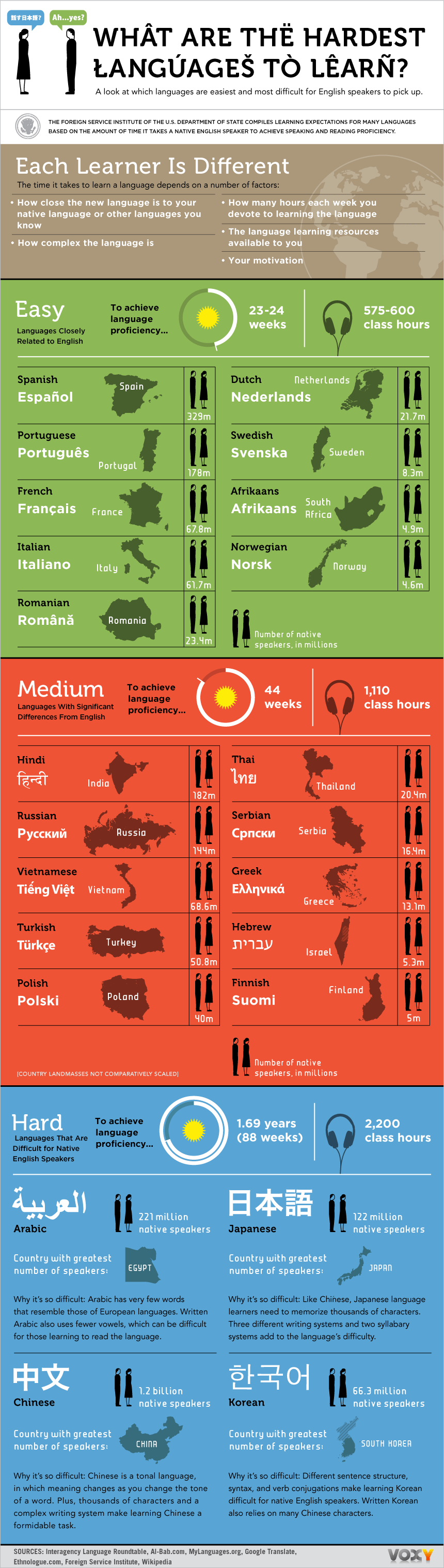
What It Shows
This infographic shows the time taken (and thus approximate difficulty) and amount of speakers (and thus approximate value) to learn foreign languages, for an English-speaker.
Read the rest of this entry »