Welcome to Infographics Blog! On this site you will see a wide variety of forms of data visualization. Some are funny, some are cool, some are interactive, and some are animated. All are reviewed along with explanations of the strong and weak points of the given infographic: how they handle aesthetics, data selection and presentation, how clever they are, and more.
Enjoy the best and worst of the infographic world, and feel free to leave a comment!
Whisky Wheel (Whisky Mag)
Posted by Simon in Food & Drink on February 4, 2015
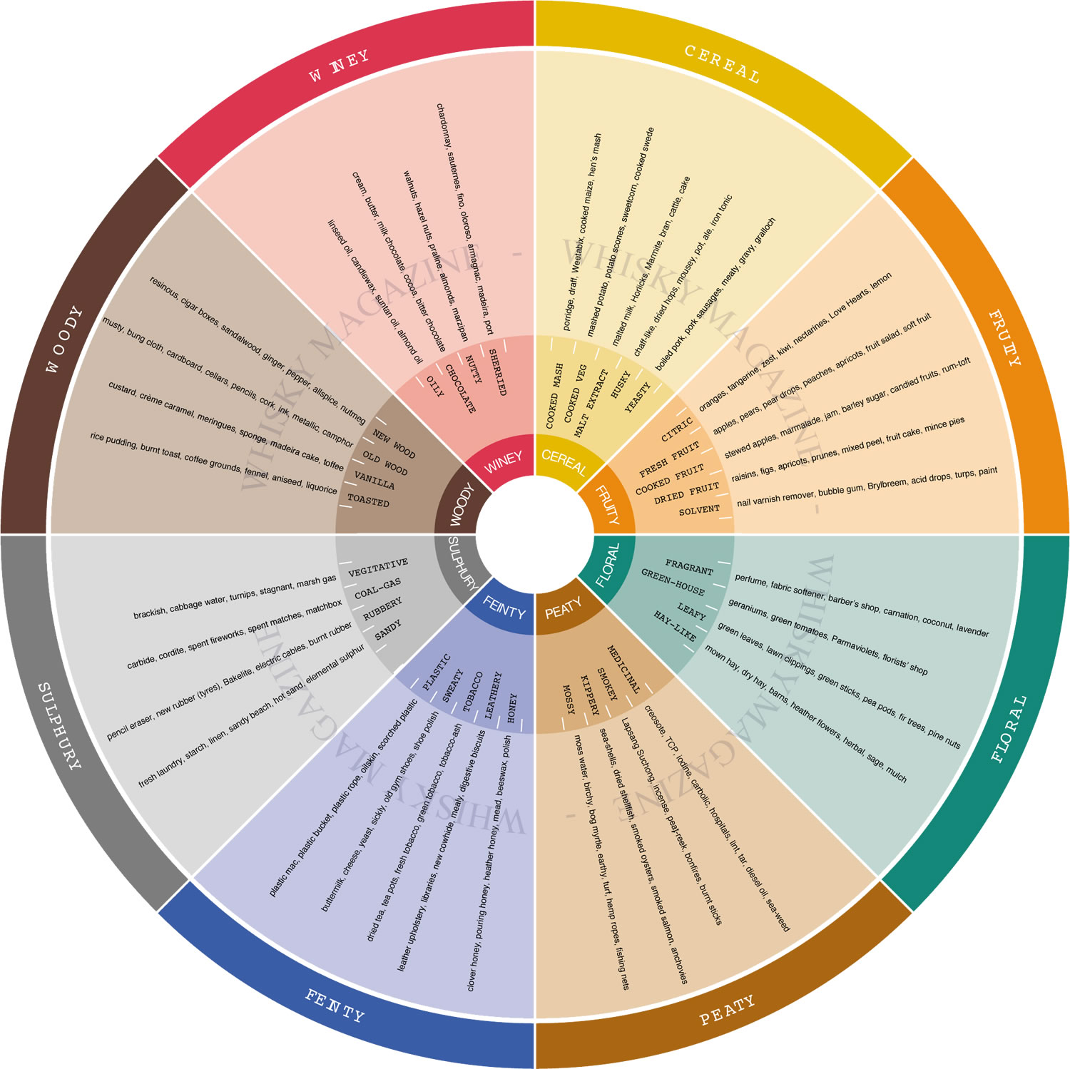
What It Shows
This infographic uses a wheel diagram to map out the various aromas to detect when nosing/tasting whisky.
Read the review of this infographic »
A Billion Degrees of Separation (Information is Beautiful)
Posted by Simon in Science, Technology, & Internet on January 21, 2015
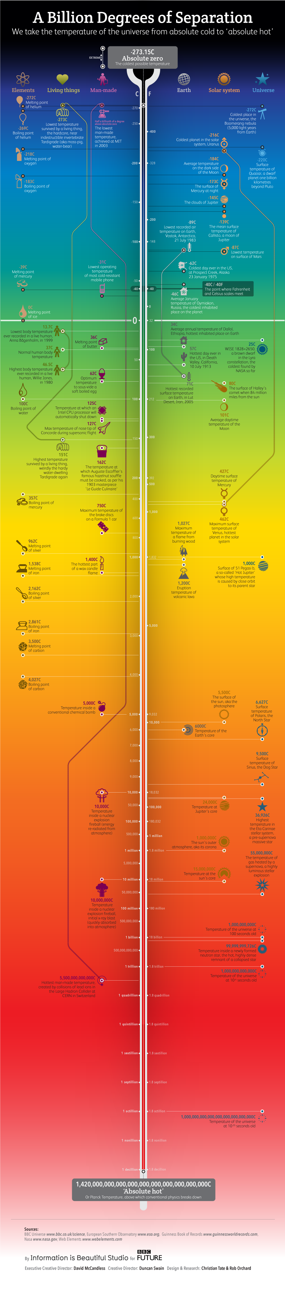
What It Shows
This infographic takes the full spectrum of cold and hot temperature and populates it with things we know about or have done.
Read the review of this infographic »
Cheetah (Jacob O’Neal)
Posted by Simon in Environment & Nature on January 3, 2015
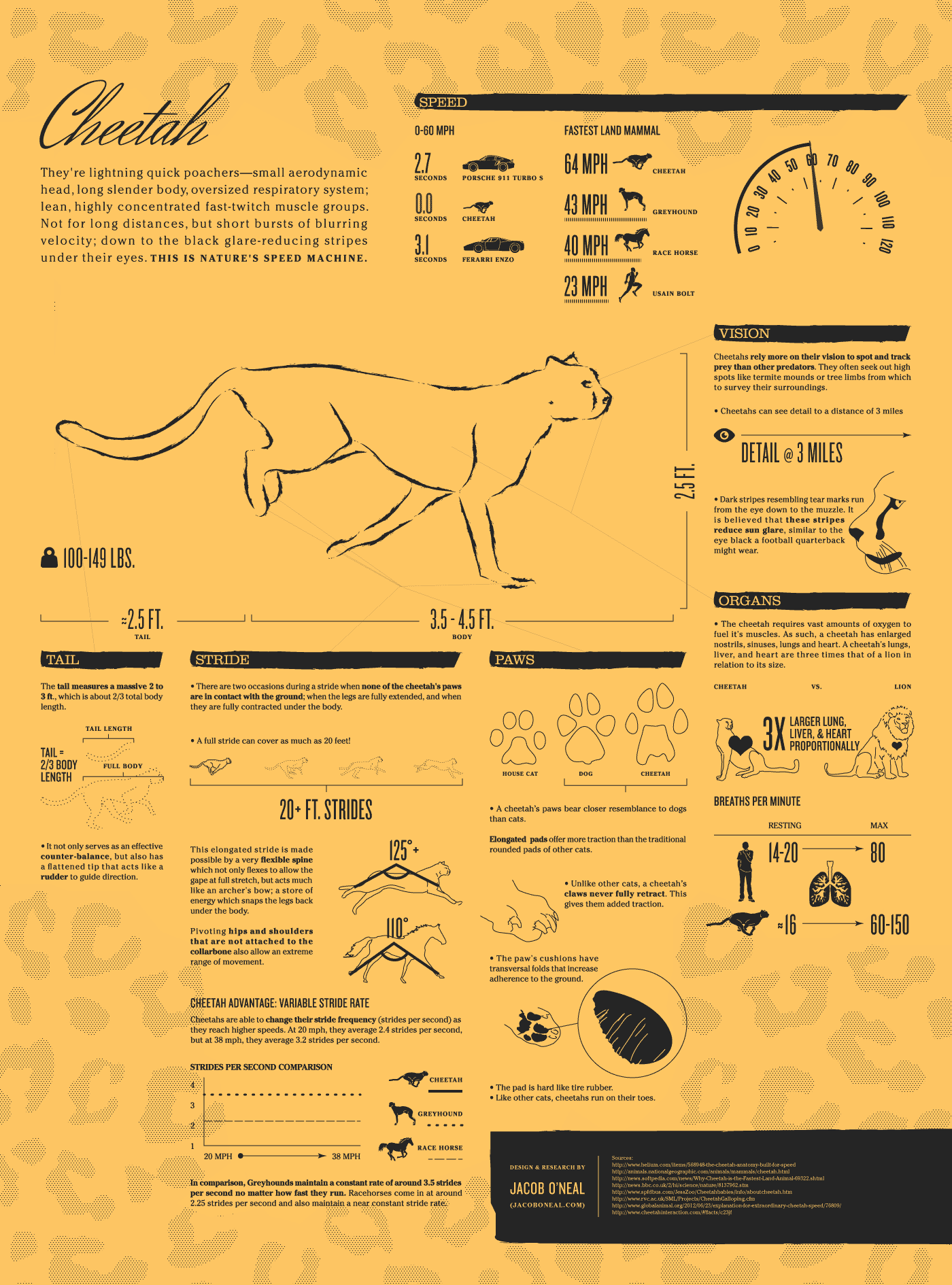
What It Shows
This infographic is an animated fact sheet all about the cheetah, with a specific focus on its speed (obviously).
Read the review of this infographic »
Cloud Atlas (Tom Morse-Brown & Lyn Brown)
Posted by Simon in Entertainment on December 22, 2014
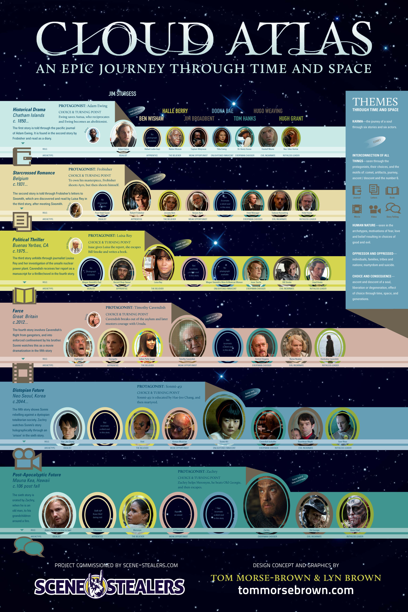
What It Shows
This infographic maps the intense layers of connections between the multiple characters, stories, and actors in the movie Cloud Atlas.
Read the review of this infographic »
Tech Support Facts You Can’t Ignore (Radialpoint)
Posted by Simon in Science, Technology, & Internet on December 1, 2014

What It Shows
This infographic assembles a collection of tech support related facts, highlighting examples of inefficiencies and wastefulness.
Read the review of this infographic »
The Evolutionary Tree of Religion (Simon E. Davies)
Posted by Simon in History, Society & Culture on November 28, 2014
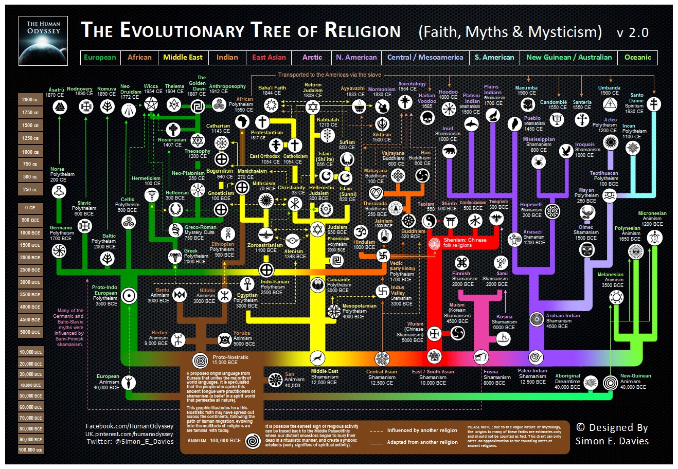
What It Shows
This is a timeline infographic mapping the evolution of various religious lines, organized geographically.
Read the review of this infographic »
The Size of the Sun As Seen From Each Planet
Posted by Simon in Science, Technology, & Internet on April 5, 2012
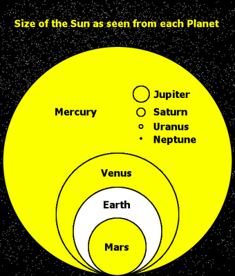
What It Shows
Super simple, not much as far as style, but a fun concept done cleanly and clearly. This infographic shows relative sizes of the sun in the sky depending on which planet you would be looking at it from.
Read the review of this infographic »
Getting Over Acne (AcneTreatment)
Posted by Simon in Health & Safety on March 31, 2012
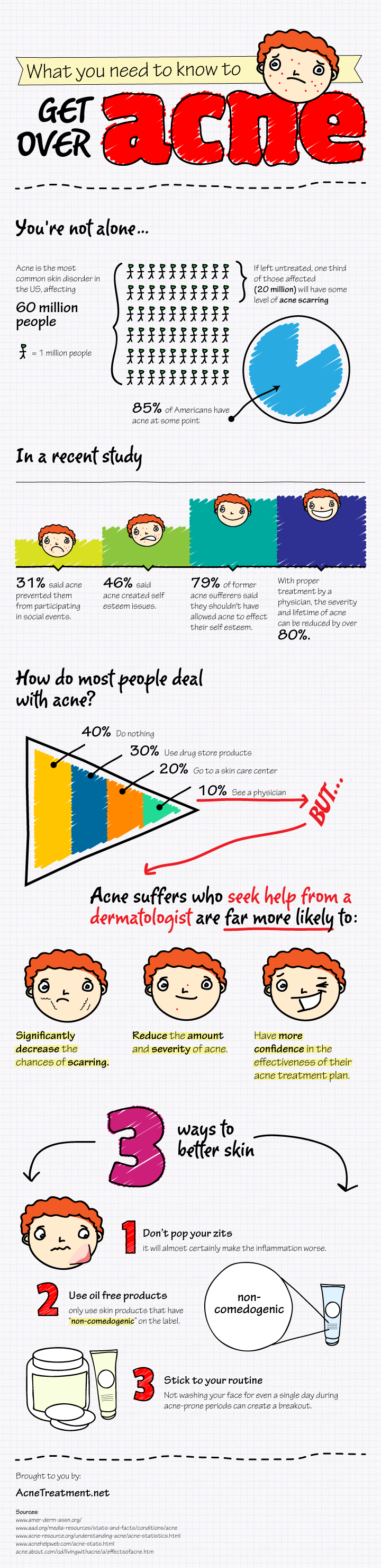
What It Shows
This infographic gives an overview of acne suffering, people’s psychological relationships with acne, and treatment statistics.
Read the review of this infographic »
Apple Tree (Mike Vasilev)
Posted by Simon in Science, Technology, & Internet on March 2, 2012
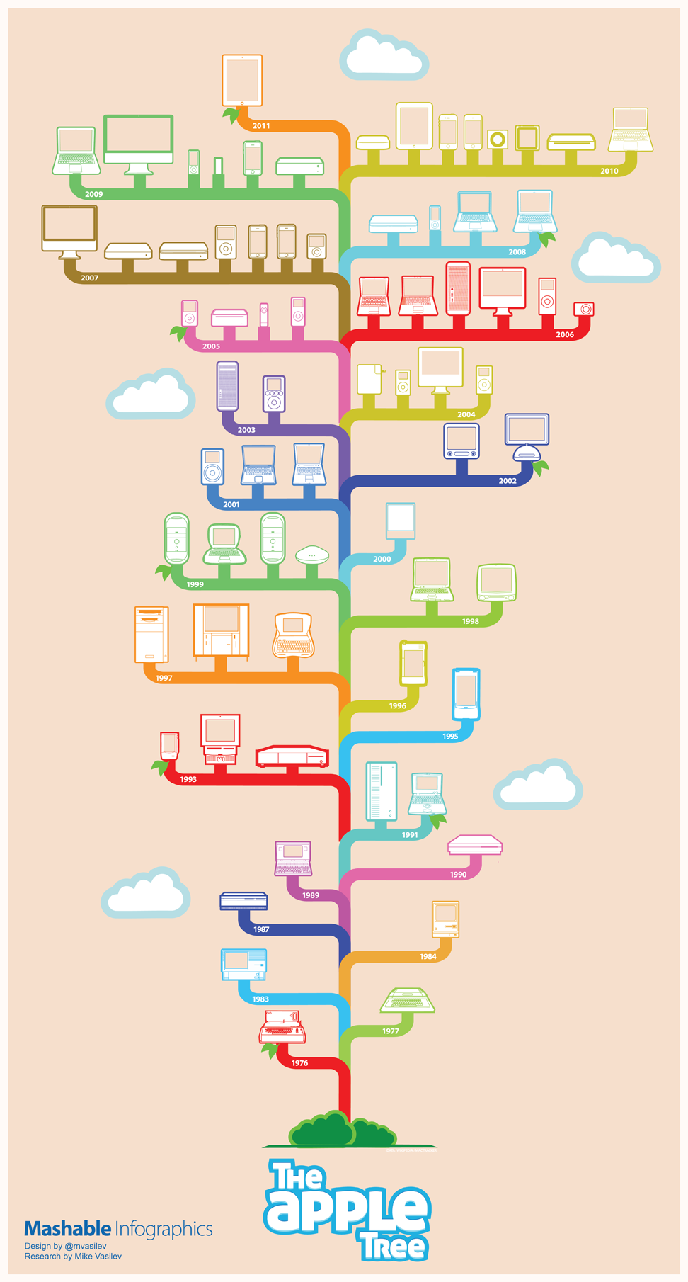
What It Shows
This infographic shows the release timeline for Apple products, from the Apple I in 1976 to today’s iPad.
Read the review of this infographic »
Who’s Most Prone to Insomnia (Canada Drug Center)
Posted by Simon in Health & Safety on February 15, 2012
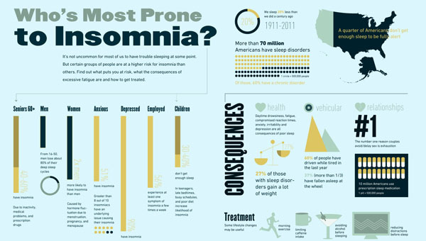
What It Shows
This infographic presents a collection of statistics to do with sleeping disorders, insomnia in particular, and how it tends to be treated.
Read the review of this infographic »