Archive for category Society & Culture
The Evolutionary Tree of Religion (Simon E. Davies)
Posted by Simon in History, Society & Culture on November 28, 2014
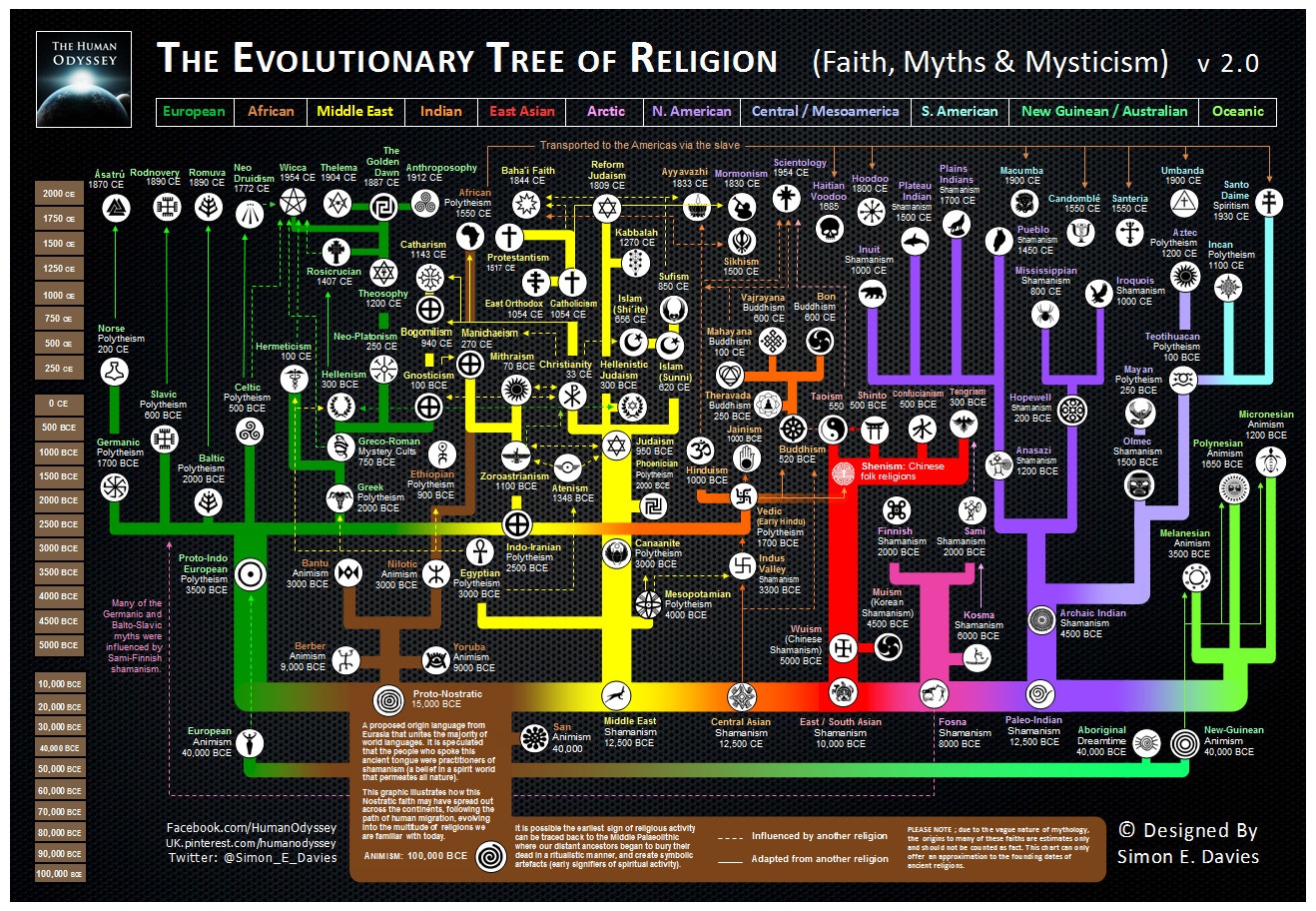
What It Shows
This is a timeline infographic mapping the evolution of various religious lines, organized geographically.
Read the rest of this entry »
TOMS: Giving Back, One for One (Autism United)
Posted by Simon in Society & Culture on January 30, 2012
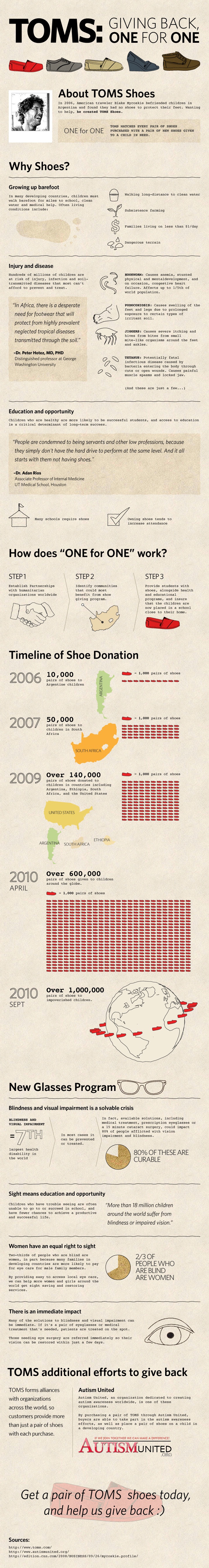
What It Shows
This infographic gives some background about the lack of footwear and visual impairment problems that exist in developing nations, and the TOMS program that, through numerous partnerships, is working towards solving these problems.
Read the rest of this entry »
Mapping America (Matthew Block, Shan Carter, Alan McLean)
Posted by Simon in Society & Culture on December 4, 2011
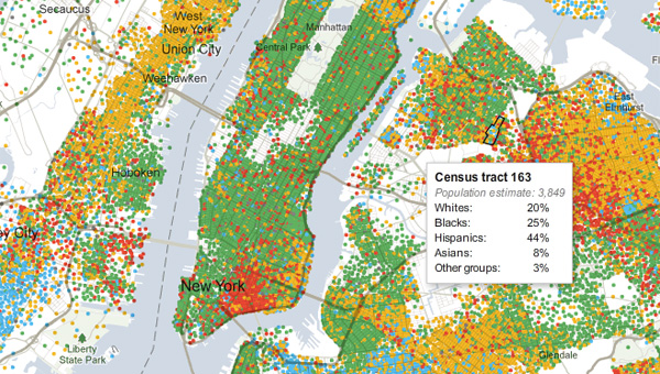
What It Shows
This interactive infographic lets you visually explore race, ethnicity, income, home value, and education level – census data, basically – across block of every city in the US. Seriously. Color-coded for easy big picture, mouse over a given block for its data.
Read the rest of this entry »
Visualizing How a Population Grows to 7 Billion (Adam Cole & Maggie Starbard)
Posted by Simon in Society & Culture on November 1, 2011
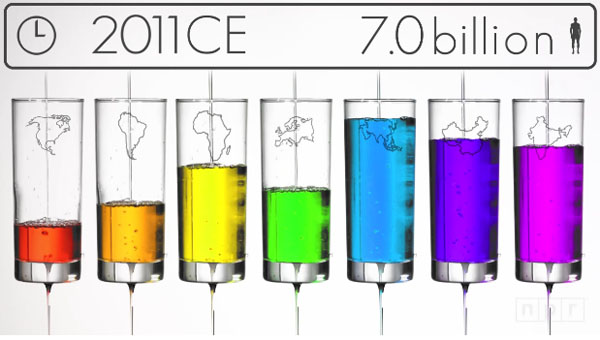
What It Shows
This video infographic gives a broad overview of how the world’s population skyrocketed from 0.3 billion a thousand years ago to 1 billion 200 years ago, and then in that 200 years from 1 billion to 7 billion today.
Read the rest of this entry »
The Boardwalk Empire (TravelInsurance.org)
Posted by Simon in Society & Culture on August 19, 2011
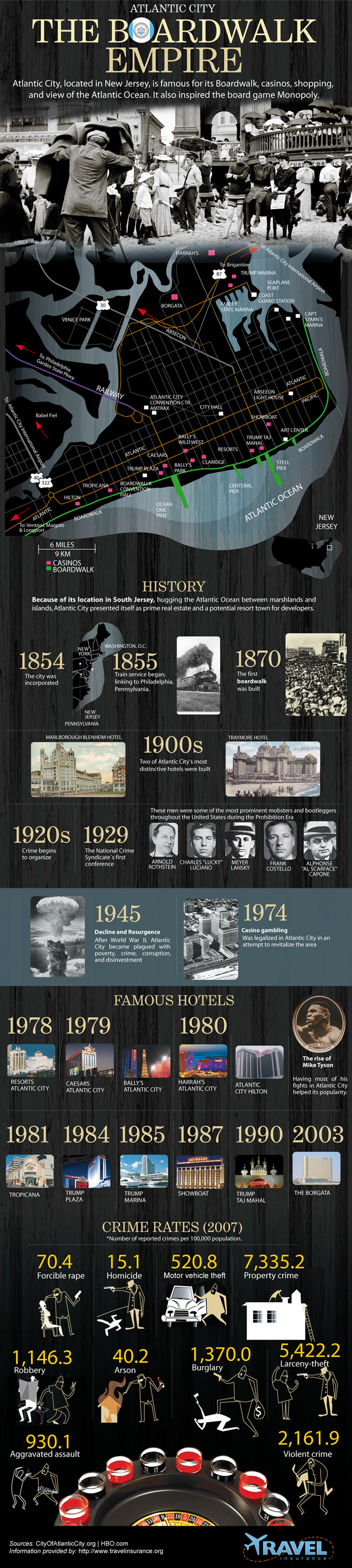
What It Shows
This infographic gives somewhat of a geographical and historical overview of New Jersey’s Atlantic City and its “Boardwalk Empire”, whose prohibition-era antics inspired the recent HBO hit of the same name. It’s more than just the game Monopoly.
Read the rest of this entry »
What Is The Difference? (Metrobest)
Posted by Simon in Psychology, Society & Culture on July 20, 2011
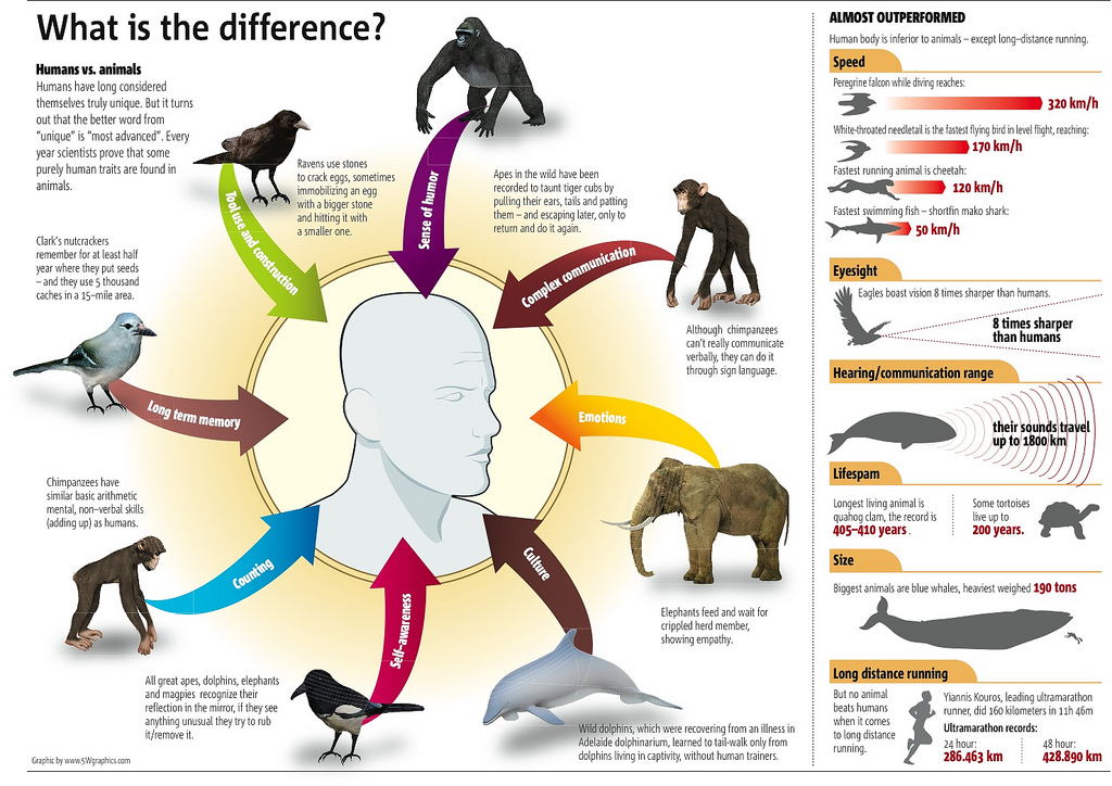
What It Shows
This infographic shows that despite our feelings of arrogance, in many ways humans are not more special than other animals, by showing the traits we share: tool use, long term memory, counting, self awareness, culture, emotions, complex communication, and sense of humor.
Read the rest of this entry »
Transgender (Charlie Rocket)
Posted by Simon in Society & Culture on July 6, 2011
![]()
What It Shows
This infographic breaks down statistics associated with transgendered people, including the percentage of the population who are transgendered, numbers for abuse and self abuse, and more.
Read the rest of this entry »
What Are the Hardest Languages to Learn? (VOXY)
Posted by Simon in Society & Culture on April 19, 2011
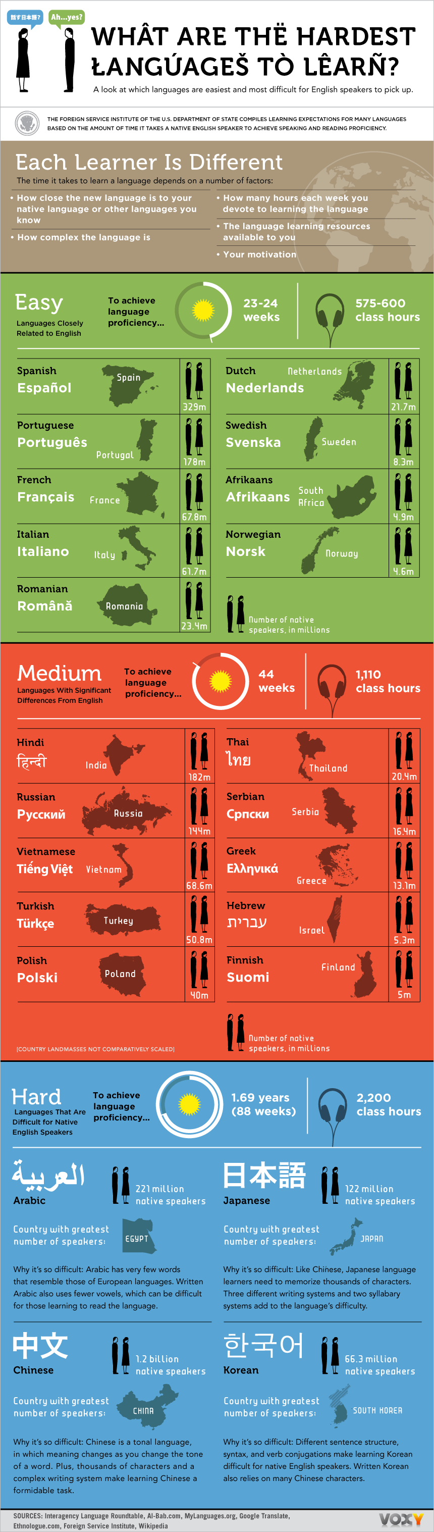
What It Shows
This infographic shows the time taken (and thus approximate difficulty) and amount of speakers (and thus approximate value) to learn foreign languages, for an English-speaker.
Read the rest of this entry »
Mean Happiness (GOOD & Open)
Posted by Simon in Society & Culture on July 8, 2010

What It Shows
This infographic uses smiley faces to compare happiness levels between various countries.
Read the rest of this entry »
Why Do Freeways Come to a Stop (Stephen J. Beard & Rich Exner)
Posted by Simon in Society & Culture on May 31, 2010
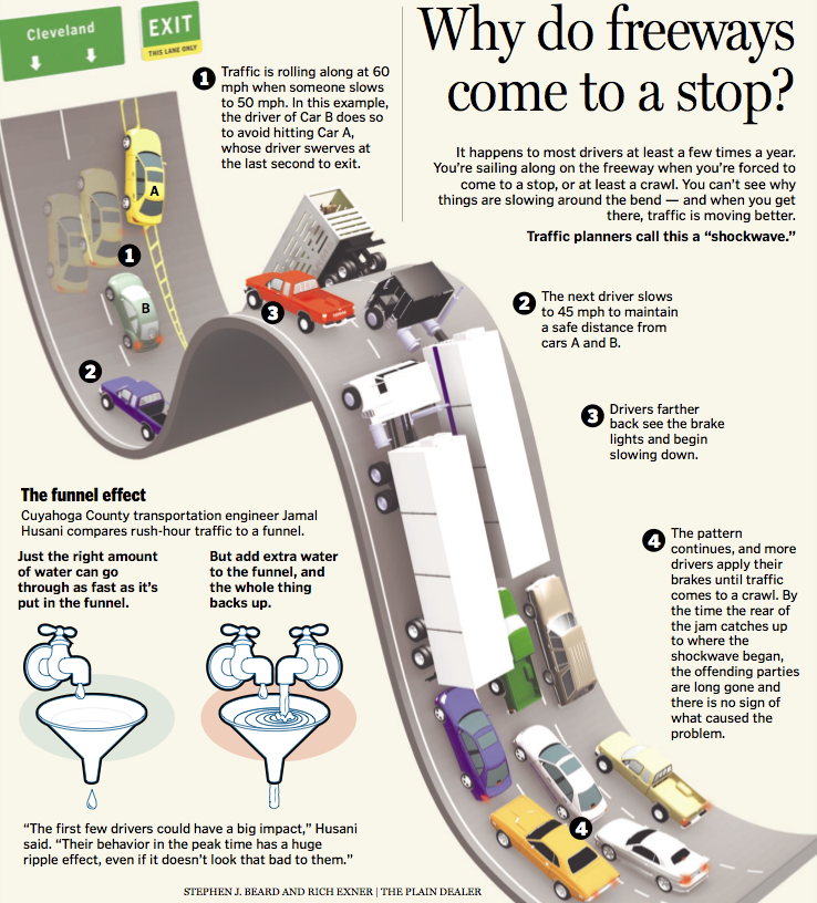
What It Shows
This infographic shows how a simple driving error creates a chain reaction of congestion on the road.
Read the rest of this entry »