Archive for category Money
The Game of Life (Lifebroker)

What It Shows
This infographic presents numerous facts and figures about life insurance, with an Australian focus.
Read the rest of this entry »
China Global Investment Tracker Interactive Map (Heritage.org)
![]()
What It Shows
This interactive infographic combines various aspects of China’s interaction with the global economy, showing its investments and activities in numerous sectors: metals, industry, transportation, real estate, agriculture, power, finance, energy, and technology. From this, interesting strategic perspectives emerge. Also included are per-country specifics across these areas, and how they connect to China with a mini profile tracking recent years.
Key take home points are China’s massive input and thus control of American debt, while actually investing in pretty much everyone but the United States in the other sectors. Very interesting.
Read the rest of this entry »
The Growth of Walmart & Sam’s Club (Flowing Data)
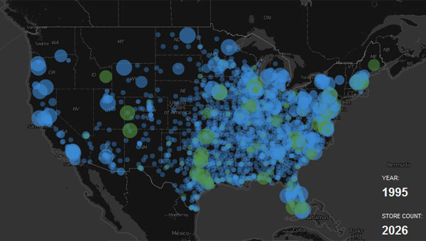
What It Shows
This video infographic tracks the expansion of Walmart by mapping the opening of stores over time.
Read the rest of this entry »
Battle of the Business Cards (Printing Choice)
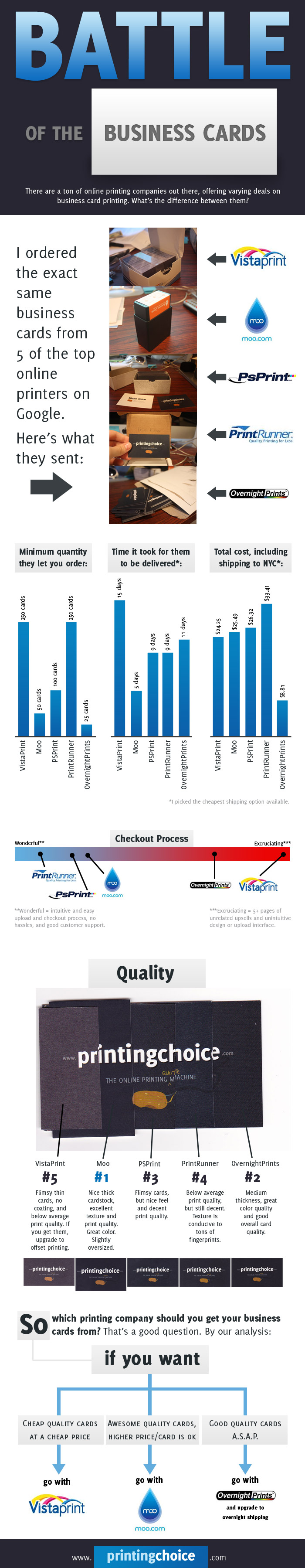
What It Shows
This infographic compares a seemingly equal business card purchasing process across 5 top online business card printing services, comparing cost, delivery time, quality, and other factors.
Read the rest of this entry »
The Hidden Costs of Running a Business (Towergate)
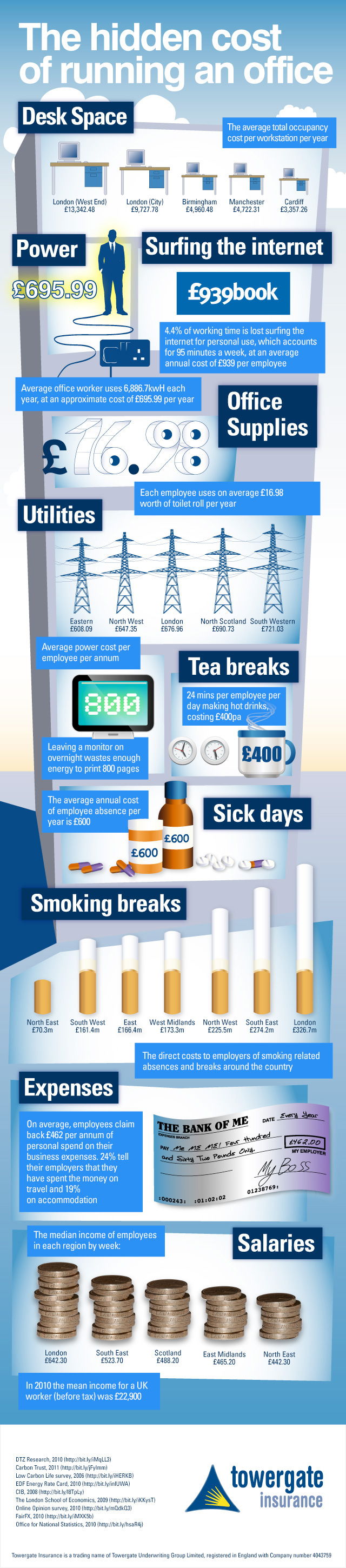
What It Shows
This infographic shows the different ways businesses cost more than managers and owners expect, with UK figures for desk space, power, employee web surfing, office supplies, utilities, tea breaks, sick days, smoking breaks, expenses, and salaries.
Read the rest of this entry »
The True Cost of Homeownership (Moolanomy)
Posted by Simon in House & Home, Money on July 12, 2010
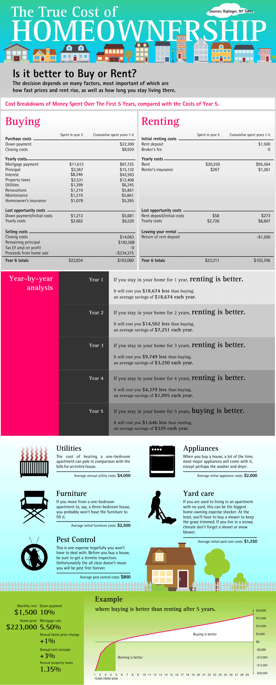
What It Shows
This infographic breaks down the factors associated with one of the perennial home questions: to buy, or to rent?
Read the rest of this entry »
Worst Oil Spills (Tiffany Farrant)
Posted by Simon in Environment & Nature, Money on June 28, 2010
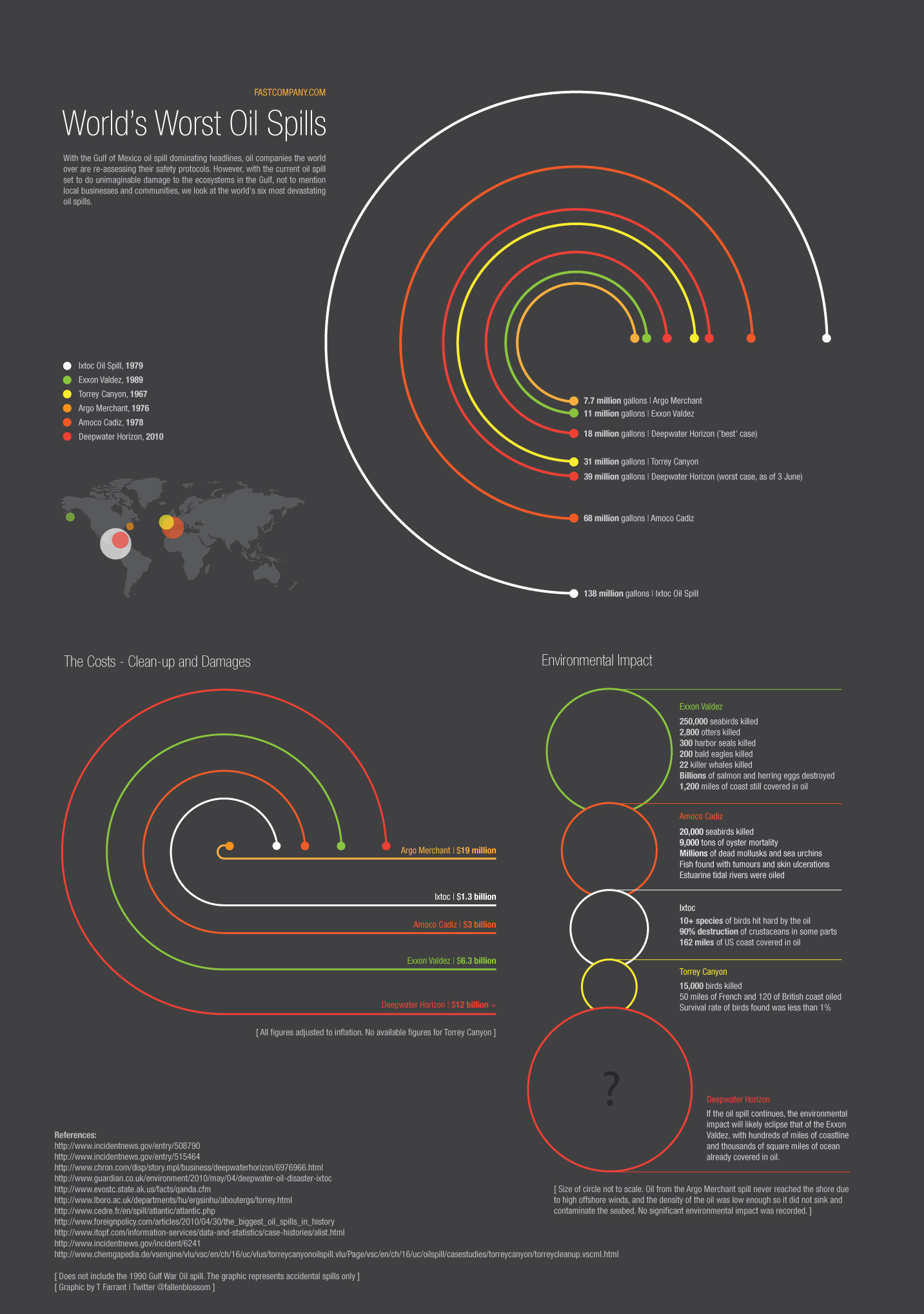
What It Shows
This infographic compares the worst oil spills in history, taking into account not only size, but economic and environmental damage. Figures for the current spill in the Gulf of Mexico are estimates, and this infographic uses these estimates to put the current spill into historical perspective.
Read the rest of this entry »
How Come Cheap Airlines Are So Cheap? (5W Graphics)
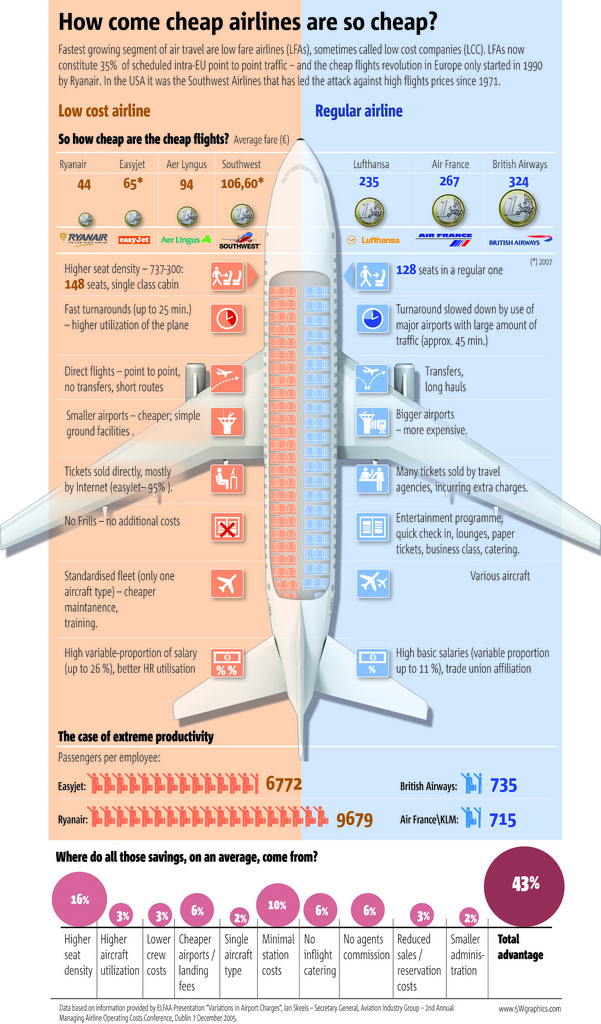
What It Shows
This infographic breaks down the variety of areas where low-cost airlines have managed to cut corner to save money and pass those savings onto the consumer looking for cheap flights.
Read the rest of this entry »
How to Improve Your Credit Score (YourWealthPuzzle)
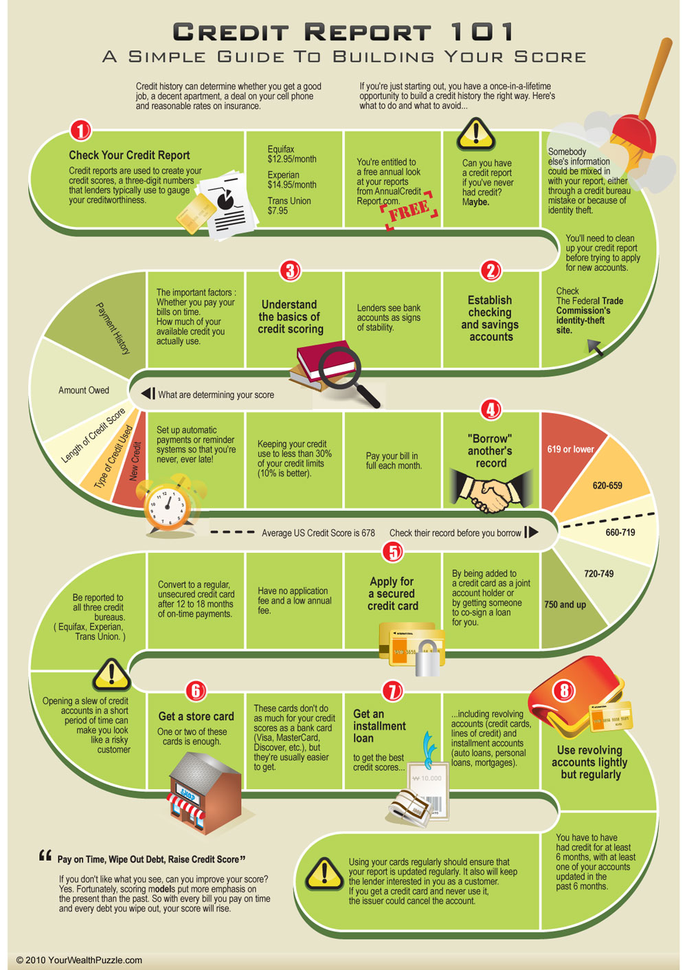
What It Shows
This infographic displays the dos and do nots for improving your credit score using a game board as a format.
Read the rest of this entry »
Celebrity Body Insurance (Free Insurance Quotes)
Posted by Simon in Money, Society & Culture on April 29, 2010

What It Shows
This infographic shows which celebrities have insured which parts of their body, and for how much. While the rest of us are getting auto insurance and health insurance, these celebrities are insuring everything from mustaches to tastebuds.
Read the rest of this entry »