Archive for April, 2010
Celebrity Body Insurance (Free Insurance Quotes)
Posted by Simon in Money, Society & Culture on April 29, 2010

What It Shows
This infographic shows which celebrities have insured which parts of their body, and for how much. While the rest of us are getting auto insurance and health insurance, these celebrities are insuring everything from mustaches to tastebuds.
Read the rest of this entry »
2010 Bundle Report: How America Spends (Stefanie Posavec)

What It Shows
This interactive multi-layered infographic breaks down last year’s spending in America by category (and sub-category), region (and sub-region), and demographic (and sub-demographic).
Read the rest of this entry »
Age Distribution on Social Network Sites (Pingdom)
Posted by Simon in Science, Technology, & Internet on April 22, 2010
What It Shows
This infographic graphs the age demographic breakdown for the most popular social network sites online.
Read the rest of this entry »
The iPod Index (Burak Nehbit)
Posted by Simon in Money, Science, Technology, & Internet on April 19, 2010
What It Shows
This infographic has taken data from a study on the amount of hours needed to work a typical wage job in different world cities in order to buy an 8 GB iPod Nano. The idea is that the iPod represents somewhat of a standardized global commodity, so it can be used as a constant to compare the richness of various cities in the world by measuring how many hours of average wage work are required to purchase it.
Read the rest of this entry »
Left vs Right (David McCandless & Stefanie Posavec)
Posted by Simon in Politics, Society & Culture on April 15, 2010
What It Shows
This infographic is a supremely comprehensive breakdown of left vs right (liberal vs conservative) thinking, covering politics, society, culture, family, and beliefs. For every element, views are compared and contrasted in a massive mirror image attempt.
Read the rest of this entry »
Canada’s Most Visited Attractions (Canada 411)
Posted by Simon in Society & Culture on April 12, 2010

What It Shows
This infographic lists the top areas and attractions in Canada, ordered by number of yearly visits.
Read the rest of this entry »
World Hunger by the Numbers (Online Schools)
Posted by Simon in Food & Drink, Health & Safety on April 8, 2010
What It Shows
This infographic is presents a series of world hunger related facts. I normally let the infographic itself present the facts, but here are some doozies:
Read the rest of this entry »
North Korea: The Craziest Country in the World (Jason Powers)

What It Shows
This infographic gives a big picture view of the economics, military, education, and politics of Kim Jong-Il’s North Korea, successfully attempting to show just how crazy he and his country are.
Read the rest of this entry »
Teen Pregnancy in America: Facts & Statistics (Online Ultrasound Schools)
Posted by Simon in Health & Safety, Society & Culture on April 1, 2010
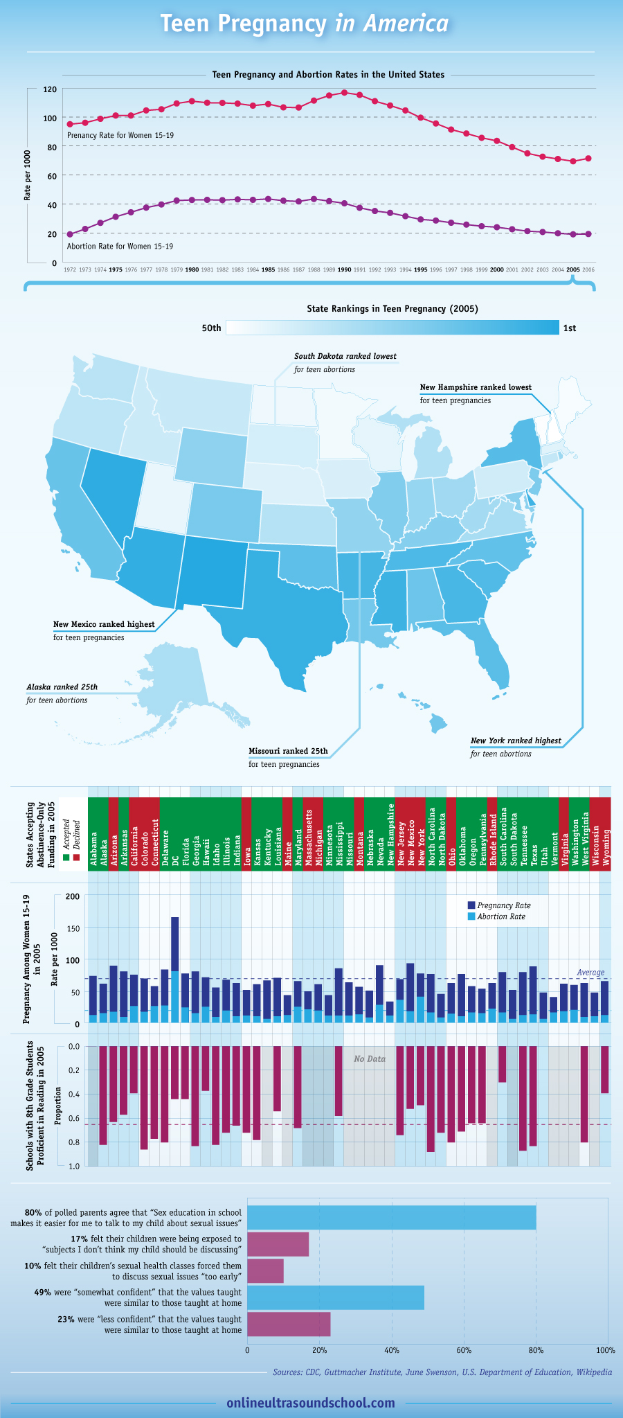
What It Shows
This infographic shows a collection of nationwide and state-level statistic on teen pregnancy and abortion rates in America. The map of America with different states highlighted by teen pregnancy rate rank gets more quantified in more detail in the graph below it.
Read the rest of this entry »