Archive for category Infographics & Design
The Designer’s Toolkit (BestVendor)
Posted by Simon in Infographics & Design, Science, Technology, & Internet on January 18, 2012
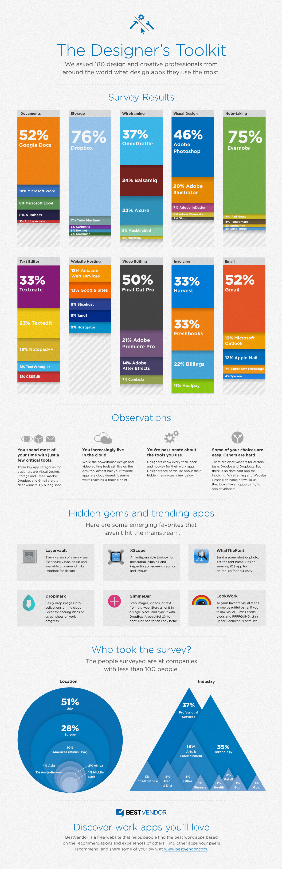
What It Shows
This infographic visually breaks down web tool use based on a polling of 180 designers, for documents, file storage, wireframing, visual design, note taking, text editing, web hosting, video editing, invoicing, and email.
Read the rest of this entry »
Chart Suggestions: A Thought Starter (Andrew Abela)
Posted by Simon in Infographics & Design on November 21, 2011
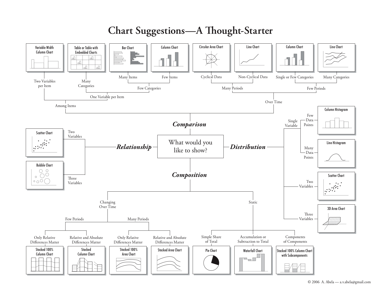
What It Shows
This infographic helps people who want to graphically represent data. Starting at the middle, it offers paths to the ideal graph to express whatever type of data they have, for relationship, comparison, distribution, and composition mapping.
Read the rest of this entry »
David McCandless: The Beauty of Data Visualization (TED)
Posted by Simon in Infographics & Design on April 22, 2011
I am a fan of infographics, of David McCandless’ work, and of TED.com videos, and so what more could I ask for than their combination? The video below is a solid, inspiring presentation discussing a variety of infographics with a great deal of surrounding context for not only why we love them, but why we need them.
So You Need a Typeface (Julian Hansen)
Posted by Simon in Infographics & Design on May 24, 2010
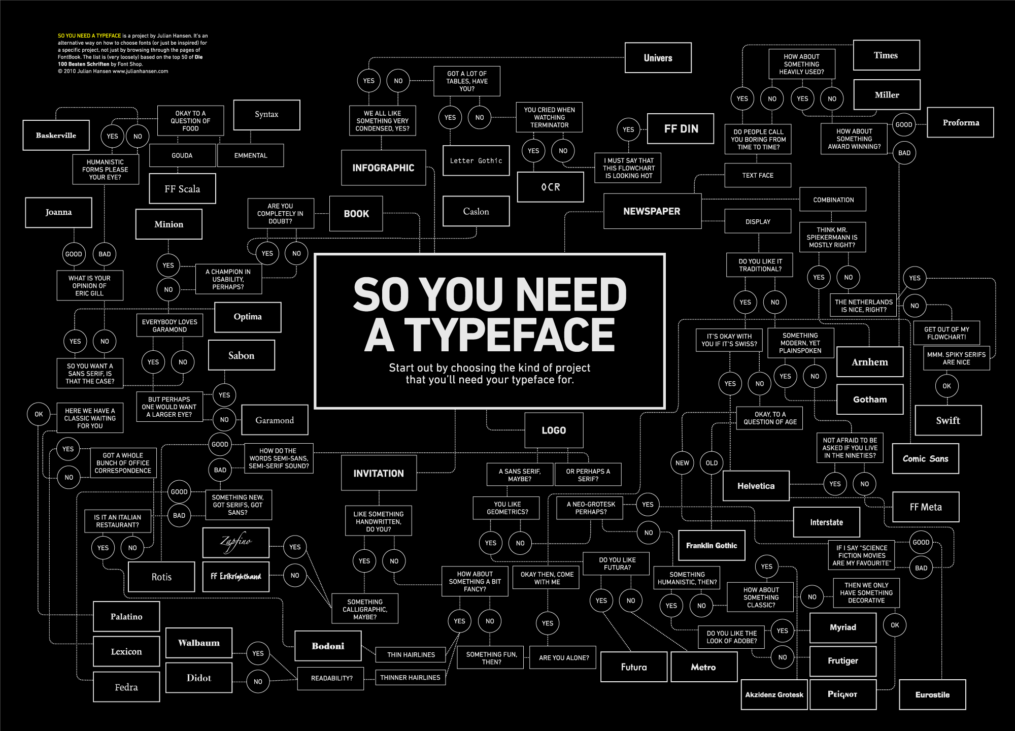
What It Shows
This infographic offers a flowchart for choosing an appropriate typeface (font) depending on the type of application and aesthetic preference selections.
Read the rest of this entry »