What It Shows
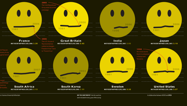
This infographic uses smiley faces to compare happiness levels between various countries.
Why It’s Good
I find the use of the smiley face mouth to show the happiness graph a cute idea. It definitely works as far as the right side of the face, since increasing happiness makes for a smile, but it’s a bit strange on the left when a drop in happiness to start a trend would be rather smile-like.
I like the topic, too, and find that it’s not in public discussion often enough. Happiness statistics are extremely important and indicative of where we’re at in a big picture sense. I tend to be more interested in the stats that compare a country’s economic prosperity with the happiness of its citizens, but I still find just about any global happiness stats interesting.
What It’s Missing
Unfortunately, the infographic doesn’t really say much. I would have rather seen smaller graphics and more countries, too.
When it comes to happiness, there is not only a factor of how much people are comfortable being honest, but the very important distinction between happiness in the moment (with life being a continuous stream of moments, and a life’s happiness potentially being judged through the cumulative look at these moments), and happiness upon reflection.
Check out this very interesting TED talk for what I mean:
Overall, I don’t hate the infographic, but it’s a bit below GOOD’s usual high standards.
This infographic appears on the GOOD website here.
