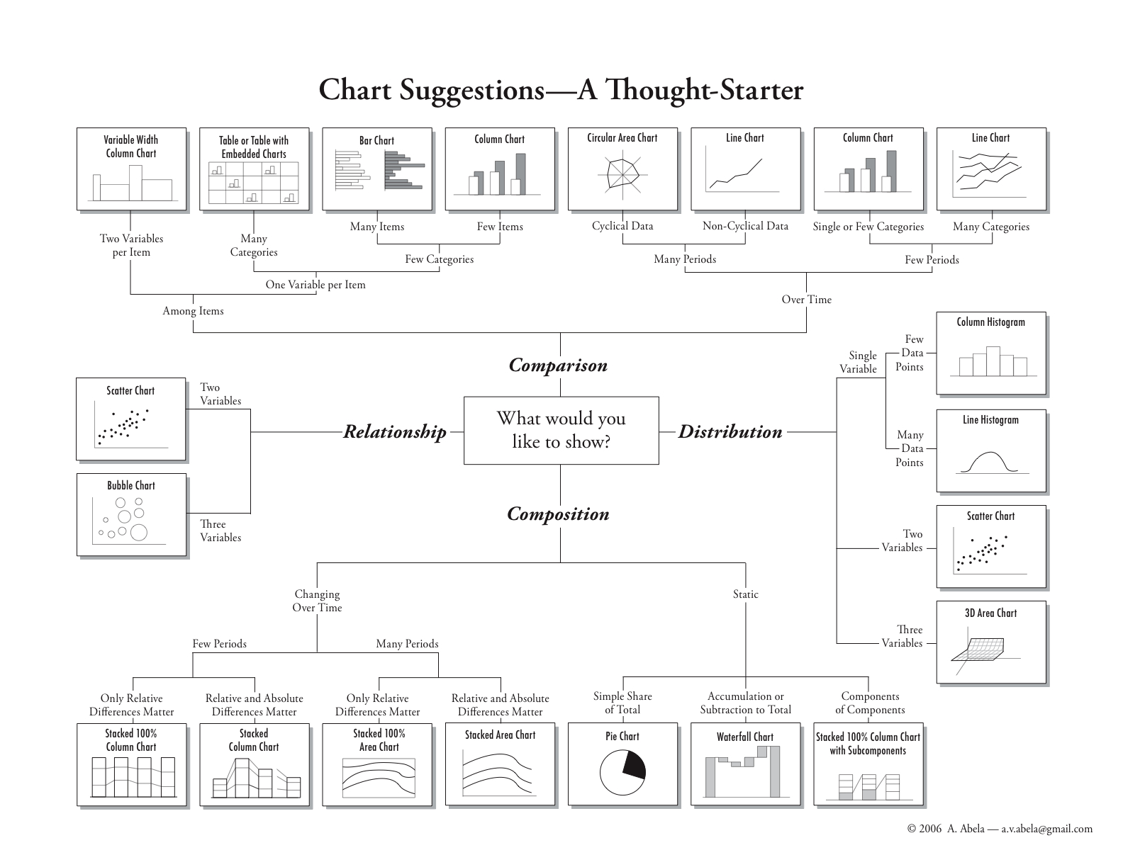
What It Shows
This infographic helps people who want to graphically represent data. Starting at the middle, it offers paths to the ideal graph to express whatever type of data they have, for relationship, comparison, distribution, and composition mapping.
Why It’s Good
When I first saw this, I felt like I finally got what I was looking for, and yet I wasn’t fully aware that this kind of breakdown was possible. It’s so intuitive to understand, and remarkably thorough. It may not have everything, but it has a lot, and it covers what it covers cleanly and elegantly. Just start at the center and follow the paths.
What It’s Missing
Artistically, there isn’t much spice to this. It’s a bit dry, which the colorlessness doesn’t help. Even the font selection seems to lack thoughtfulness and aesthetics. Still, it’s not like it’s ugly. Plus, the small drawings of each final chart type are what matter most, and they are completely clear.
Andrew Abela’s very useful infographic was first made available here.