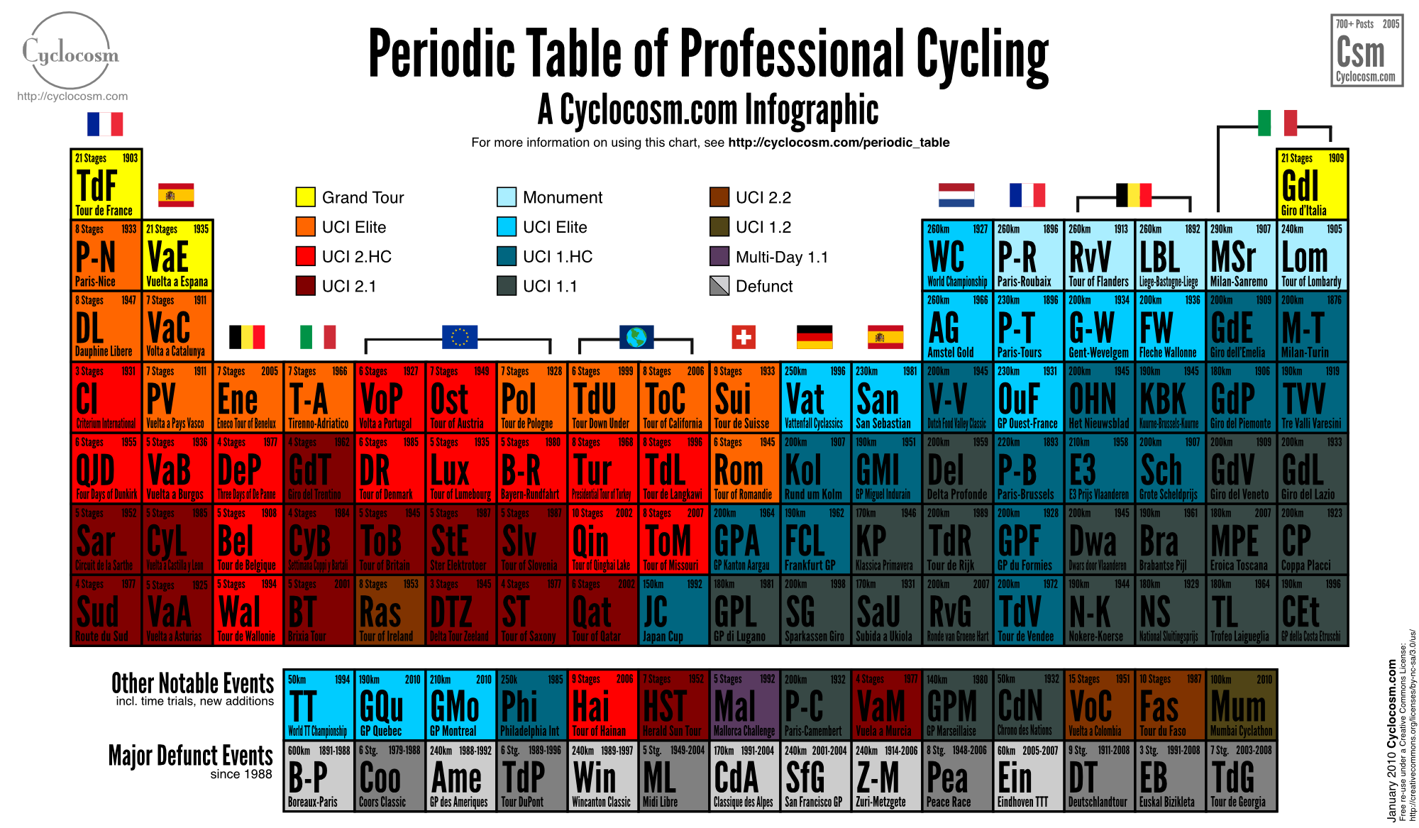
What It Shows
A complete breakdown of professional cycling events (eg. Tour de France) using the periodic table as the structural base. Rows indicate the prestige of the event, and columns represent host nations. Stage races tend to the left, single-day races to the right.
Why It’s Good
I’m a big fan of grid-based infographics, where row and column information combines for an overall easy synthesis and big picture view. They are the simplest example of how the visual presentation makes the learning easier. I would argue that any table is an infographic, in a way, even if they tend to be stripped down, because the visual placement makes a difference to how the information is understood and interpreted.
As far as this cycling competition infographic, especially once you know how to read it, the information is very clear and fun. To be honest, I’m not a huge professional cycling fan, but having the competitions presented like this has given me some quick perspective and knowledge of at least the biggest competitions, as far as what I’m taking home from it.
What It’s Missing
The infographic has a slightly narrow appeal, but there’s nothing wrong with appealing to a niche, so no points really deducted there. There may be slight issues and omissions that you can find on the original source page, but those kinds of issues are to be expected. The more elements (pardon the pun) you include in an infographic, and the more niche the topic is, the more nitpicky your readers will get. So, yeah, the creator should have maybe got the criticisms right, but overall, this is probably the best example of what the person was trying to do, far more succeeding than failing.
While you can figure out that the more important events are in the upper rows, I don’t like as much when infographics have too much assumed knowledge. This isn’t so bad, and there are explanations on the source’s main page, but I still think the explanation belongs on the infographic itself, even if it clutters the design a bit more. An infographic should be self-sufficient. The colour legend at the top attempts to do this, I think, but it isn’t enough for the average non-cycling fan.
I’m picky, clearly, and overall this cycling infographic is pretty solid.
Found at Cyclocosm here.