What It Shows
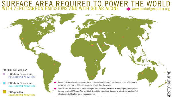
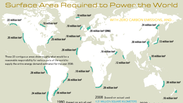
This pair of infographics shows the amount of surface area required to power the world with solar and wind power at a projected estimate of consumption in the year 2030.
Why It’s Good
With the variety of energy sources in action in today’s world, it’s interesting to try to get a sense of what a single, zero emissions source could accomplish and what it would require. The concept is interesting, in an abstract, fantasy sense.
Here’s the wind map:
Even though a diversification of energy sources makes more overall sense, it’s nice to see a non-oil energy producer isolated as the primary source and to play with the thoughts of how it would happen.
What It’s Missing
The map is a bit misleading, even if accurate. The squares of land make it seem like only a small fraction of land is really required, and even though that’s true, the total surface area required is actually quite massive.
Also, building that many solar panels would carry with it a rather heavy carbon footprint in the initial construction, and be a massive undertaking.
Finally, I would be curious to know how nuclear power fits in the mix, and how much land would be required there. A stigma exists around nuclear power given the disasters that have happened, but the odds of a problem are so slim at this point that I’d be curious to see how the map would look.
These infographics come with surrounding explanation on a blog post here.

