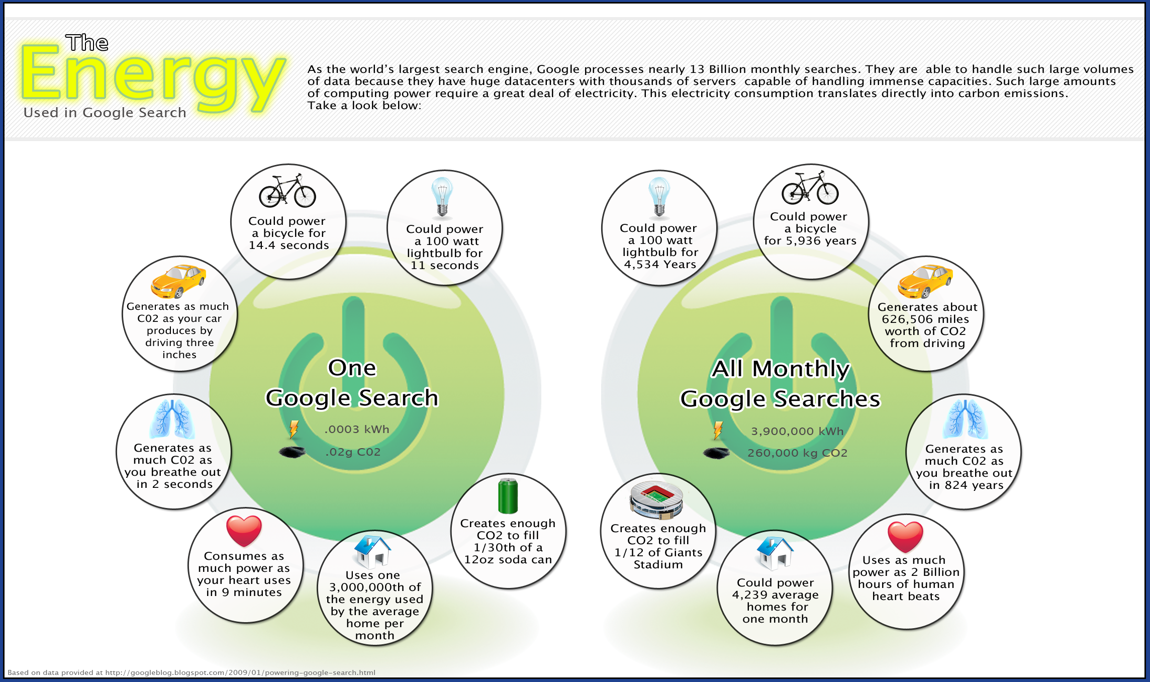
What It Shows
This infographic maps out the various energy opportunity costs of having Google run as it does, on per search and monthly search levels. Environmental effects are presented in kWh and CO2 emissions.
Why It’s Good
It’s important to be aware of the environmental impact of the luxuries we enjoy. This information is not always available, so when it is, I like to think that we should pay attention. I think it makes sense to look at what the energy lost in one activity could translate into for another, to get a better perspective on what we do and be able to make decisions when sacrifice is necessary. On that level, I think it’s good for this blog to bring information of this kind to our attention.
Also, a per search and monthly totals analysis makes sense to help understand the energy losses and emissions.
What It’s Missing
This infographic has problems, but suffers from two in particular.
The first is the choice for the comparisons. What an opportunity to put the energy use in terms we could understand. Showing how many homes could be powered by the energy makes sense, as do a couple of others, but some are totally unhelpful.
For example, a month of Google searches produces enough CO2 to fill 1/12th of Giants Stadium. Assuming you know how big Giants Stadium is (and as such what 1/12th of it is), how does 1/12th, in general, as a fraction, ever seem like a lot? The mind is forced to try to take a figure that is already ambiguous and then divide by 12? Just doesn’t make sense.
As much power as 2 billion hours of human heart beats? Well I don’t know what one hour of human heart beats requires, so it’s hard for this to feel relevant to me. Plus, it’s not like we could turn Google off and keep hearts pumping, hearts that will for now stop due to Google. They’re just too disconnected.
The biggest issue with this infographic, however, is that it’s on a blog post trying to argue that Google is this massive consumer of energy, but if anything, I’m impressed at how little it consumes. My first impression was “Really? That’s it?” Then I realized the source of the information was actually a post on Google’s Blog! While admitting they must do whatever they can to streamline and be more efficient, I think they’re actually proud of their consumption figures. Saying a search fills 1/30th of a soda can with CO2 makes it sound like not much.
Setting aside their massive profits, the services rendered by Google seem to make these energy costs worthwhile. The average American car drives 15,000 miles per year, or 1,250 miles per month. The infographic indicates that a month of Google searches creates the amount of CO2 equivalent to 626,506 miles of driving. That means we would need 500 cars to stop driving to offset Google’s CO2 emissions. Sounds pretty darn reasonable to me. 500 cars, for the amount of information at the fingertips of so many around the world. I bet those emissions are even offset by the amount of green living tips people learn searching on Google.
All to say, sorry, great idea if the damage was heavy. Thankfully for the world but unfortunately for this infographic, it doesn’t seem to be. Get people to keep Googling and take a bus.
This infographic is sourced here but was sent to me from a friendly site fans Chris and Calvin. Thanks!