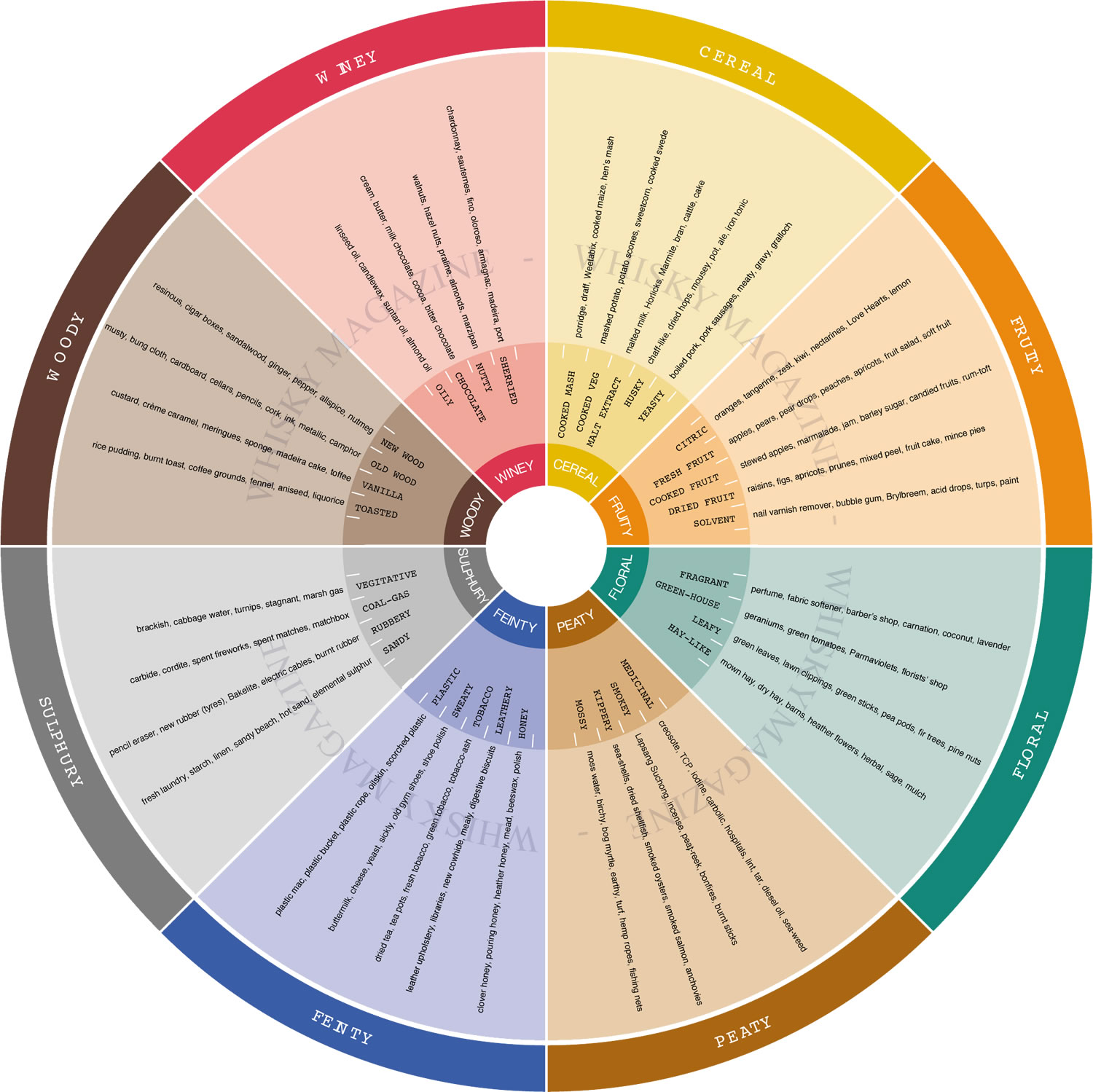
What It Shows
This infographic uses a wheel diagram to map out the various aromas to detect when nosing/tasting whisky.
Why It’s Good
Being able to detect specific aromas is not always easy, since they come as a complex collection. Yes, you can relate them to the real-world sources (e.g. cut grass, honey, sandalwood), but when there are 10 at once, wrapped in the sting of 40% ABV, it’s not always easy to get your bearings. A graphic like this is a great reference and starting point.
Colour use was a natural choice, and the varying shades within the slice break up the segments in a pleasing way. I also like the font choices, although I feel like I shouldn’t. That said, the chaotic font spacing in the outermost ring is an issue.
What It’s Missing
Sorry, but that watermarking is over-the-top. I understand why someone might worry that their logo/name can be cropped out, but this is an over-reaction much to the detriment of the experience. The article says the wheel is a work-in-progress, but sadly, I wasn’t able to find an update.
I found this in part 3 of Whisky Magazine’s “nosing course” here. Apparently, it was derived from the Pentlands Wheel, made by Pentlands Scotch Whisky Research (now known as The Scotch Whisky Research Institute) for whisky industry use.
Here’s hoping a new one with more tasteful watermarking is on the way.