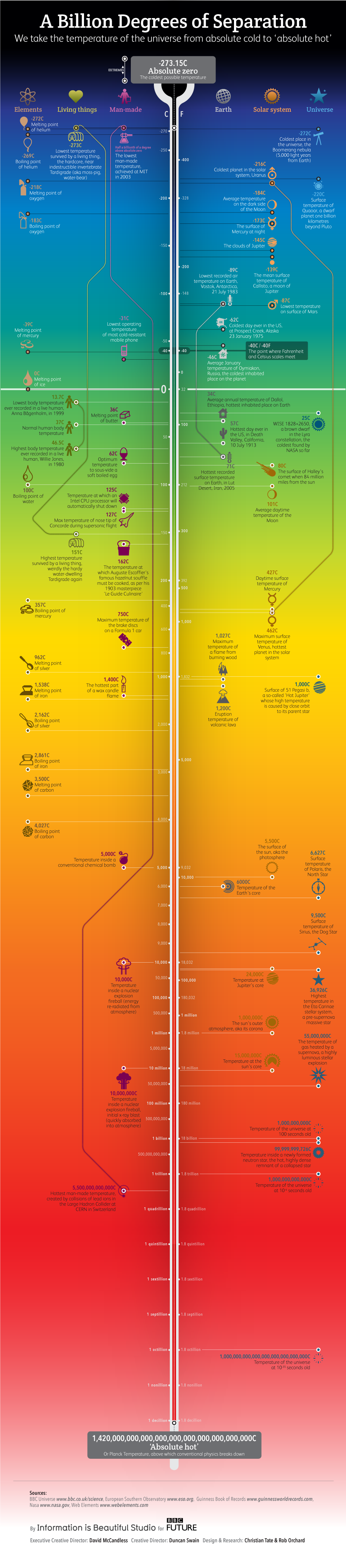
What It Shows
This infographic takes the full spectrum of cold and hot temperature and populates it with things we know about or have done.
Why It’s Good
It’s nice when you get to learn from a certain angle that you may never have thought of. What is essentially just a set of facts becomes unified when placed along a scale. When taken all together, you feel like you’ve not only learned some particulars, but also bigger picture, relational knowledge. Amazing to understand that humans have created such a massive range of temperatures, from basically absolute zero (-273 celcius) to 5.5 trillion degrees celcius. Yay for lab conditions!
I really like that you have temperature as the main axis, but you get a sub-division by type, here between ‘elements’, ‘living things’, ‘man-made’ things, ‘Earth’ things, ‘Solar System’ things, and ‘Universe’ things. I think these groupings makes sense.
Visually, the rainbow gradient does a good job of echoing the described temperatures, from blue for cold to red for hot. The unfortunate consequence of that choice is the difficulty in maintaining readability of fonts. Overall, not a huge issue here, but I’d have opted for something a little thicker and clearer for the black and white text descriptions.
What It’s Missing
Why oh why did they put cold at the top? It’s hard to not expect “high” in the graphic to mean “high” temperatures. High is hot. Low is cold. What’s the deal. I guess the idea is that you read top to bottom, and you want to go from low to high…? There’s no way the designers didn’t consider this decision in putting this infographic together, so I’d love to know the logic.
This infographic was made by by the Information is Beautiful team, for the BBC. The feature can be found here.