What It Shows
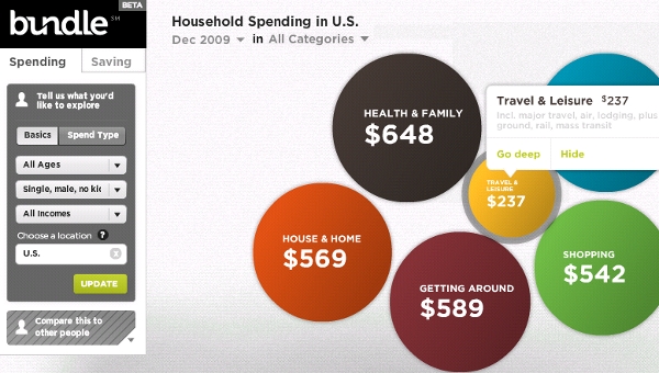
This interactive multi-layered infographic breaks down last year’s spending in America by category (and sub-category), region (and sub-region), and demographic (and sub-demographic).
Why It’s Good
That’s… uh… a lot of data. Bundle has undertaken and succeeded with a rather massive project to present a huge amount of collected information. You curious to know how the 90% percentile of single males aged 36-49 spent on electronics in October 2009 compared with those 18-25 married with kids in California? No problem. There is a fantastic level of data depth and detail here, making it a great tool for investigation, with an option for comparison.
The navigation/interface is rather intuitive considering just how much information is available. Really, that’s the make-or-break aspect of this data tool, and they managed to make it quite reasonable. It’s a bit intimidating at first, but really, I’m not sure how I would improve upon it.
On top of that, separate infographics were created drawing conclusions from the data pool, like the one below that shows the top spending and lowest spending cities in America:

These infographics are each self-sufficiently successful, helping to go beyond the data access tool and giving you some proper analysis.
It’s clear that this was a massive project, and Bundle is to be commended for their efforts.
What It’s Missing
The package on the whole is great, but I didn’t like the starting page. I don’t like that I needed to click on text links below the initial image to start getting around. Links presented in a contextual way like that don’t immediately make you think you have to click on them to proceed, so I think a bulleted list could have been more effective. I would have liked maybe some old school image maps on the initial image, too. A more organized and even visual table of contents-type setup could have oriented me better.
Once the initial stats were presented as annual totals, I would have liked that option in the timeline dropdown, instead of just picking by month.
While I can understand why they didn’t want to include the mortgage/rent information, it’s a bit weird to cover that much to do with spending and not really talk about it, considering how much of an expense it represents.
A data tool is great, but to me, an infographic should really give you take home information and not just expose you to ways of gathering your own data. That’s why I think it was quite admirable of them to take what was already a solid data tool and use it to provide the additional infographics.
This infographic is found on the Bundle site here.