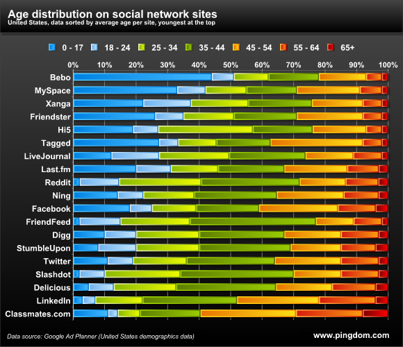
What It Shows
This infographic graphs the age demographic breakdown for the most popular social network sites online.
Why It’s Good
It’s a handsome infographic, no doubt, and the visuals really help get the information across. The quantity of demographic chunks resulted in a good choice for colorizing (the rainbow).
I really like how, even if they didn’t state explicitly (which they do), you could tell they organized the list with the youngest at the top. There are always risks in making information compact, but this infographic succeeds in using the compactness to make it easy for users to make comparisons between social sites without much effort.
What It’s Missing
I would have liked the infographic to be dated, since these numbers will change, and the accuracy will disappear. A comparison between this graphic and the same breakdown five years from now could be interesting, too.
If it were my infographic, I would have also added the number of users per site to the left of the site name, or made it visible on mouseover.
There is extra information on the page where I found it (linked below), but surprisingly, no site sizes there either. The assumption that the the infographic (along with a few others) would be read along with the accompanying article is probably why it’s not as self-sufficient as it could be, but it’s a shame, because it’s not far away from being stand-alone. Weirdly, there is no date for the stats in the article, either, beyond the date of the post (Feb 2010).
This infographic was made at Pingdom and can be found here.