Archive for category Science, Technology, & Internet
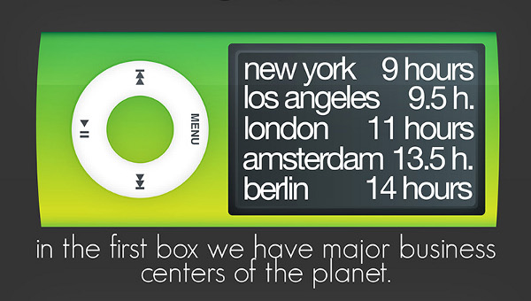
The iPod Index (Burak Nehbit)
Posted by Simon in Money, Science, Technology, & Internet on April 19, 2010
What It Shows
This infographic has taken data from a study on the amount of hours needed to work a typical wage job in different world cities in order to buy an 8 GB iPod Nano. The idea is that the iPod represents somewhat of a standardized global commodity, so it can be used as a constant to compare the richness of various cities in the world by measuring how many hours of average wage work are required to purchase it.
Read the rest of this entry »
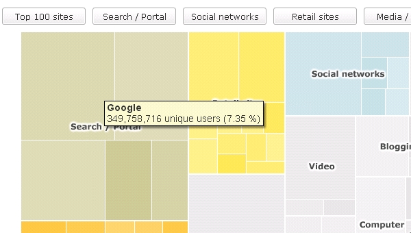
The Top 100 Sites on the Internet (BBC)
Posted by Simon in Science, Technology, & Internet on March 22, 2010
What It Shows
This infographic shows rectangles of relative size to indicate the popularity of websites based on unique users, according to Nielsen statistics. For each block, the total unique users are indicated, and the relative percentage of the total graphic. One layout shows the breakdown of the top 100 web sites, color-coded by type of site (search engines, retail, social networks, etc). Some additional graphics magnify the results in the first graphic, such as those for search engines.
Read the rest of this entry »
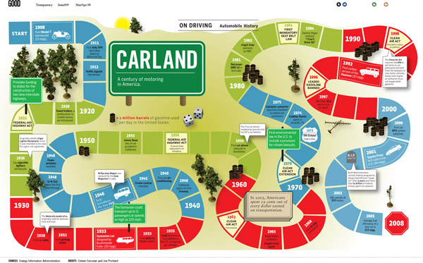
Carland (Coleen Corcoran & Joe Prichard, Good Magazine)
Posted by Simon in Science, Technology, & Internet on October 22, 2009
What It Shows
A century of automotive history in the form of a game board. This inforgraphic covers environmental laws and innovations, new technologies, and the creation of the most significant cars in history.
Read the rest of this entry »


