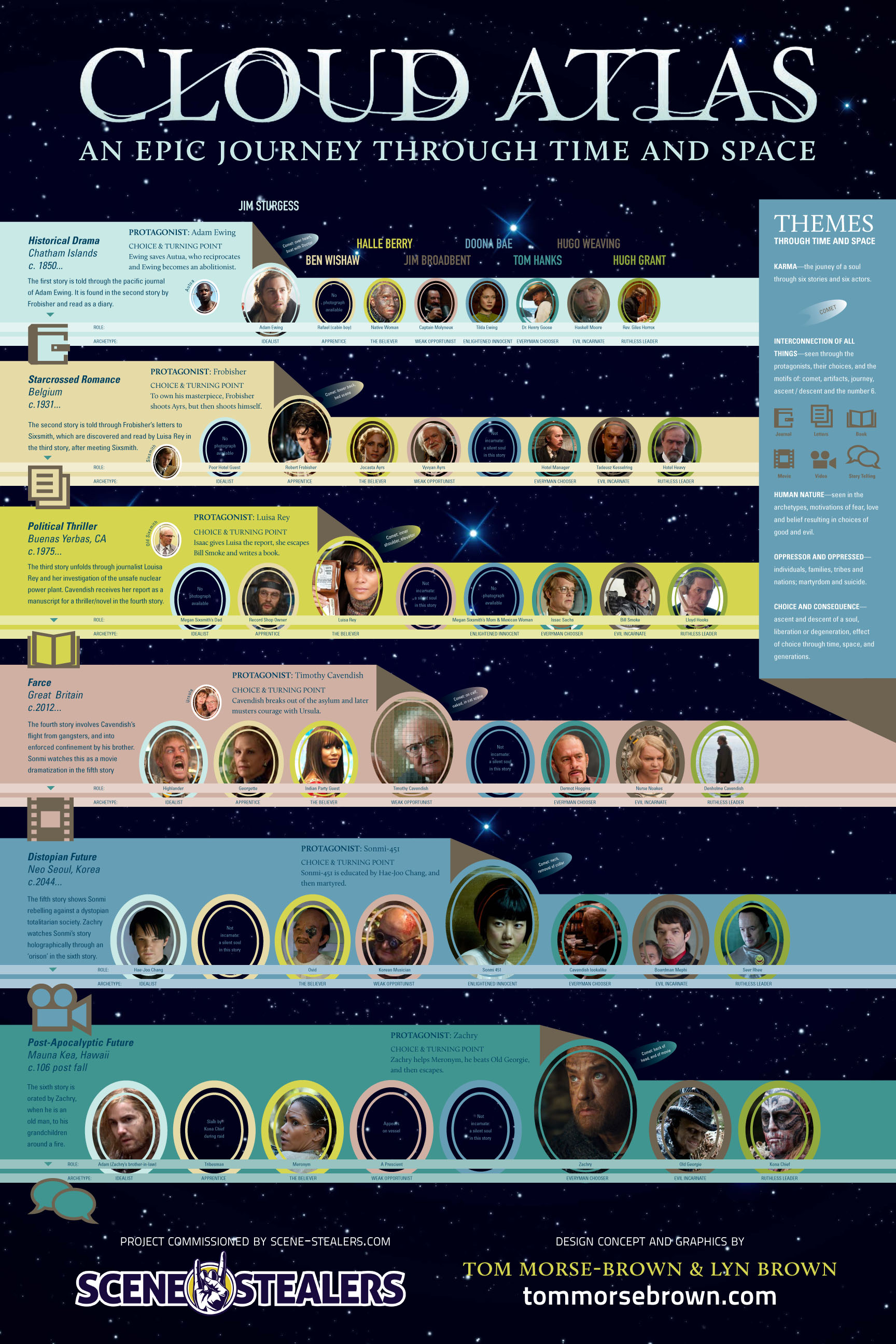
What It Shows
This infographic maps the intense layers of connections between the multiple characters, stories, and actors in the movie Cloud Atlas.
The film has been out for a couple of years, but I hadn’t gotten around to seeing it until a few days ago. Immediately after watching, especially given my experience with Inception infographics, I was willing to bet that there was at least one Cloud Atlas infographic. It’s just begging to be made into some sort of table, with row and columns for actors and stories.
Sure enough, there are actually many; the one I’ve decided to review here is my favourite.
Why It’s Good
I like that they decided to go big on the infographic with a large image size given the amount of information to be included. I also think a movie for each row and an actor for each column was the right way to go. Adding the archetypes was a nice touch too.
Overall, what I like best about it is that it’s the infographic that most helped me to understand what went on in this otherwise confusing (and thought-provoking) film, and how all the elements and story plots are connected.
What It’s Missing
I like that individual actors’ roles are vertically aligned, but I would have preferred them to be more exactly aligned. They used colour to indicate that it’s the same actor, but the OCD part of my brain wants more precision. I believe the alignment was lost because of the designers’ enlargement of the protagonist’s photo for each story, but it wasn’t worth it.
This infographic was found on Scene Stealers here.