What It Shows
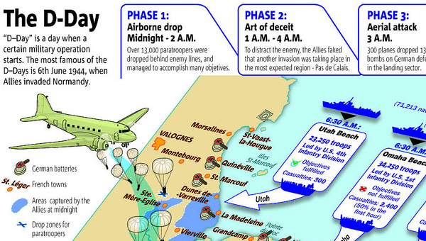
This infographic shows and explains timelines, strategies, and map information about the famous D-Day invasion of World War II.
Why It’s Good
The artwork is extremely well done, and while the cartoony look doesn’t necessarily capture the seriousness and sacrifice of the invasion, it does well to keep the infographic clean and clear.
There is a lot of information and, considering the amount of statistics, it’s quite easy to read. There is enough presented here to give a person a solid overview of D-Day’s perspective – at least from the Allies point of view. Of course, there is a lot of interesting detail about D-Day that isn’t in this infographic, but a solid amount is packed in here nonetheless.
What It’s Missing
A little bit more proofreading. Phase 1 “…managed to accomplish many objetives.” “Supreme Commander Dwigth D. Eisenhower”. Also, the naval vessel figures don’t quite add up. Bit of a shame considering how well done it is otherwise. The visual ideas were good, and there is a lot of info, but the mistakes cut from the credibility.
I found this infographic on this Flickr page, and while it’s credited to the talented folks at 5W Infographics, I can’t seem to find it in their site portfolio.
