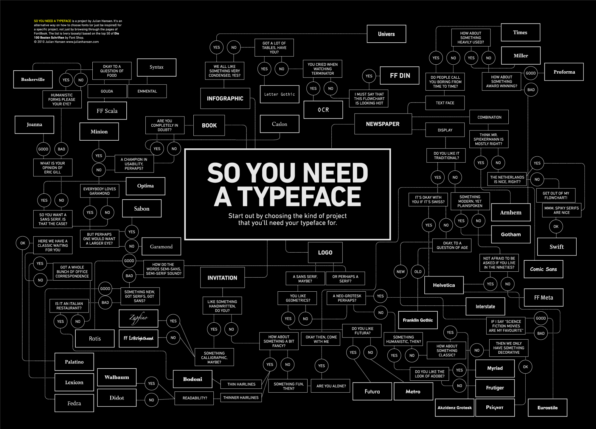
What It Shows
This infographic offers a flowchart for choosing an appropriate typeface (font) depending on the type of application and aesthetic preference selections.
Why It’s Good
I very much enjoy functional flowcharts, especially when they are of personal use to me. This one seems like it could really do the job, providing you have all the fonts at your disposal! I like the concept, and the decision to use this format. The problem was identified, and pretty much solved. As the creator says, it’s better than going through a fontbook.
I generally appreciate the humour in helping people make aesthetic selections (“You Cried When Watching Terminator: Yes/No”). For the most part, the options were clear and make sense.
I’m not typeface expert, so I can’t say whether or not the actual advice is correct, but it seems to make sense.
What It’s Missing
While I can see why black and white makes sense thematically, a little bit of color might have been nice. It could do with something to distinguish the questions from the font answers. Color can work, but if the black and white is desired, then the shape of the box (as is often the case with flowcharts) could work too, turning the rectangle into a diamond or another shape.
This work by graphic design student Julian Hansen can be bought in poster form here.