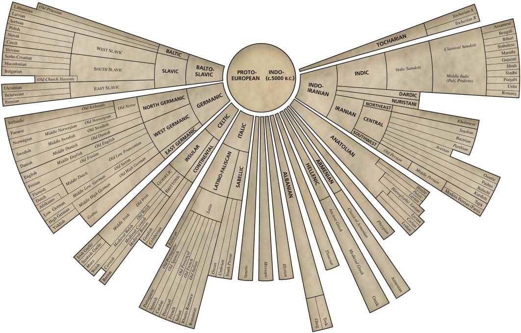
What It Shows
This infographic shows the structure of the spread of all languages derived from the same Indo-European protolanguage.
Why It’s Good
Even having studied language and language history (I minored in theoretical linguistics), I can’t attest to the complete accuracy of the infographic, but it looks pretty solid to me. There is actually a lot of information here. Even though there are no real dates in the graphic, you get a sense of the relative evolution of the language branches through history.
The strength of the infographic is in the compact way of giving quite a broad picture, giving a viewer a genuine overview despite having many elements to contend with.
It’s solid aesthetically, too. Appropriately classy and historical.
What It’s Missing
It’s missing some of the ways languages have influenced each other (for example, the influence of the romantic languages on English as a result of the Norman Conquest), but I don’t blame the makers for this, since any additional complexity could kill readability.
Check, for example, the infographic below, found on the Wikipedia page for the Indo-European language tree:
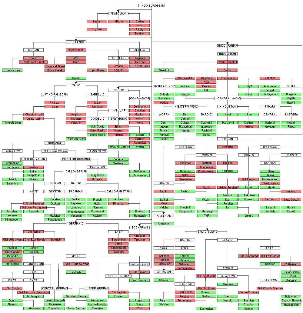
Look at how much more difficult it is to follow compared with the first infographic. The first one takes risks with font size and compactness, but the result is a functional and aesthetically sound success. This is why I can forgive some of the missing language cross-over detail. I’ll take slight over-simplification over an unreadable design.
I’m always a fan of further reading included in the graphic, so a few extra links would have been nice.
I found this infographic a long time ago, from a source that is no longer online. If anyone can point me to the original source, I would appreciate it and credit accordingly.
Source: The American Heritage Dictionary of the English Language, Fourth Edition (2000)
Thank you Steve Kleinedler for getting in touch with the source!
Pingback: Can Phonemes Explain the Origin of Language? | The Less Obvious Angle()