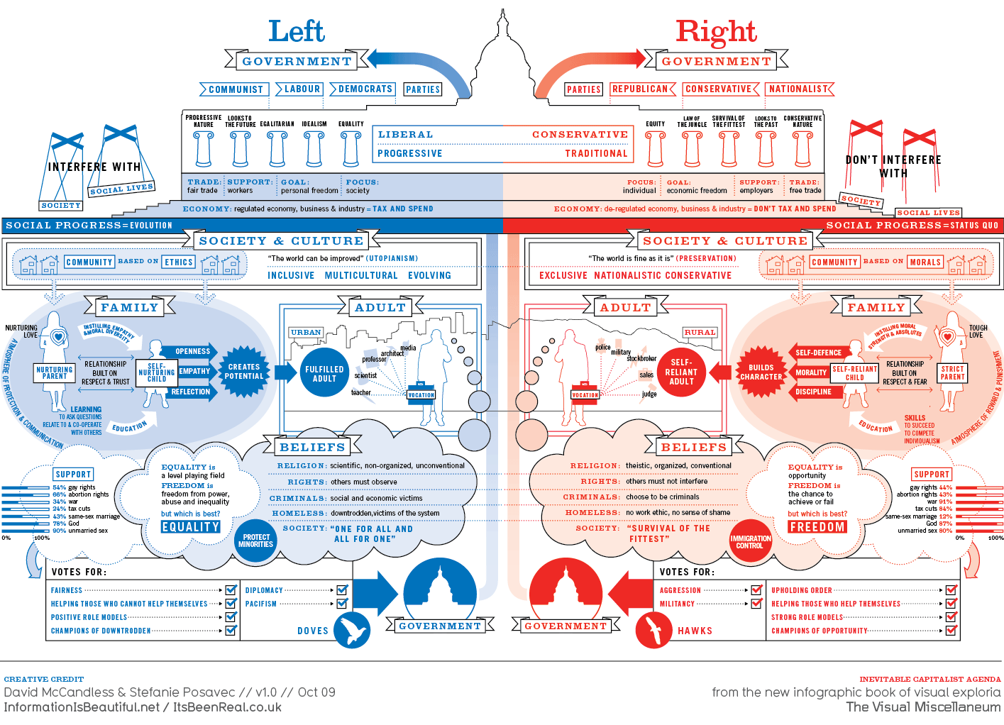
What It Shows
This infographic is a supremely comprehensive breakdown of left vs right (liberal vs conservative) thinking, covering politics, society, culture, family, and beliefs. For every element, views are compared and contrasted in a massive mirror image attempt.
Why It’s Good
This is one of my favorite infographics, for the success despite the ambitious scope. The strength is not in each individual component, but the picture that develops by elaborating two opposing systems of thought and seeing how the elements compare. There are so many elements covered, that there is something to learn and questions inspired by many different chunks and blocks, and plenty of opportunity for self identification. There are so many places to stop and think, on each side, and the whole comparative element takes things even further. Even if you thought you had a good sense of left vs right thinking, seeing it all presented at once refines the perspective. Americans are not 100% cut and dry one side or the other, but you do see the consistency in each side’s philosophy, and it makes partisanship, however dangerous and silly, much more clear.
The visuals do a great job of breaking up a lot of information into readable pieces, making it possible to consider the infographic holistically. The art is substantial but far from excessive, and well done enough to make it all aesthetically satisfying. The color division works, too.
The presentation seems remarkably unbiased, portraying the plausible values of both sides without jabs. I am amazed at how much the creators managed to include, and how cleanly they managed to include it.
Awesome.
What It’s Missing
Not much. There is so much in this infographic, that it’s hard to imagine what could be missing. I suppose it does present contrasting stereotypes, and not everyone fits on one side, but in a time of a polarized America, infographics like this help us understand a bit about why. I don’t like that people are often expected to be on one side or the other, and while I think the infographic might oversimplify and emphasize differences more than similarities, the many components allow people to realize that they may not fit 100% squarely in either camp, and I think that’s helpful.
If you’re interesting in learning more about liberal vs conservative thinking, check out the TED talk below by Jonathan Haidt. It’s well done, but I can’t make the same claims about it being unbiased…
This infographic is found at one of the coolest infographics sites around, InformationisBeautiful.net, on this page.