Welcome to Infographics Blog! On this site you will see a wide variety of forms of data visualization. Some are funny, some are cool, some are interactive, and some are animated. All are reviewed along with explanations of the strong and weak points of the given infographic: how they handle aesthetics, data selection and presentation, how clever they are, and more.
Enjoy the best and worst of the infographic world, and feel free to leave a comment!
Mean Happiness (GOOD & Open)
Posted by Simon in Society & Culture on July 8, 2010

What It Shows
This infographic uses smiley faces to compare happiness levels between various countries.
Read the review of this infographic »
The Economics of the World Cup (Know Your Money)
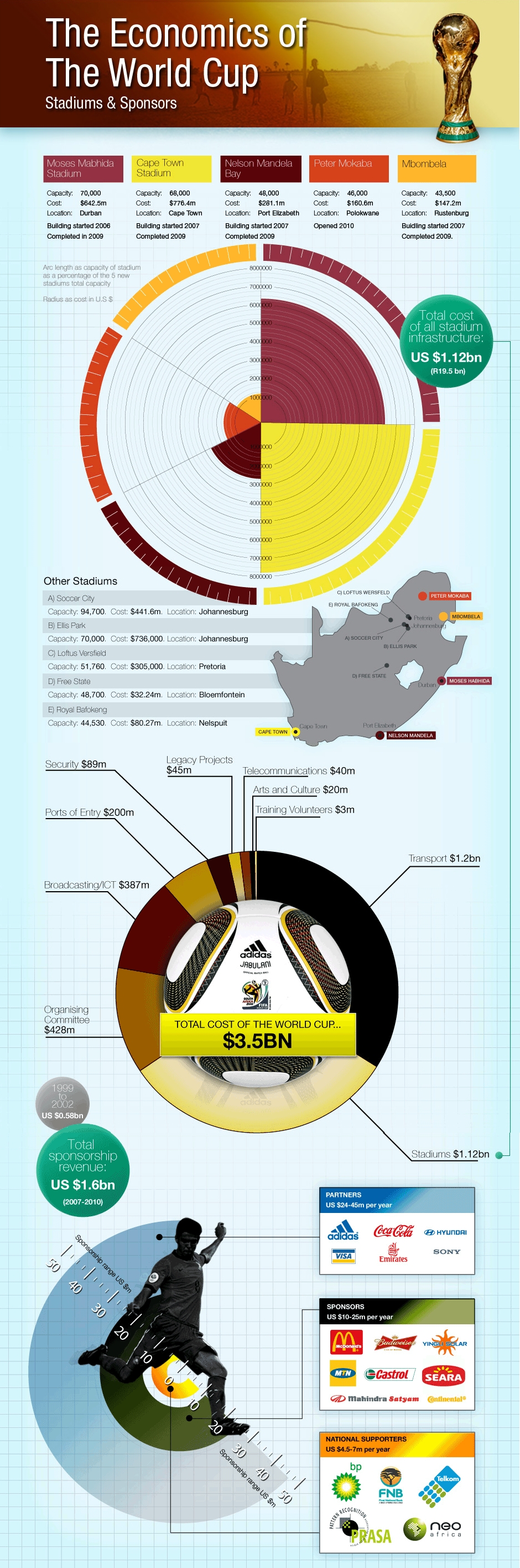
What It Shows
This infographic shows an economic breakdown of the current World Cup tournament, including sponsorships, stadium costs, and more. Warning: it’s a large image!
Read the review of this infographic »
UNHRC Refugee Statistics (Scruton, McCormick, Sheehy)
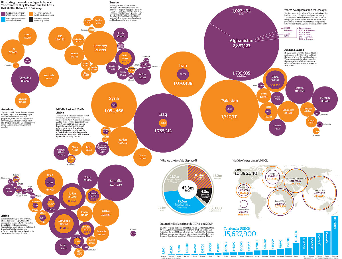
What It Shows
This infographic mainly indicates the amounts of refugees leaving and entering countries around the world.
Read the review of this infographic »
Worst Oil Spills (Tiffany Farrant)
Posted by Simon in Environment & Nature, Money on June 28, 2010
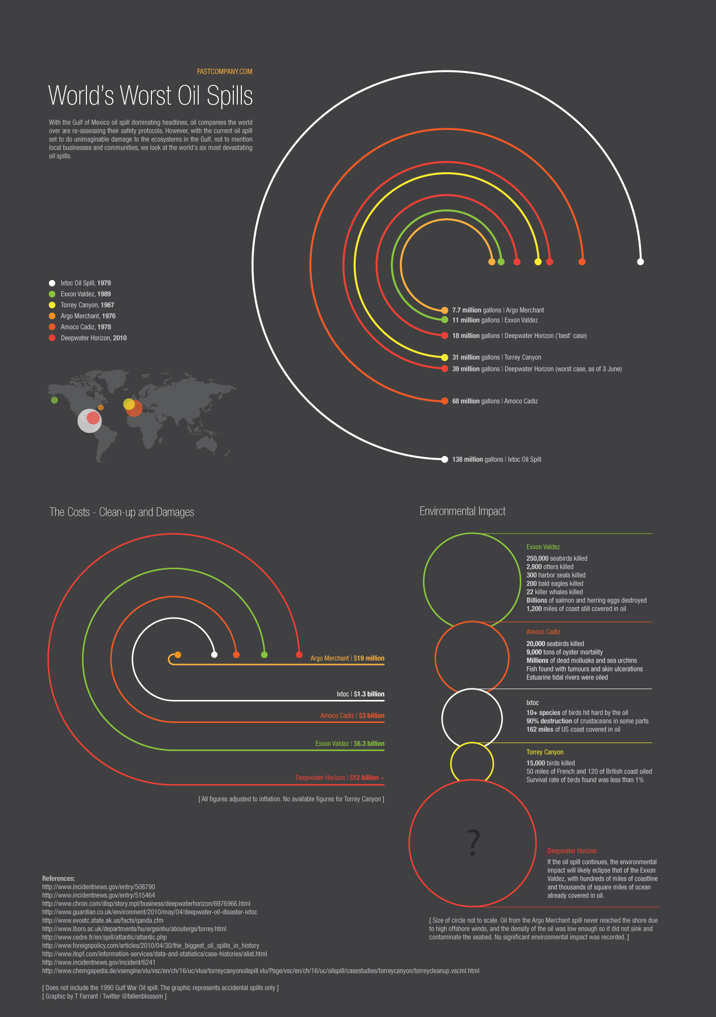
What It Shows
This infographic compares the worst oil spills in history, taking into account not only size, but economic and environmental damage. Figures for the current spill in the Gulf of Mexico are estimates, and this infographic uses these estimates to put the current spill into historical perspective.
Read the review of this infographic »
How Wild is North America? (The Big Wild)
Posted by Simon in Environment & Nature on June 15, 2010

What It Shows
This infographic offers somewhat of an environmental breakdown of Canadian, American, and Mexican wilderness with specific focus on the degree of actual wild in these countries. This includes percentage of water use, human to animal relative populations, and straight up untouched by humanity territory calculations.
Read the review of this infographic »
The Energy Used in Google Search (Wellhome)
Posted by Simon in Environment & Nature, Science, Technology, & Internet on June 10, 2010
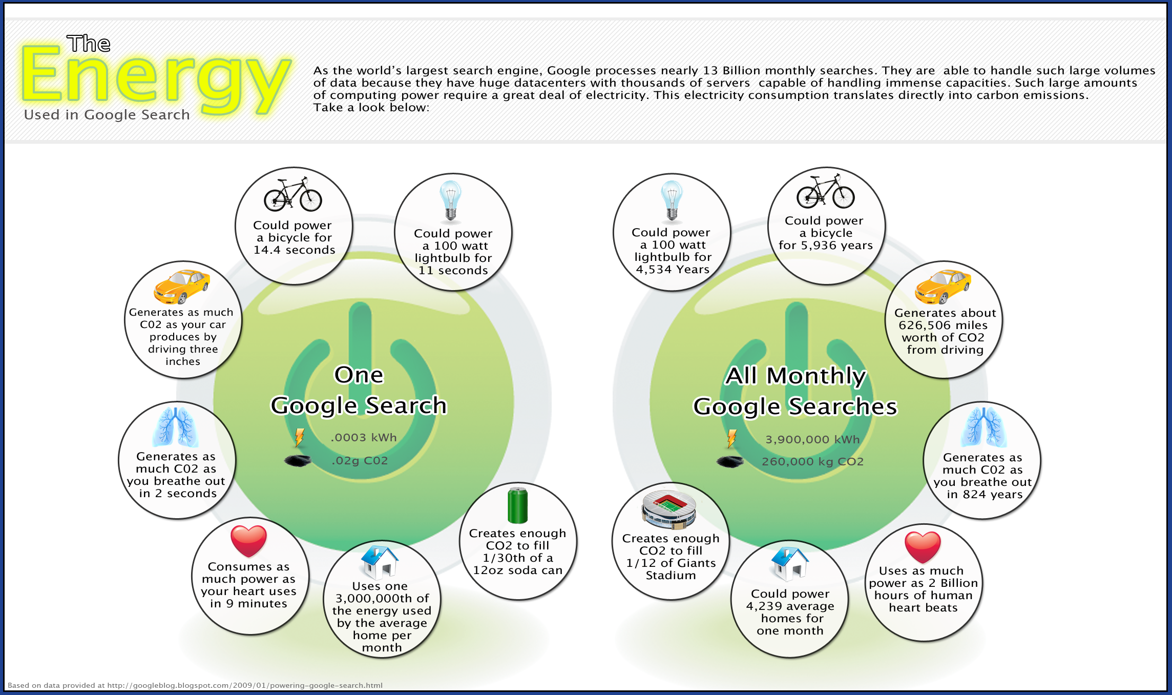
What It Shows
This infographic maps out the various energy opportunity costs of having Google run as it does, on per search and monthly search levels. Environmental effects are presented in kWh and CO2 emissions.
Read the review of this infographic »
Surface Area Required to Power the World (Land Art Generator Initiative)
Posted by Simon in Environment & Nature on June 7, 2010

What It Shows
This pair of infographics shows the amount of surface area required to power the world with solar and wind power at a projected estimate of consumption in the year 2030.
Read the review of this infographic »
How Come Cheap Airlines Are So Cheap? (5W Graphics)
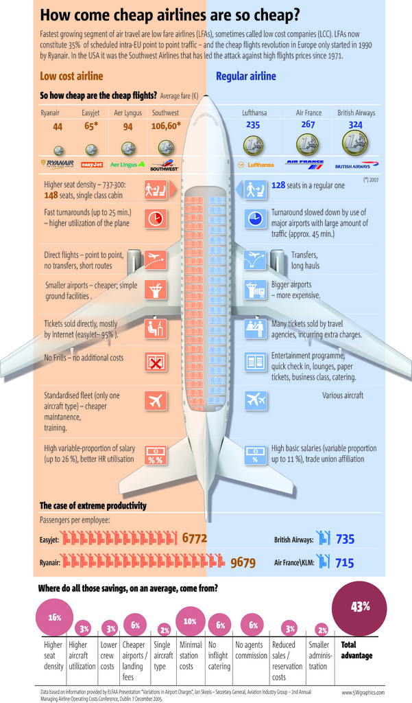
What It Shows
This infographic breaks down the variety of areas where low-cost airlines have managed to cut corner to save money and pass those savings onto the consumer looking for cheap flights.
Read the review of this infographic »
Why Do Freeways Come to a Stop (Stephen J. Beard & Rich Exner)
Posted by Simon in Society & Culture on May 31, 2010
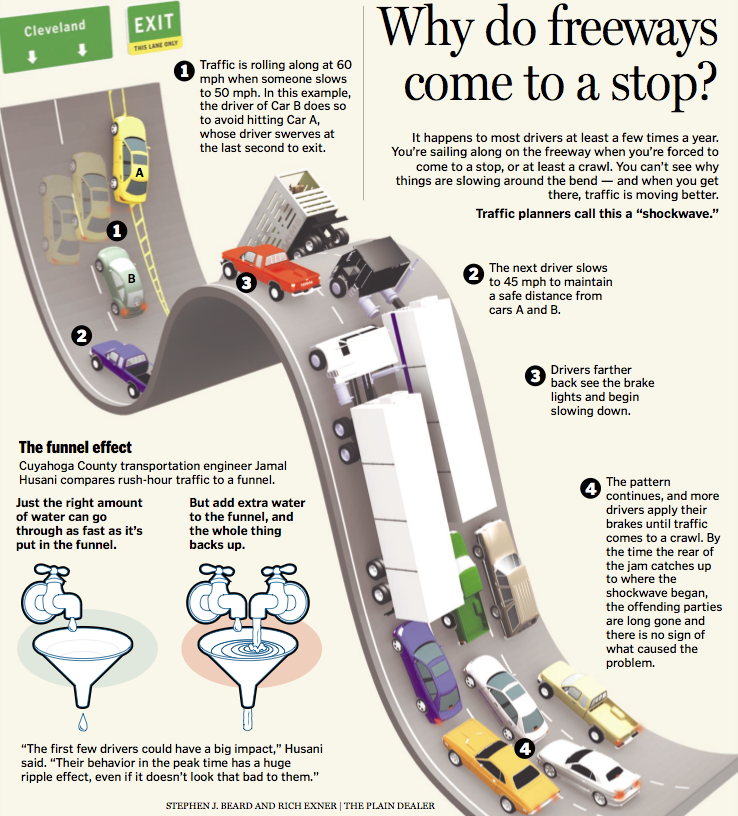
What It Shows
This infographic shows how a simple driving error creates a chain reaction of congestion on the road.
Read the review of this infographic »
Up In Smoke (Good Magazine & Graham Roberts)
Posted by Simon in Health & Safety on May 27, 2010
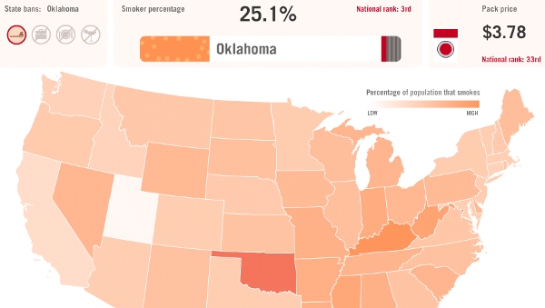
What It Shows
This interactive infographic gives an American state-by-state look at cigarette smoking popularity, prices, and bans.
Read the review of this infographic »