Welcome to Infographics Blog! On this site you will see a wide variety of forms of data visualization. Some are funny, some are cool, some are interactive, and some are animated. All are reviewed along with explanations of the strong and weak points of the given infographic: how they handle aesthetics, data selection and presentation, how clever they are, and more.
Enjoy the best and worst of the infographic world, and feel free to leave a comment!
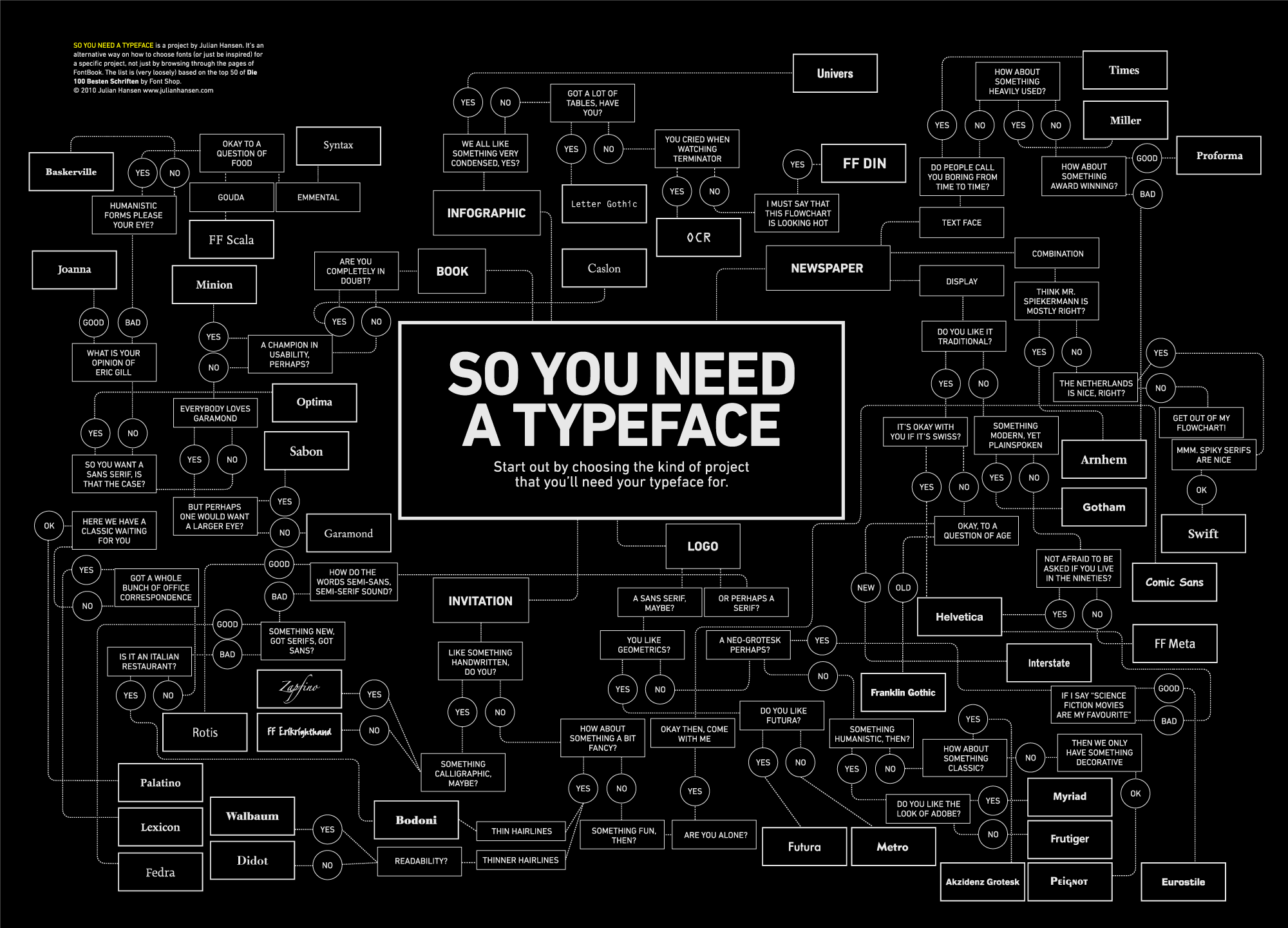
So You Need a Typeface (Julian Hansen)
Posted by Simon in Infographics & Design on May 24, 2010
What It Shows
This infographic offers a flowchart for choosing an appropriate typeface (font) depending on the type of application and aesthetic preference selections.
Read the review of this infographic »
D-Day (5W Graphics)

What It Shows
This infographic shows and explains timelines, strategies, and map information about the famous D-Day invasion of World War II.
Read the review of this infographic »
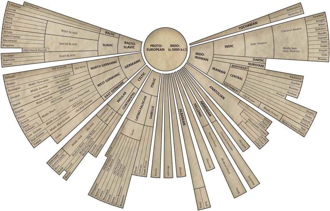
Indo-European Language Tree
Posted by Simon in Society & Culture on May 17, 2010
What It Shows
This infographic shows the structure of the spread of all languages derived from the same Indo-European protolanguage.
Read the review of this infographic »
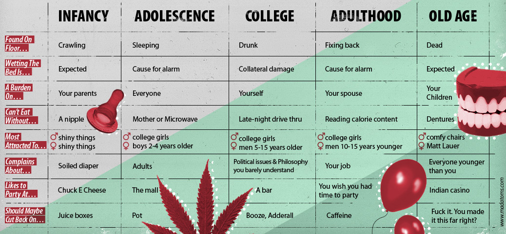
The Five Stages of Your Life (Worm Miller & Marek Haiduk)
Posted by Simon in Society & Culture on May 13, 2010
What It Shows
This infographic is a humourous grid breakdown of different aspects of life depending on what stage of your life you’re in: Infancy, Adolescence, College, Adulthood, and Old Age. These aspects are presented as beginnings of phrases (eg. “A burden on…”), and the phrase is completed differently depending on the life stage in question.
Read the review of this infographic »
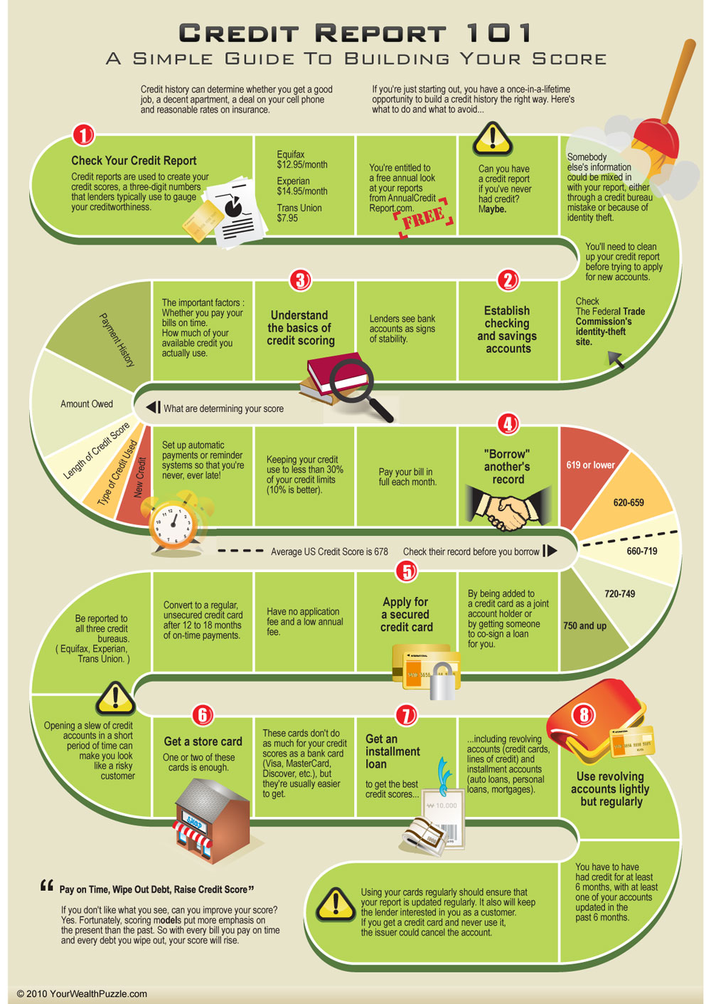
How to Improve Your Credit Score (YourWealthPuzzle)
What It Shows
This infographic displays the dos and do nots for improving your credit score using a game board as a format.
Read the review of this infographic »
Ever Gotten a Date Online? (Online Schools)
Posted by Simon in Science, Technology, & Internet, Society & Culture on May 6, 2010
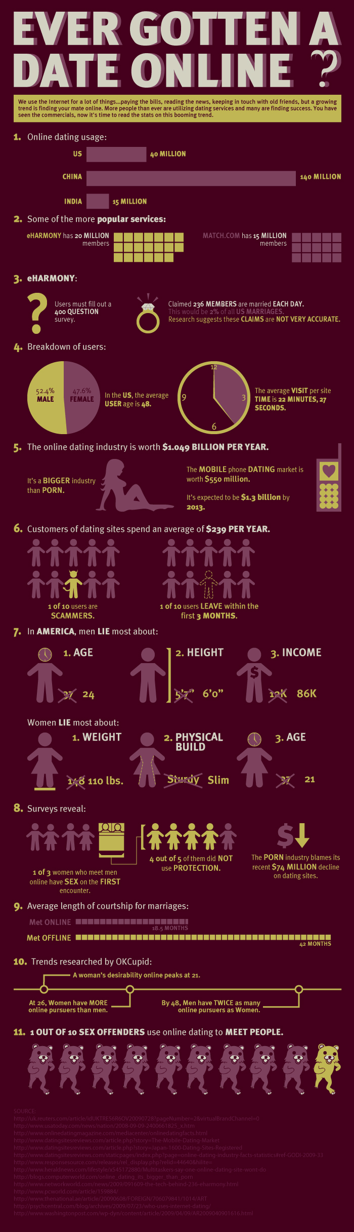
What It Shows
This infographic is a collection of statistics and information about the current online dating industry: who takes part, how many, and what they do.
Read the review of this infographic »
London Property Search (Gartoo)
Posted by Simon in House & Home on May 3, 2010
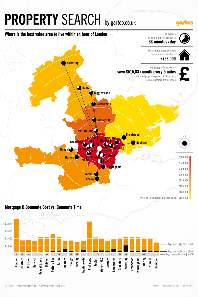
What It Shows
This infographic attempts to inform home buyers who want to avoid the astronomical housing costs of London’s real estate by comparing costs for areas outside London with the commute cost and time to come into the city.
Read the review of this infographic »
Celebrity Body Insurance (Free Insurance Quotes)
Posted by Simon in Money, Society & Culture on April 29, 2010
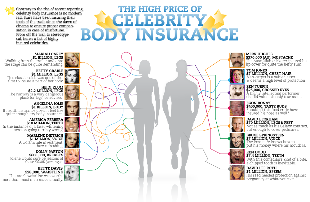
What It Shows
This infographic shows which celebrities have insured which parts of their body, and for how much. While the rest of us are getting auto insurance and health insurance, these celebrities are insuring everything from mustaches to tastebuds.
Read the review of this infographic »
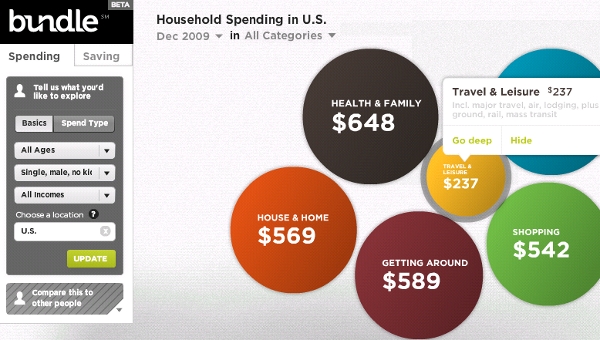
2010 Bundle Report: How America Spends (Stefanie Posavec)
What It Shows
This interactive multi-layered infographic breaks down last year’s spending in America by category (and sub-category), region (and sub-region), and demographic (and sub-demographic).
Read the review of this infographic »
Age Distribution on Social Network Sites (Pingdom)
Posted by Simon in Science, Technology, & Internet on April 22, 2010
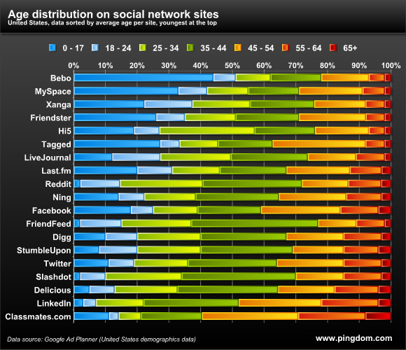
What It Shows
This infographic graphs the age demographic breakdown for the most popular social network sites online.
Read the review of this infographic »